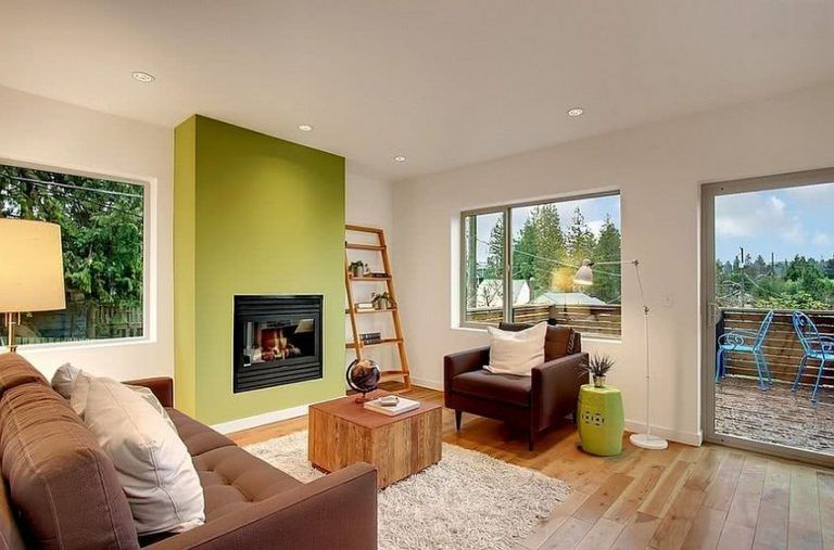
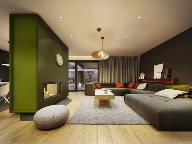
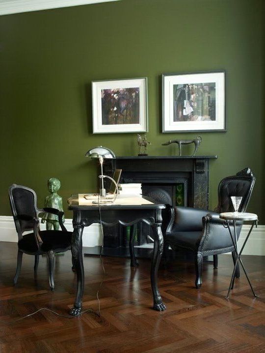
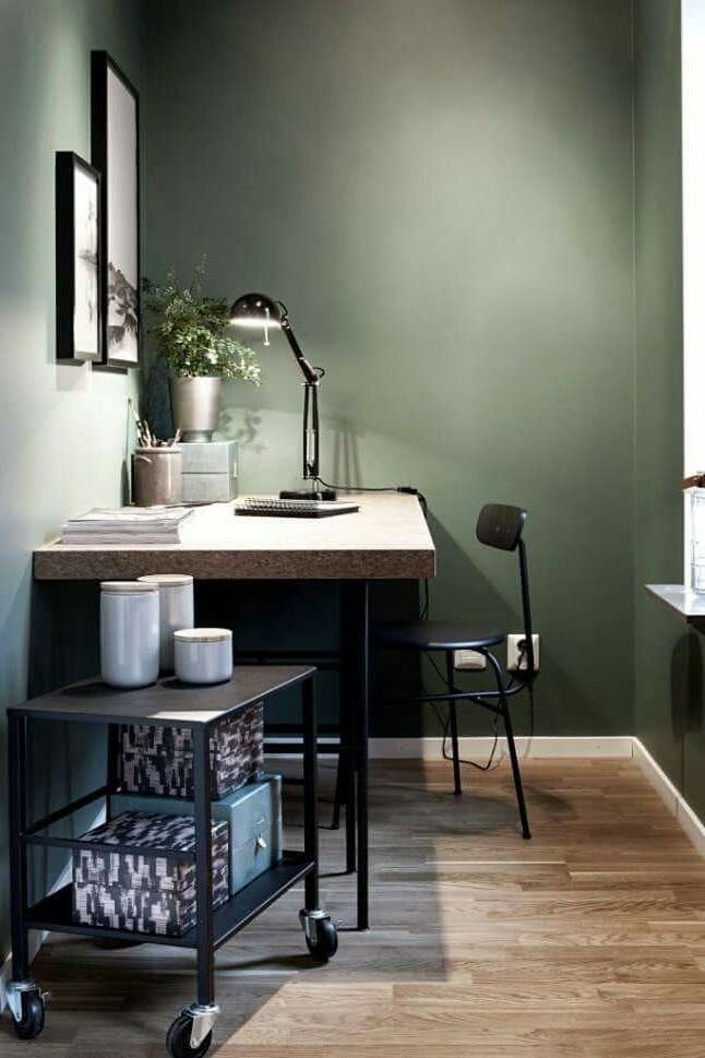
The green color is one of the least used in decoration, however, all its shades remind us of nature, so we should always keep it in mind. It helps us bring freshness and optimism to spaces.
We present some ways to use it in decoration that are currently in fashion.
There are a huge number of shades of green. We will show you below the tones that are being used the most in decoration.
Sage
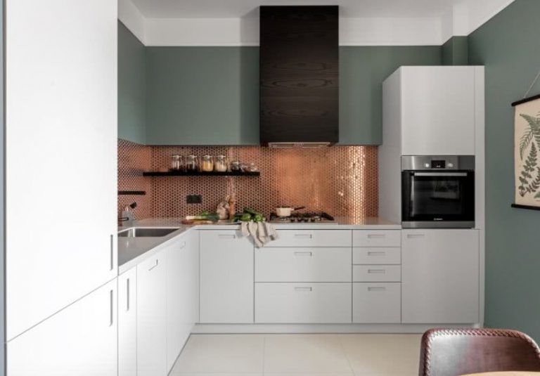
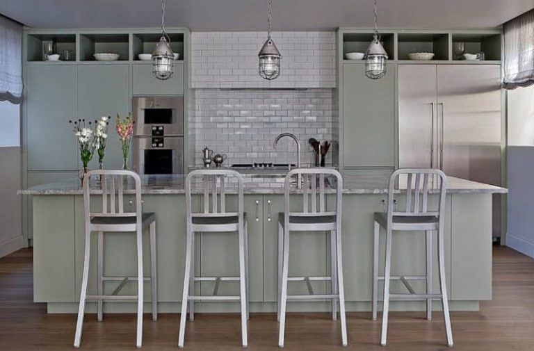
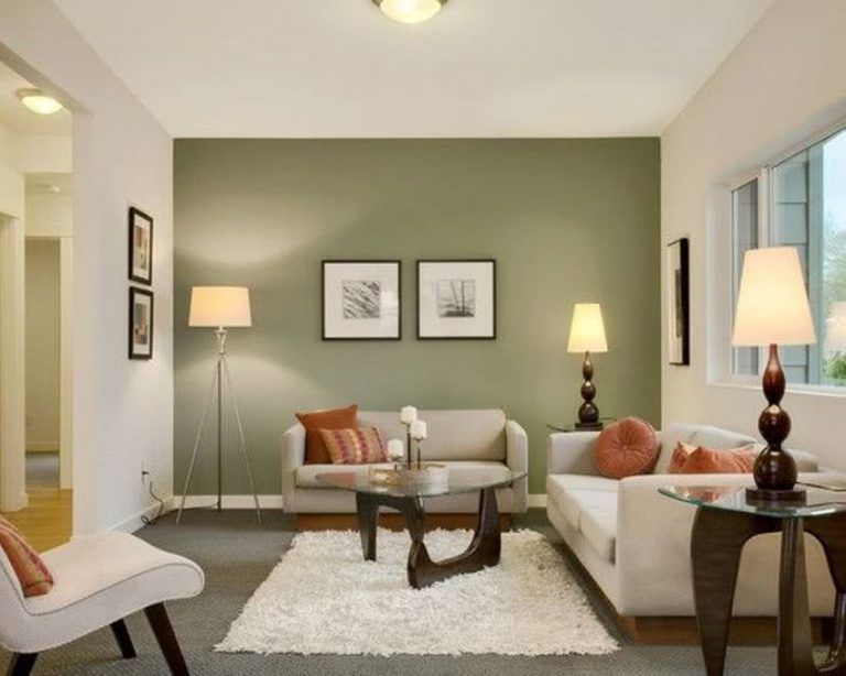
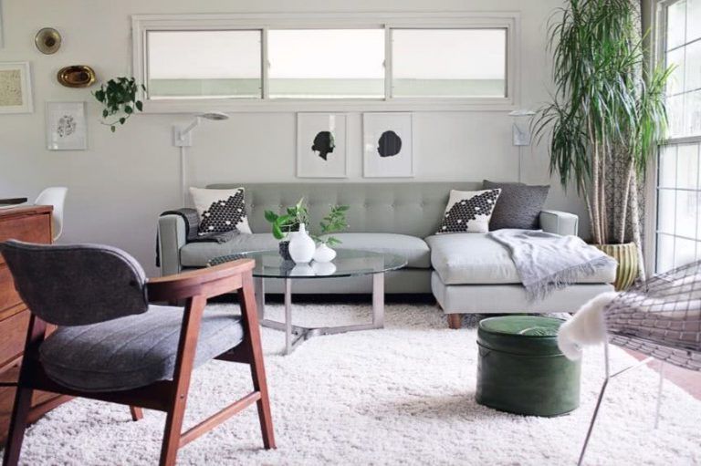
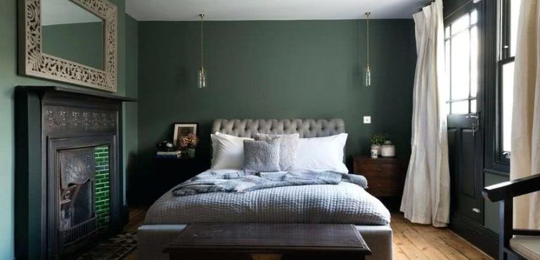
There has been a huge increase in the use of sage color in interior decoration, and it is easy to understand why. This gray-green hue is a soft, restful color that’s easy to layer. It is a new neutral, which has the advantage of not being boring or predictable, which is why it is being used more and more.


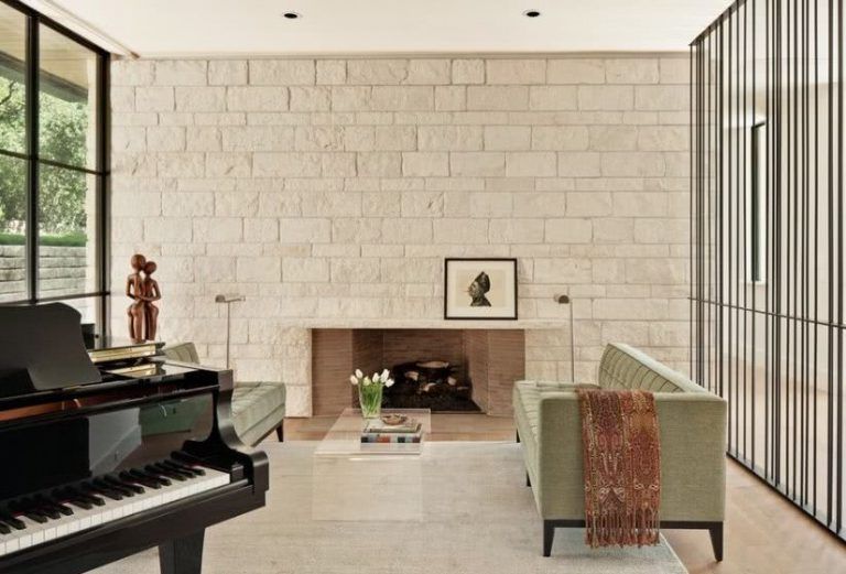
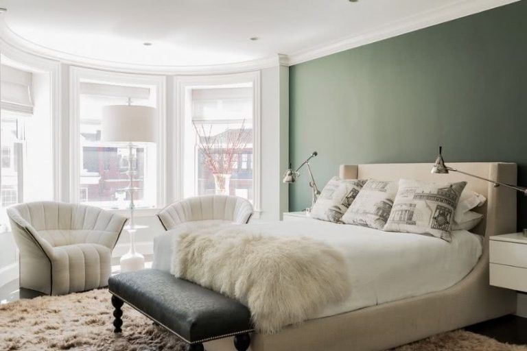
This room proves that this color pairs beautifully with almost any other color or material, including wood or metallic finishes.


It’s also the perfect pop of color in a mid-century modern room, as this room with neutral colored furniture demonstrates.


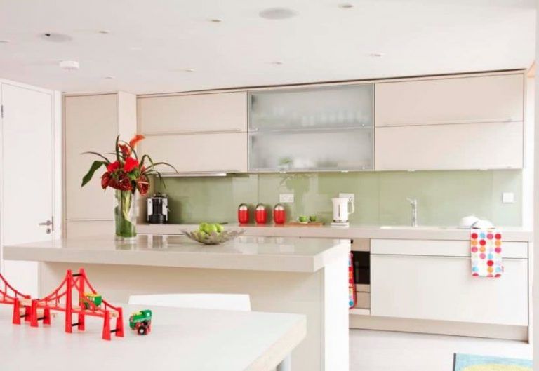
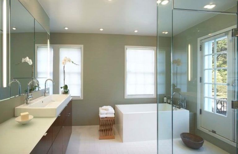
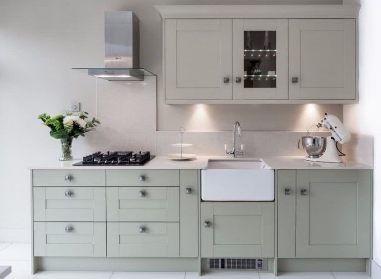
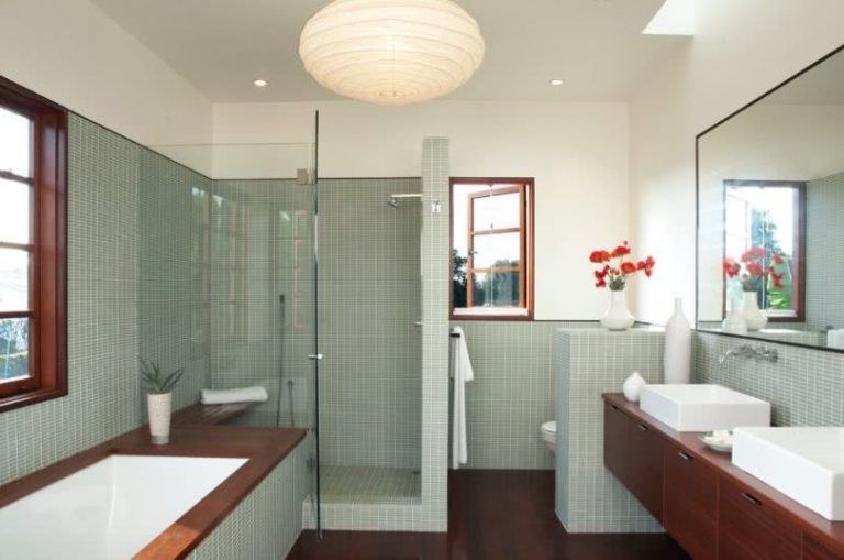
It looks spectacular on kitchen cabinets as well as on bathroom walls. It can also be perfect in a vintage style decoration.


Mint
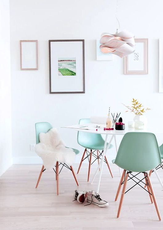
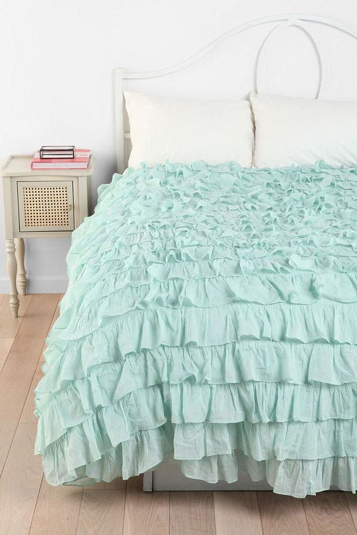
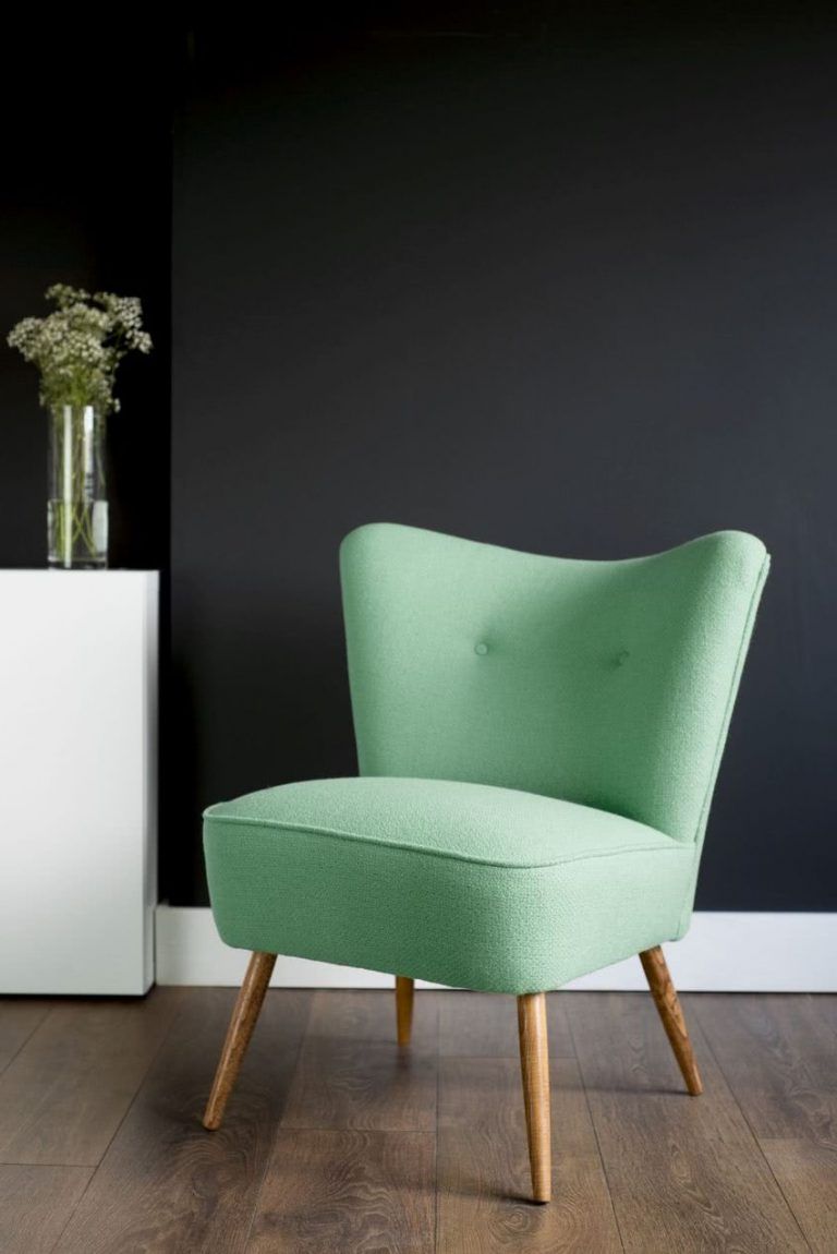
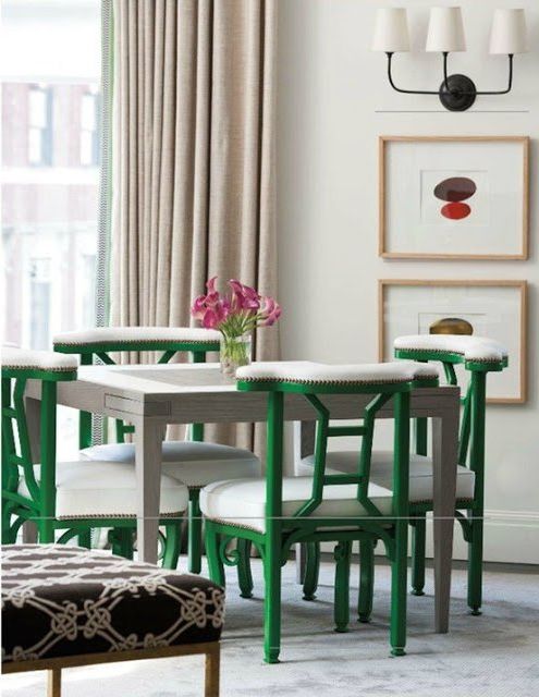
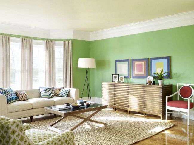
Mint green can be a wonderful choice in decoration. Whether in a youthful or romantic bedroom, or to transform the living room into a fresher and more cheerful space, this light tone can be of great help. These mint green chairs highlight this modern dining room. We love the mix between retro and current.

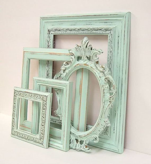
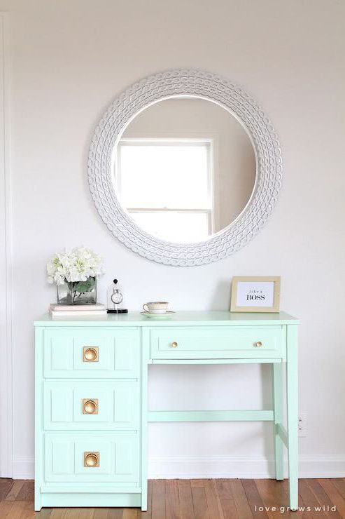
Vintage frames can be a beautiful decorative piece. Painted mint, they look fabulous.

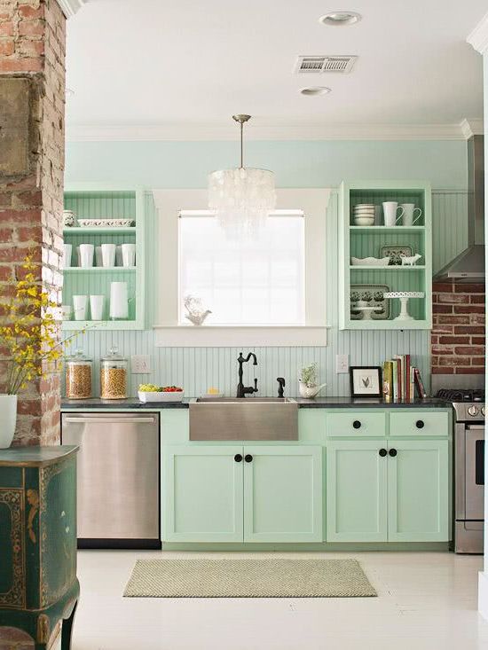
Your kitchen can come alive with this shade. The cabinets can be one of the possibilities to decorate with this color.

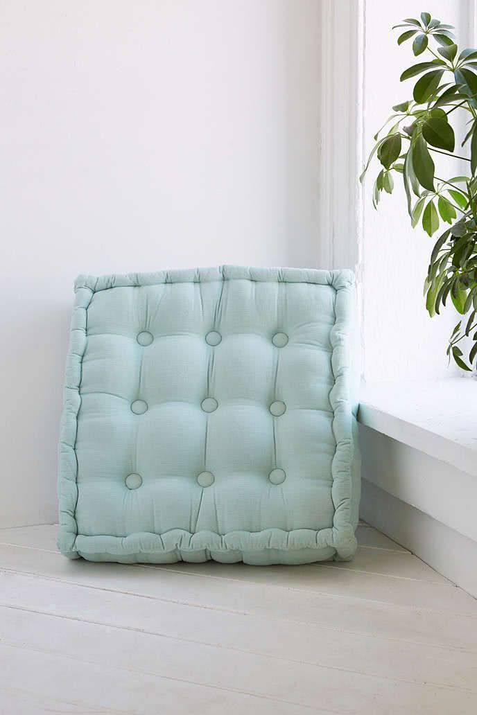
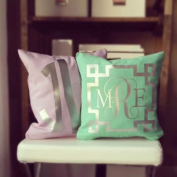
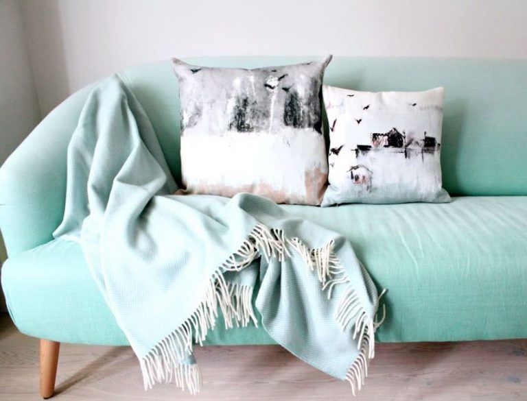
Another way to add a touch of color to the home is through cushions.


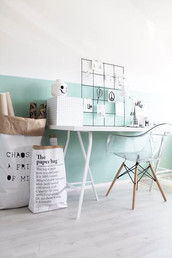
If you’re looking to create a unique or custom look, consider painting just one half of this color.

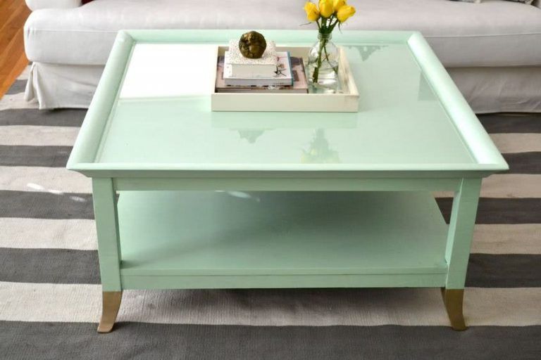
Coffee tables do not have to be traditional. Instead, you can add color to the center of the room and create a beautiful focal point.

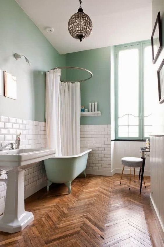
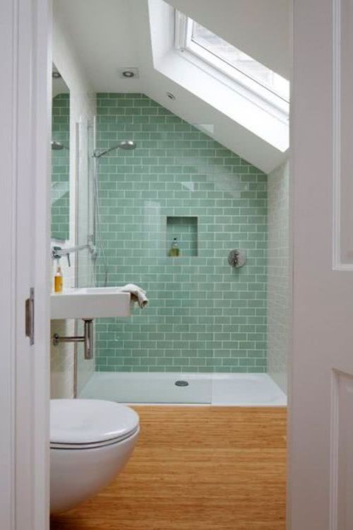
In the bathroom you can add some tiles or tiles in this shade, or you can also paint the wall. From the shower to the floor, this color works wonders for these spaces, giving them a clean and neat look.


A nightstand in this uplifting, feminine hue works well with a variety of styles and will add a subtle touch of playfulness to a room.


Bluish green
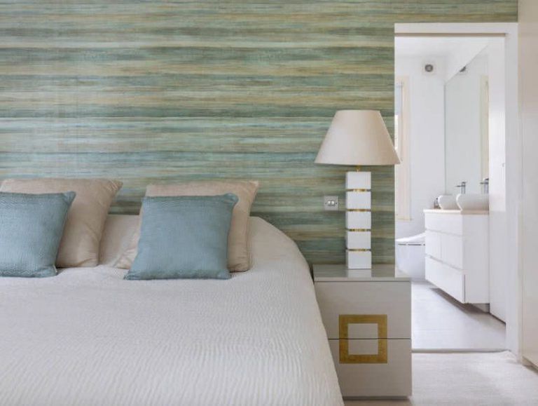
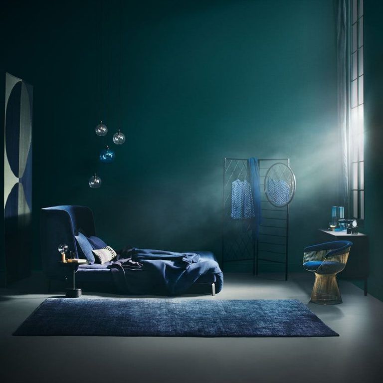
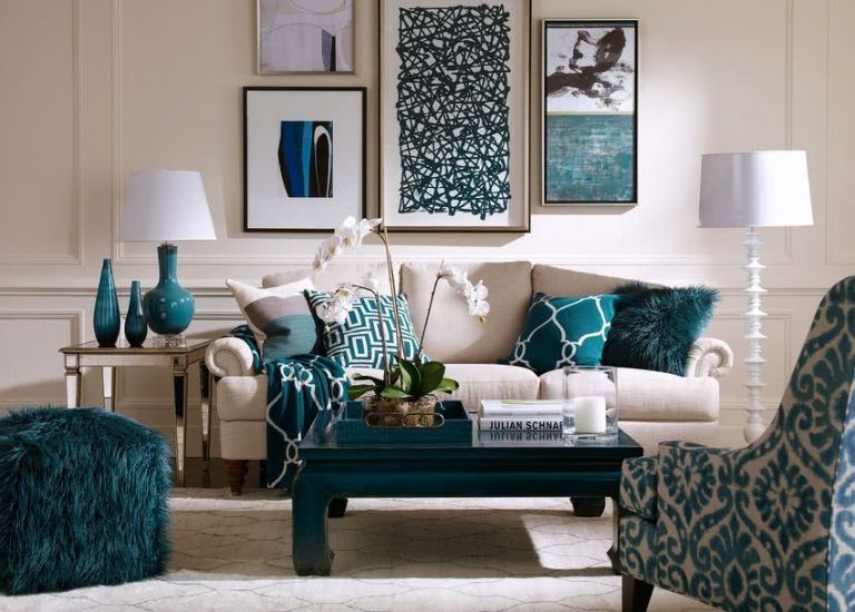
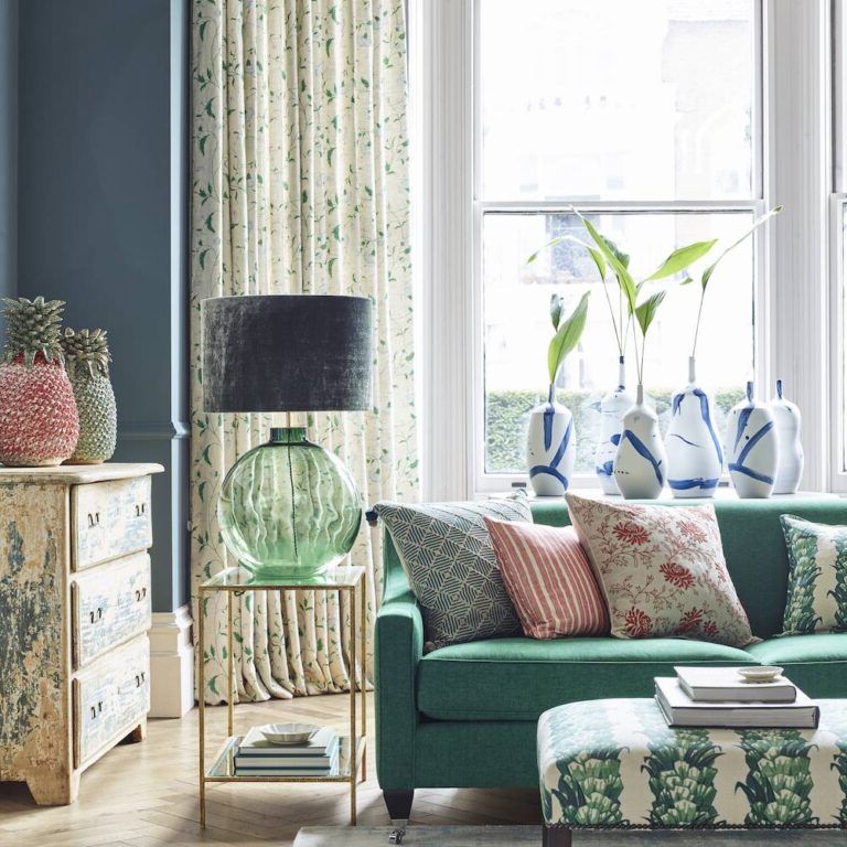
It is another shade of green that is fashionable in decoration. It embodies depth and freshness, but is not overwhelming. These qualities make it perfect for the home. Many shades can be used, from the darkest, gray tones to the bluest end of the spectrum.


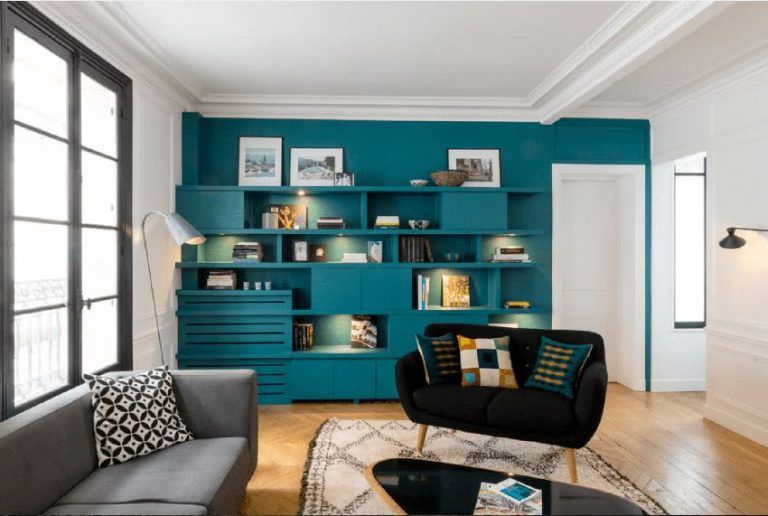
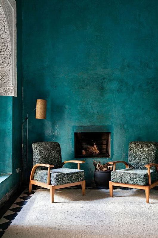
There are few colors that you can use in the whole room and don’t feel overwhelmed, this green is one of them. With such a wide range of tones, it can be used on upholstery, rugs, and on walls as a backdrop.

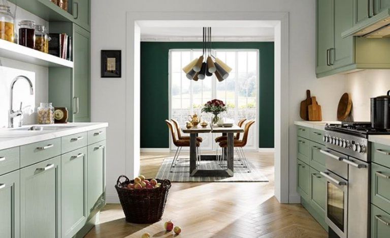
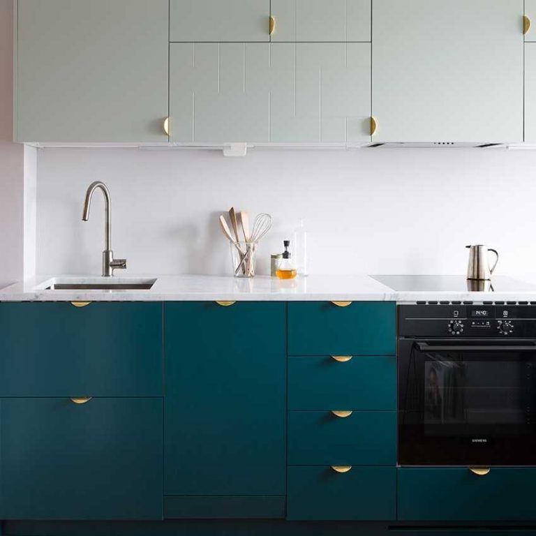
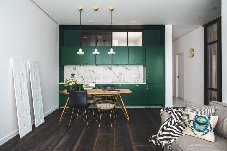
Teal is a strong color, but being from the blue family, it is a rare combination of strength and calm. Used in the lower cabinets in this kitchen, it adds a lot of character.


Even a single object in this wonderful hue can add a burst of life to any space, from the living room to the bedrooms.

Olive
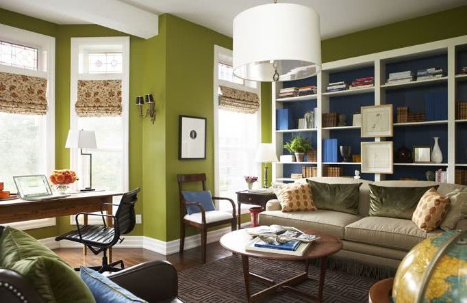
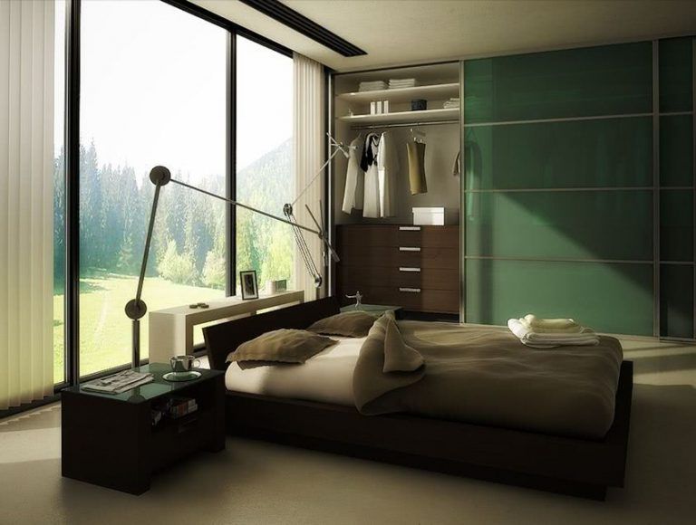
People tend to think that olive color is monotonous, and unfortunately dismiss it as a good color for the home. However, if you want to add a natural and calming tone, it can be a good option.

There are many shades ranging from light yellow olive to dark brown olive. They’re all lovely when paired with the right secondary colors. Olive can be really pretty and is worth a try if you like the color green.

Maroon is the perfect complementary color to olive. If you look at the color wheel, you’ll see that maroon is directly opposite olive.

Gold and orange tones add a bit of brightness and keep a room from looking dull.

Olive wall is a good background choice for neutral furnishings and accessories.

Brown and olive green are very natural colors that complement each other.

Two beautiful shades of olive and creamy white make this a pretty room. Light gray, creamy white, and olive green color schemes are great choices for bedroom decor.
Green Forest
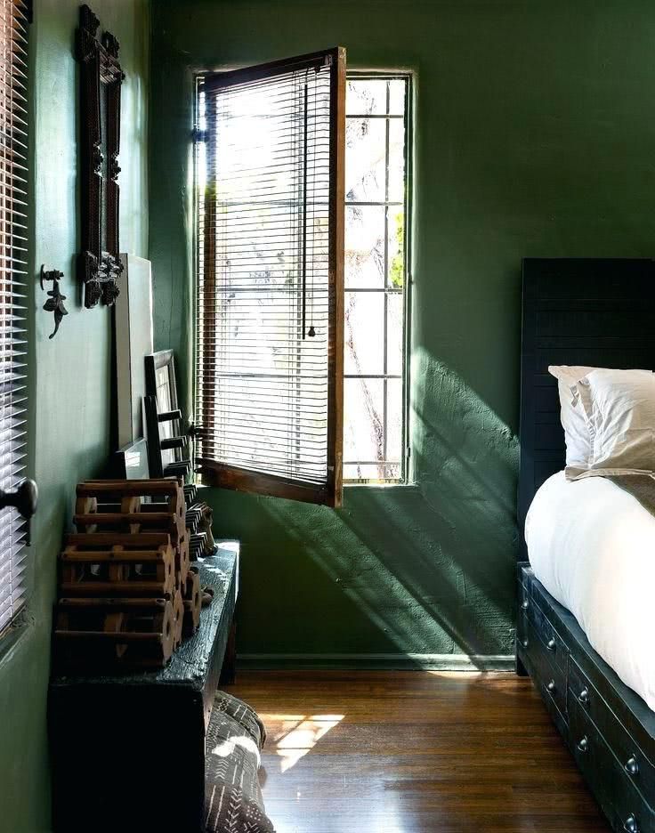
It is a very beautiful color, which accompanied by neutral tones can look sensational in the home. You should be especially careful if you combine it with opposite colors. For example, if you combine it with yellow, orange, pink or purple, the colors will be enhanced, so it is recommended that you combine it with neutrals.


Make sure to decorate the rest of the room with plenty of neutrals and no other strong colors. The room will remain calm and relaxing.


And of course, if you have a knack for decorating, there are plenty of ways to make colors like soft pink, fuchsia, and camel look stunning with forest green.


It is best to use it on small surfaces, and use mostly neutrals like grey, white, beige.

Emerald green
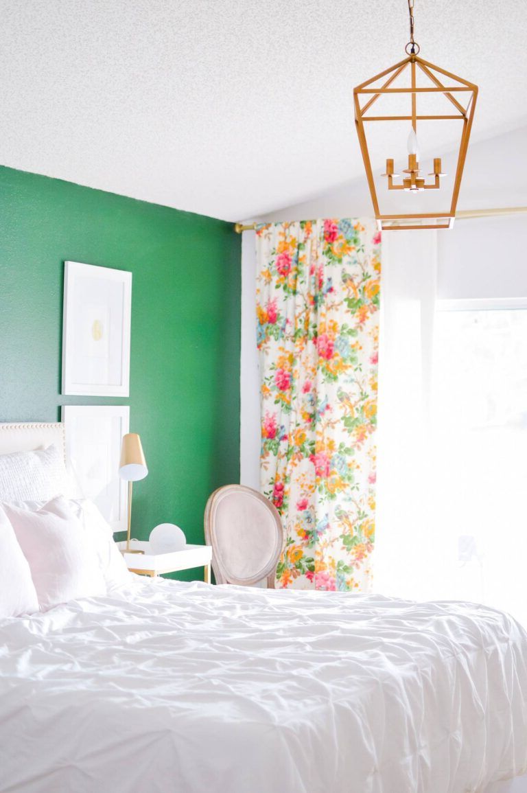
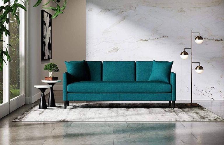
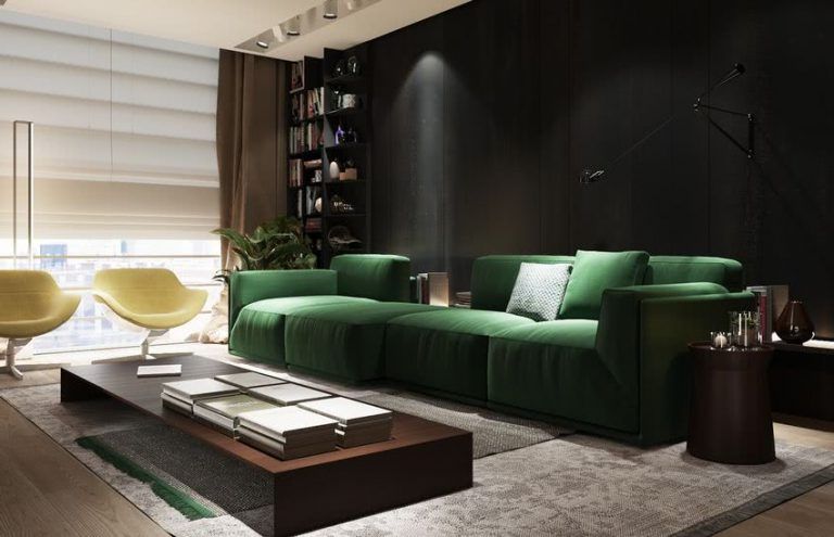
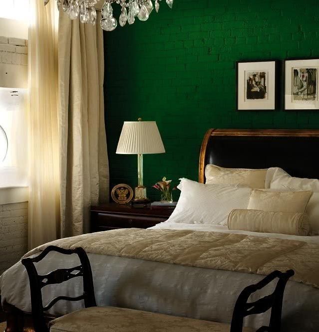
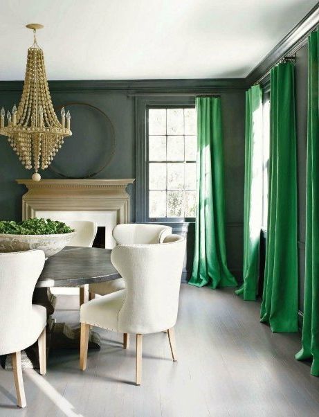
Emerald green was chosen as a favorite color a few years ago, by experts and Pantone, the highest authority in terms of color trends, both for fashion and for interior and exterior decoration. And of course, it is still used to bring spaces to life. So if you are thinking of renewing the color of the walls, or adding some color details to the rooms of the house, think that now you can make the most of emerald green.

The advantages of the emerald green color in decoration are many, which you can use in various ways. It conveys a feeling of liveliness and enthusiasm and looks good in almost any environment, it goes with all shades of green and contrasts nicely with other colors such as black, blue or white.

If you think that it can saturate the environment, you can use it in small doses, such as cushions, but in reality it is such a flattering color that in a monochromatic environment it will look elegant and current.

If you are more daring, a wall in this color can be magnificent.
