These mistakes in decoration are the most common. But luckily, they’re also easy to fix.
For anyone who wants, of course.
By doing so, we will leave the house more beautiful, and on many occasions, with simple gestures.
With that said, let’s look at these 15 decorating mistakes and their solutions:
You can watch it on video, or below the video you have the article with photos and explanatory text.
- Decoration error 1: Everything in neutral tones, without contrasts
- Not keep proportion
- Choosing the color without taking into account the orientation of the house
- Don’t do color swatches
- Paint first, buy furniture and textiles later
- Badly hung and disproportionate pictures
- Decorate the whole house at once
- Floor to ceiling curtains and with the right fabric
- Buy textiles without touching them, without seeing them
- Proportion in ceiling lamps
- Not making a list of needs according to our lifestyle
- Not measure well, but well
- Abuse a trend
- Do not risk
- Poor lighting
Decoration error 1: Everything in neutral tones, without contrasts
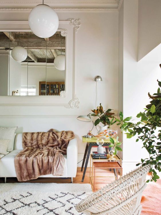
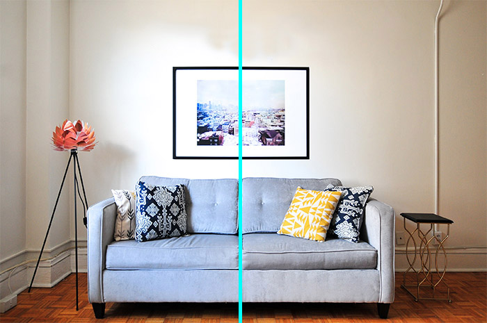
One of the most common decoration mistakes is betting everything on neutral tones.
On all sides we read, see and hear that neutral tones are the most elegant, the ones that look best.
And it is true, but with a huge condition: they are the most elegant and the best only when they are accompanied well.
Otherwise, neutral tones are the dullest, coldest and flattest colors that exist to decorate a space.
In fact, it is easier to make decorative mistakes with neutral tones than with saturated and powerful colors.
Let’s see an example of what I mean:
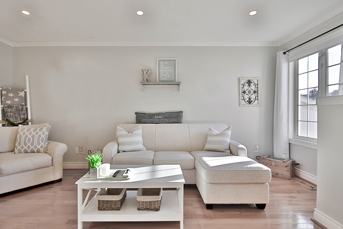
This is just one example of how neutral tones alone don’t work and that it’s easier to go wrong with only neutral tones than with more aggressive and dark colors that we always fear the most, right?:

Well, after seeing this you may be saying, okay perfect, but I want to decorate with neutral tones, so how do I do it to make it look good.
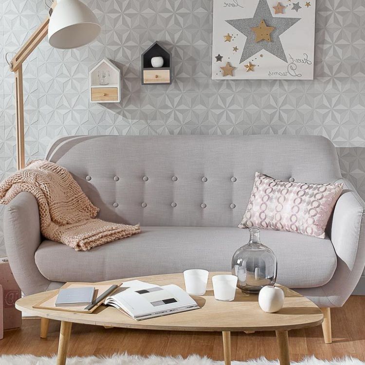
Very easy, creating contrast and texture.
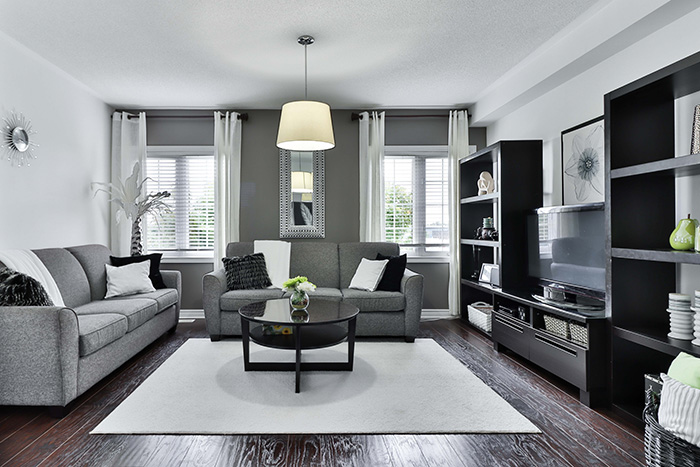
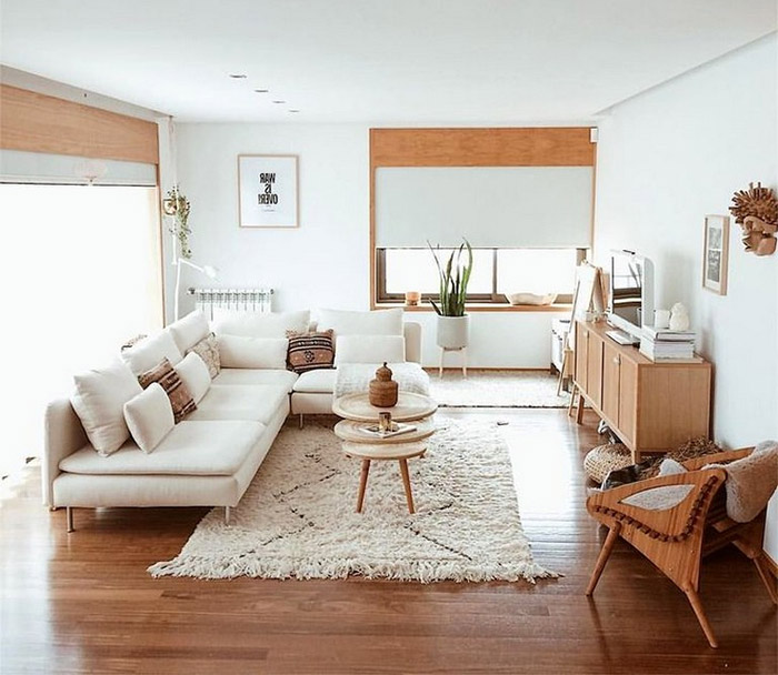
We can create contrast and texture just by using neutral tones and make the room stop being flat and bland. Let’s see the living room again.

So please remember, neutral tones, of course, but only if they are well accompanied with contrast and texture. Let’s keep going.
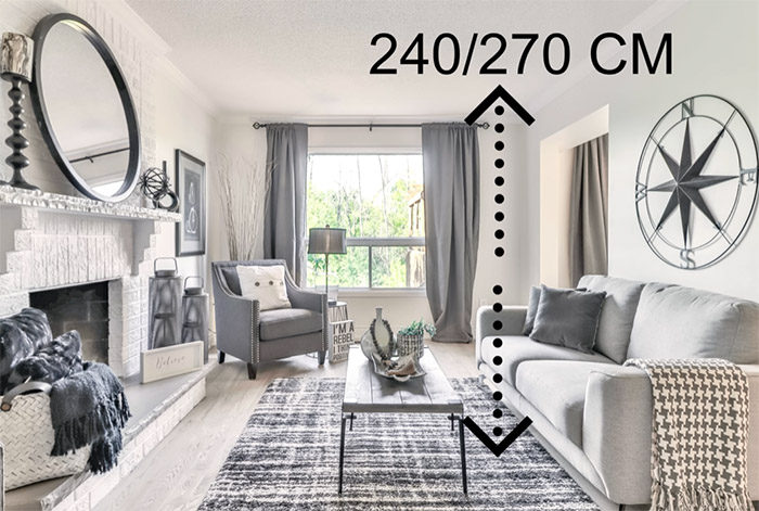
Not keep proportion
The proportion is not one of the biggest mistakes in decoration, what the mistake is is not taking it into account.
The proportion in interior design or decoration is everything. It is what guarantees you harmony.
Proportion is how the size of a piece is related to the rest of the decoration elements and to the size of the space to be decorated.
Let’s look at some examples of bad proportion.
Be careful, I do not mean that you cannot put it on if you like it, what I am saying is that it is disproportionate and that will make it not look good aesthetically.
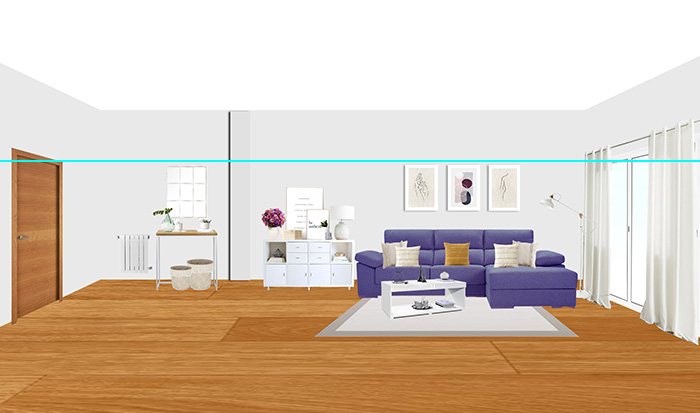
Another example that we see of bad proportion is the carpet.
It is too small for the entire seating area. It seems like a goop there in the middle without any sense.
These are just a few examples to easily illustrate the concept of proportion.
There are many rules and measures to choose furniture and decorative elements that guarantee a good proportion, as you can see in this article if you need it.
But the proportion is something that sometimes cannot be resolved with exact measurements since it is also a somewhat abstract concept.
That is why when you go to buy something that you want to put next to another piece or on it and you want it to be well proportioned, simply avoid extremes.
That is, it should not be much larger than the piece on which you plan to put it:

Then we will return with this topic focused on a specific element and we will see it in more depth.
Now let’s look at another decorative bug.
Choosing the color without taking into account the orientation of the house
This decoration error is another of the most common. Let’s take an example:
You have seen a beautiful color in a magazine, on the internet or in a color chart, you have bought it and when you have applied it on the wall and it has dried, you have said « meh » , it is more beautiful in the magazine. TRUE?
This usually happens for two reasons, one of them is the one we are seeing right now: for not taking into account the orientation of the house.
We will see the other later.
And it is that depending on the orientation of that room, it will receive one light or another and depending on that light the color will be seen in one way or another:
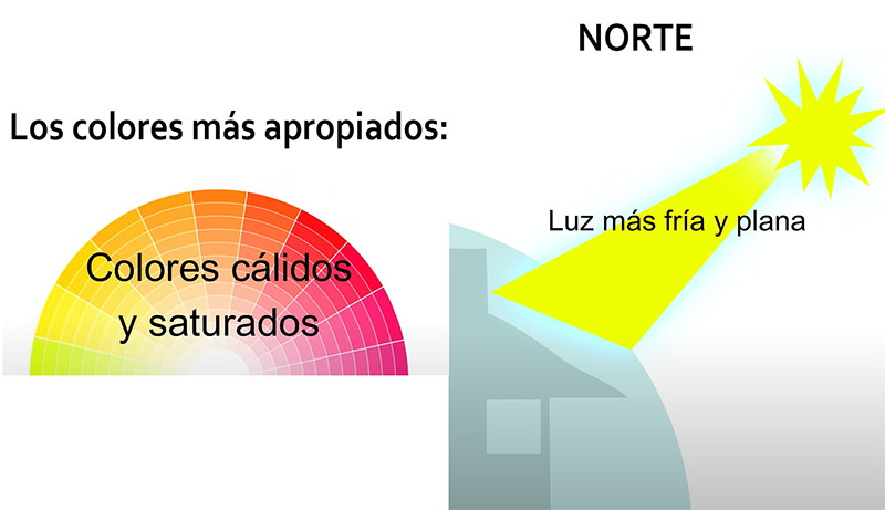
This makes colors appear less intense and somewhat cooler and flatter. So in these spaces the most saturated and warm colors work best.
If the room is facing south :
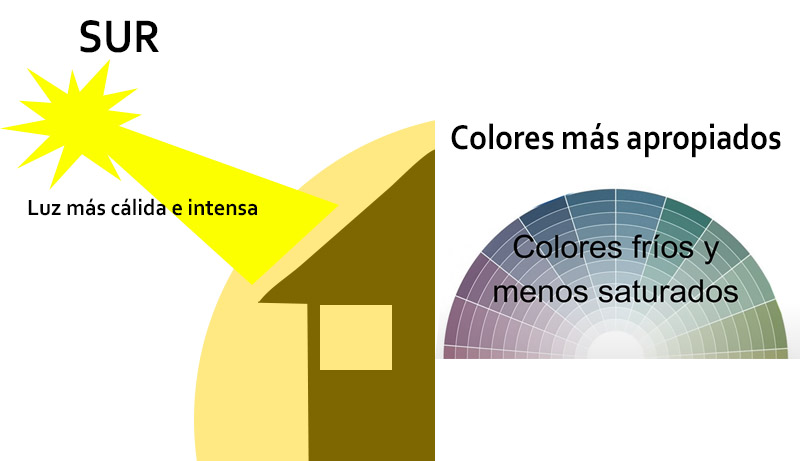
So they are the sunniest and brightest from morning to afternoon with a warmer light making the colors look more intense and warm.
Therefore, the colors that work best in these conditions are the less saturated, cold, or warm grayish colors that compensate for that intensity.
This is a much more complex topic, but I wanted to simplify it. If you want to learn more about this topic, you can read this great article.
And if all this seems like a drag and you just want to paint your walls with a nice color that you like and get out of trouble, then make a good color sample on the walls to see how that color behaves.
But it has to be a good sample, since not making a good sample of color on the walls is another of the most common decoration mistakes in decoration and it is the one that we are going to see right now.
Don’t do color swatches
This is one of the recommendations in which I am most insistent with my clients.
Always do color swatches, but a well-done color swatch, not something like this:
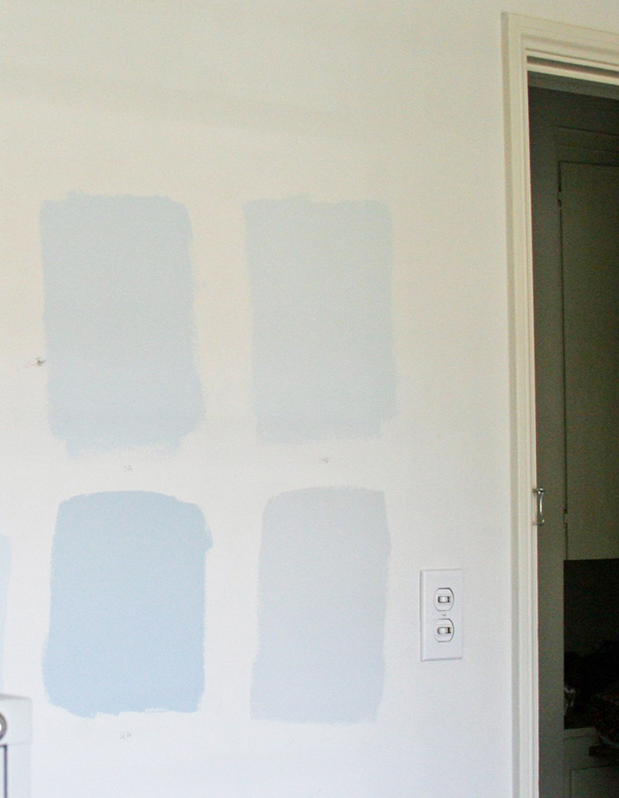
A color swatch has to meet 4 points :
- The first point is that a color swatch has to take as many hands as necessary until it covers. That is, if the color we have chosen covers with 3 coats, we need a sample with three coats, otherwise we will not see the color as it is.
- The second of them is that the sample is relatively large, simply so that we can see well, in a generous way, what color is like and how it acts on our space.
- The third point is that color swatches are always done next to doors or windows and down to the floor to see how that color works with doors, windows and floors. If you do it in the middle of the wall, you don’t know how that color combines with your floor, furniture, doors or anything.
- And the fourth point is that it should be observed throughout the day. I’m not telling you to sit in a chair and watch the hours go by in front of color, but I am telling you to see it in the morning, afternoon and evening. Because depending on the amount of light it receives and the orientation of the room, as we have seen before, that color is going to behave in one way or another, and you can be in for a big surprise if you paint your entire bedroom with that color and Suddenly in the afternoon it loses all its saturation and remains dull, sad and cold.
Doing the color sample in this way, you ensure 100% that that color is the one you want and that it looks best in each room.
Paint first, buy furniture and textiles later
Continuing with the color, another of the most common interior decoration mistakes is that normally when we get our new house or we do a renovation, we choose the color of the walls first and have the painter come.
But it is a mistake, since the color should always be chosen after knowing the finish and color of the most important furniture and textiles, or at least choosing the color when we already have a more or less clear idea of what type of furniture and textiles we’re going to have.
For the simple reason that it is much easier to change the color if we don’t like it than to change the furniture.
So before telling the painter, paint my house with this or that color, think about whether that color you have chosen is going to combine with the furniture, with your style and with the textiles.
Since if this is not the case, it is very likely that when you put the furniture in, you will not like how it looks with that color of the walls, so it will be time to repaint and this time with furniture inside the house.
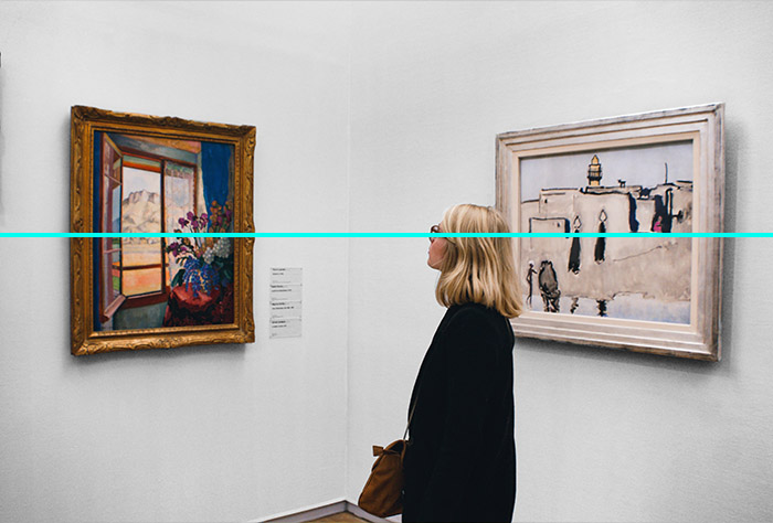
Badly hung and disproportionate pictures
Another of the biggest decoration mistakes we make is hanging the pictures wrong and putting them out of proportion.
How to correctly hang a painting?
It all depends on the work and its size, but there are several simplified rules that can guide you when hanging a painting. Let’s see them.
That is, half of the box more or less that is at eye level as we see in the image above.
But of course, what happens if the picture is very large, or we are very tall or very short? Here we can resort to these two solutions:
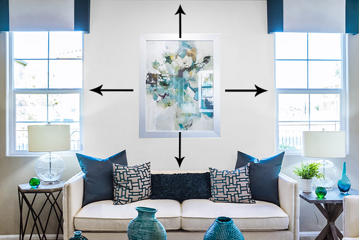
One of them is to look at the height of all the tall elements of the house, such as doors and windows. And hang the painting at a relatively equal measure to that same height. This does not fail, because we create an imaginary line of consistent height:
It consists of looking at what surrounds the painting, both what is on the sides and what is above and below:
If you are going to hang more than one painting, try to make a separation of about 10 cm between each painting so that each piece looks on its own and as a whole and does not seem like a hodgepodge of ideas and colors.
On the other hand, and returning to the issue of proportion, we also have to take into account the size of the painting in proportion to the size of the elements that surround it or the wall itself.
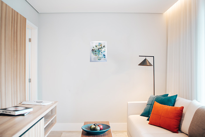
So, if you are going to put pictures on an empty wall, make sure that the picture is big enough not to be disproportionate to the wall.
The same happens with the rest of the elements that surround that painting, such as sofas and other furniture.
For it to be proportionate, it should not be too big, that the painting almost occupies more than the sofa or the piece of furniture, nor too small that the painting and the piece of furniture are completely unrelated.
Use your own perception to see if that box is too big or too small.
But this rule is very flexible, do not take it as something rigid, because the painting can measure something more or something less without problem.
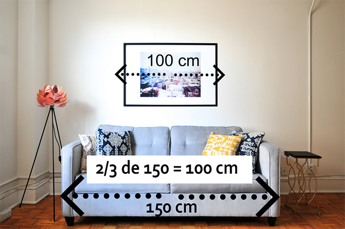
If instead of putting a picture on the piece of furniture in question you plan to put several creating a gallery, then the gallery in total would be the one that would have to have two thirds of the size of the piece of furniture.
In this case, do not look at the proportion and size individually, but taking into account the total of all the boxes.
But this rule also takes it as something flexible, since many times putting a work of art asymmetrically with respect to a piece of furniture looks great.
By respecting the proportion and location, all your paintings will look perfect and you will get all the decorative potential that a painting has to decorate a room.
You can see more tips on how to hang and place the pictures correctly.
Decorate the whole house at once
It is normal that when we are going to furnish and decorate a house we want everything already done to see it beautiful and enjoy it.
But this is the most effective way to fall into decorative showers that we will later regret for sure.
Start with the basics, what you need to live comfortably and the rest of the pieces, take all the time you need until you find the ideal piece that you have fallen in love with and fits perfectly with your home.
If you don’t do it this way, I can assure you, if you haven’t already discovered it for yourself, that more than one piece you buy later you won’t like how it looks, it won’t fit well or it won’t work as you thought and you’ll have to buy another.
Floor to ceiling curtains and with the right fabric
In spaces that have a standard ceiling, between 240/270, the curtains always go from the ceiling to the floor.
That they do not step on the ground, but that they do not fall short either, right to the ground.
This will make your ceilings appear taller and slimmer and your windows better framed.
For spaces with very high or very low ceilings there is no standard that works for everyone, you have to examine that space individually.
Not only the height of the curtains is important, but also the correct fabric.

The light curtains are from the firm Kenay Home
If the fabric is very heavy and opaque, the curtains will steal a lot of open light and also a lot of physical and visual space, so unless you need thick and opaque curtains out of necessity, the lighter the better.
Buy textiles without touching them, without seeing them
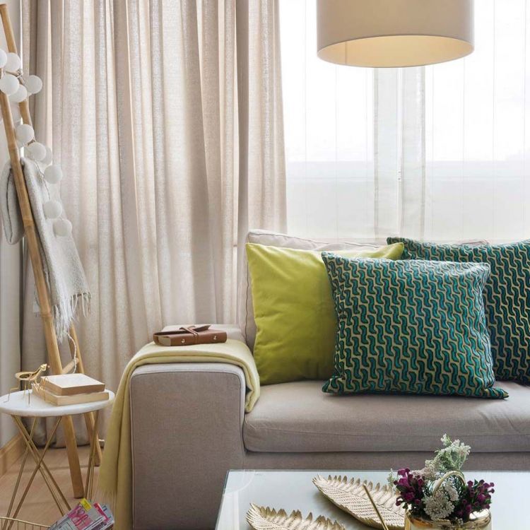
As we have already seen throughout the video, textiles can be the protagonists and radically change the atmosphere of a space.
For this reason, I never advise buying textiles without seeing them, without touching them, because that beautiful pattern on the curtains that you have seen in the online store may be much larger or smaller than what you expected when you see it in person.
It is also very likely that the color you have chosen for the bedspread for example will change when you see it in person.
In fact, raise your hand to those who have not experienced this: You have bought an online textile that looked beautiful in the photo but it has arrived at your home and the color tone was slightly different and therefore the textile no longer matches or suits you. it looks so good or you just don’t like it anymore.
So, when you go to buy an important textile online such as curtains, a bedspread or a sofa cover, for example, ask for a sample beforehand, or if that online store has physical stores, come and see it in person and so on. you’ll be right for sure.
Proportion in ceiling lamps
Returning again to the issue of proportion, another mistake in decoration that is very, very common is the size of the lamps that are totally disproportionate.
Or very big or very small.
Except in the dining area, where you can see the perfect size for dining room lamps, in the rest of the spaces, the size of the lamp must be proportional to the size of the entire room.

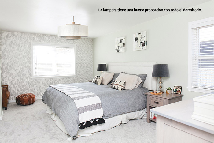
You can also see these trend ceiling lamps.
Not making a list of needs according to our lifestyle
Not thinking about your lifestyle and making a list of your needs is another of the most common decoration mistakes and the most expensive when it comes to decorating a house.
The first question that is on my list of questions when I start a project with a client, the first, always, is what is your lifestyle like at home?
An example:
A couple of years ago a couple contacted me to decorate their new house because they couldn’t make them like their living room because of the sofa.
This couple had a great fondness for watching series. And they bought a huge television to enjoy them, because it was their hobby.
On the other hand, they bought a straight sofa, since they no longer liked a chaise lounge sofa.
So, when the sofa arrived and they began to live in their new house, they were unhappy with the sofa, basically because they couldn’t both lie comfortably on it to watch the series, since the straight sofa they bought instead of a chaise lounge did not allow them to be as comfortable as they wanted.
And this for not making the list of needs.
If they had made the list of necessities, they would have known that, in addition to buying a sofa that they love, that sofa would also have to allow them to lie down at will.
So, do not skip this point, and when you go to buy a piece of furniture, you will not only buy a piece of furniture that you love, but also a piece of furniture that fits your lifestyle and needs.
Not measure well, but well
A couple of years ago in a client’s house there was a gap in the dining area of 80 centimeters between pillar and pillar, and in the end, after thinking about it a lot, drawing and redrawing, we came to the conclusion that a certain style of sideboard It would fit perfectly in that hole.
So we started looking for that sideboard and found a wonderful piece that was 79 cm wide and aesthetically perfect, it was as if it had been made for that client.
So of course we bought it.
A few weeks passed and when the sideboard arrived, the client told me that it did not fit. How was it possible?
Basically because we didn’t measure the skirting boards, which each added up to one centimeter and we only had a gap of at most 78 cm and not 79. And this was because we didn’t measure well.
Normally, and especially in sofas, we measure the width and if we see that it fits on the wall we buy it, but we tend to forget the depth and height, and then, on many occasions, that sofa is a huge lump that is eaten half room.
This happens with all furniture.
For this reason, always measure in three dimensions and in this way not only will you not make a mistake as it happened to me, but you will also have a clear idea of how much land that piece of furniture is going to eat up, both in width and height. as deep.
Abuse a trend
Trends are good, they shake the hornet’s nest of decoration and new spaces, creativities and opportunities arise and everything evolves.
But, although the trends are there for it, for whoever wants to use them, it is always better to apply them in moderation.
An example: a few years ago the renewed boho style became fashionable, a very burdensome style with which if we are not careful, we can create spaces like this:
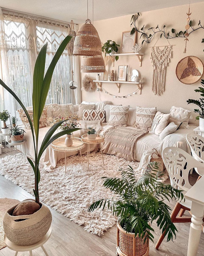
Ornate spaces, impossible to live in, impossible to maintain and clean, extremely saturated with textures, materials and colours, where the bohemian essence of the style has been lost in the midst of so much visual noise.
Be careful, I don’t want to say that if you like to have your house like this, don’t have it, but as a professional I have to recommend that you don’t abuse a trend, since both in trends and in practically other areas of life, in what subtle, in the measured, is beauty and elegance.
You can also see these 10 decorative rules to have a perfect living room.
Do not risk
I wanted to leave this point for one of the last ones because with the resources that we have seen, we will be able to carry out this point better.
Most of my clients when I talk to them and they start telling me the ideas they have in mind to decorate their house, they tell me great ideas.
But they do not dare to carry them out in case they look bad. And it’s normal, but up to a certain point, because if they had taken a risk and applied that idea, 90% of them would have been right.
And be careful, when I say that you take risks, it is in relatively rectifiable things, such as creating that decorative corner, adding some cushions and a rug or painting the walls a certain color, along with some paintings.
Not in things like, for example, that you see a sofa that you liked and say I’ll take it home. No, be careful, let’s think about things a bit.
But in the rest, in little details, take risks, carry out that idea, because from experience I can tell you that it will look good on you for the simple reason that this idea is born of your tastes, born of your lifestyle and born of how you know your house and no one knows all this better than you.
What happens when we do not risk or follow our instinct? What do we copy? Consciously or not, we end up copying.
Because when we have doubts, we start looking for our idea on the internet, to see if it looks good, and in the end we end up “copying” the idea that we have seen.
And this leads to what is happening right now: That you get on Instagram, for example, and all the houses are the same, one copy after another.
So, if you want a house with personality, made for you, follow your inspiration and take a risk.
But take risks for sure: Measure beforehand, make samples, ask for samples, etc. And so you will never be wrong.
Poor lighting
This is the most important point of all, also the most boring and the least decorative, but if you have poor lighting, no matter how you have the house, it will never look good and it is very likely that you will not feel comfortable either.
Lighting is what determines whether a space is going to look good or it is going to look bad.
Luckily, in addition to being the most important decorative point or error, it is also usually the easiest to correct.
If so, simply change the bulb to a more powerful one.
Beware, I’m saying a more powerful bulb, not a cooler bulb.
The light in the interiors, except in the bathroom and in the kitchen, must be warm, with a temperature of about 2700/3000 degrees kelvin, but the power, the lumens, must be adequate so that when we turn on the lights at night we can see our home in fullness, without shadows or half off.
Add a table lamp, a floor lamp and you can play with the lighting to your liking while maintaining adequate lighting.
On the contrary, if every time you turn on the lights in your house at night you have to wear sunglasses, buy a bulb with fewer lumens or install dimmers and you will achieve a more harmonious and balanced lighting.
If you have been wanting more, you can see these decorative errors in the bedroom.
And if you think a friend or family member might like this article, share it. Thank you!