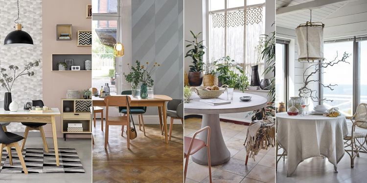
As with everything in fashion, wall color trends come and go, sometimes lasting only a few months. But as much as they change continuously, we can follow our own style, without neglecting the trends of the moment, and adapt them to our personal style and taste. The really important thing is that you like it and it looks good with your decoration.
Today several major paint brands have announced their colors for the year 2022. Let’s see what shades several of them choose, including Benjamin Moore, Sherwin-Williams or Behr.
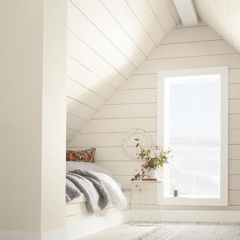
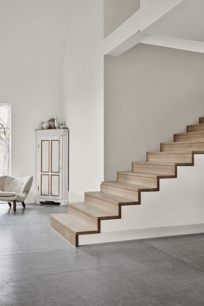
White
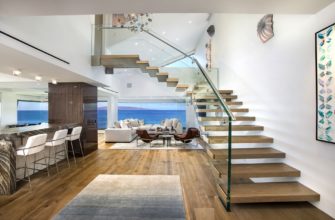
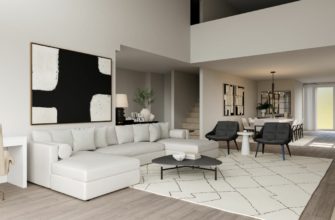
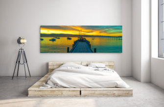
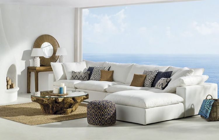
It is one of the simplest options, since the white color on the walls can act as a backdrop to incorporate small notes of color in the decoration.

It never goes out of style, so our house will always look current. It will only be enough to change the decoration accessories to keep it modern.

You can use warm, vanilla, or cooler whites mixed with a small dose of grey.

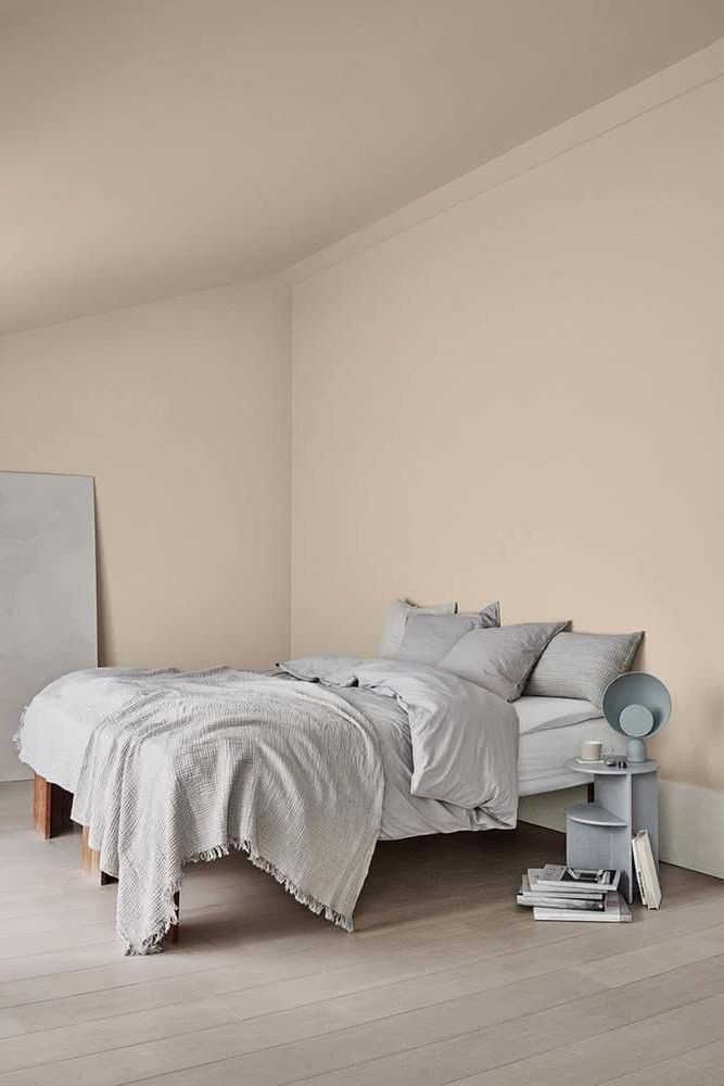
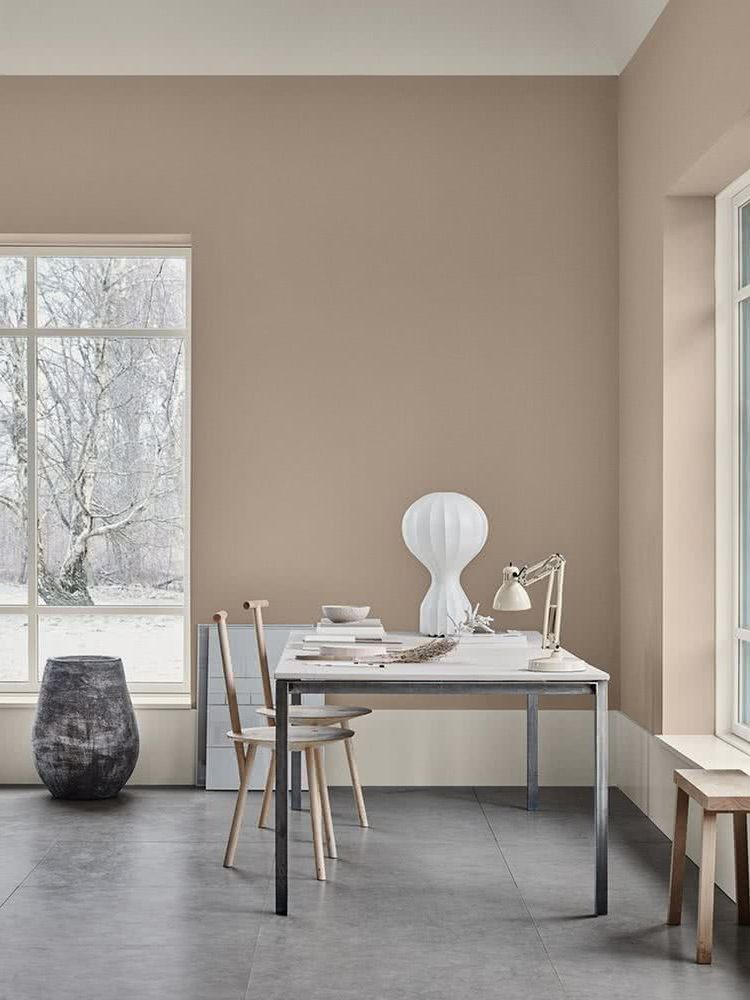
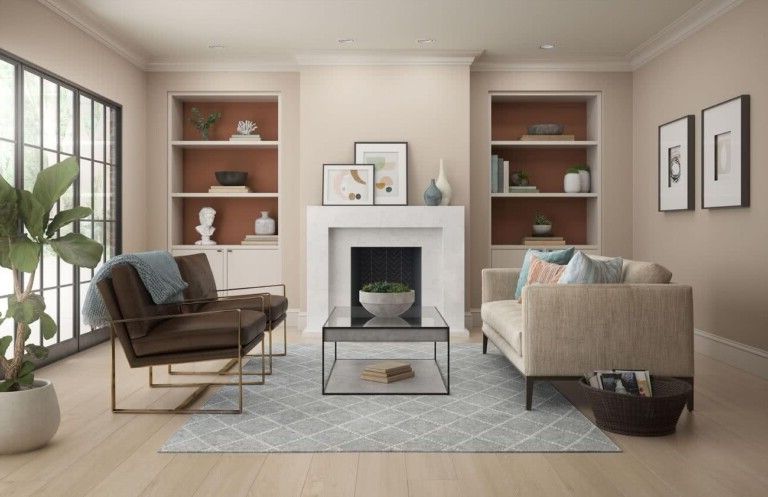
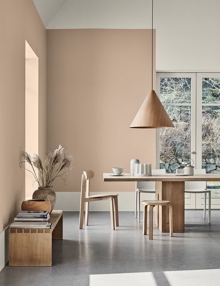
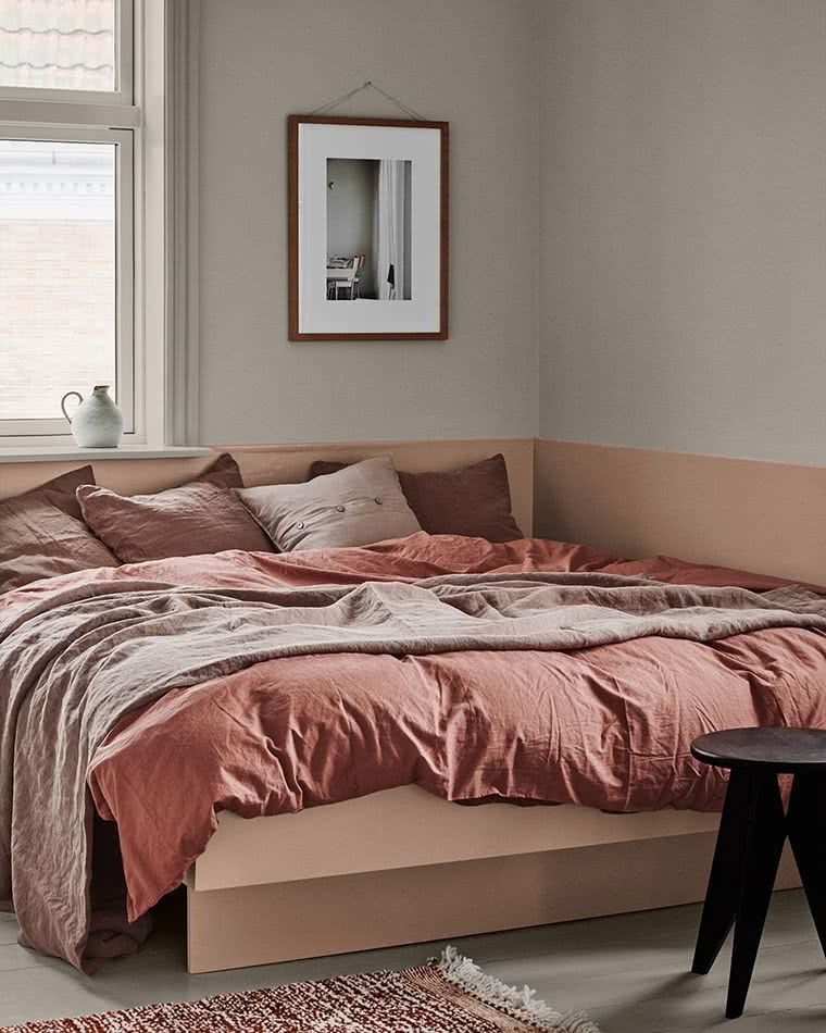
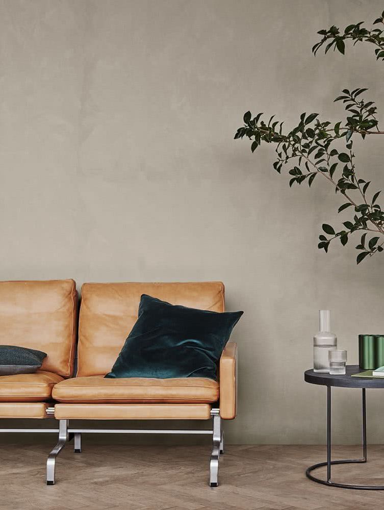
Beige
You can compose a nice palette with soft shades of sand, gray and white.

This color, on the walls, is also timeless, so your home will never look out of style.


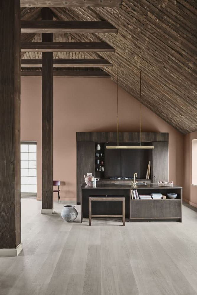
It incorporates rustic woods and oxidized metals, to give a rustic industrial touch, one of the chic trends of the moment.

This beige has a reddish undertone, which is very reminiscent of clay.

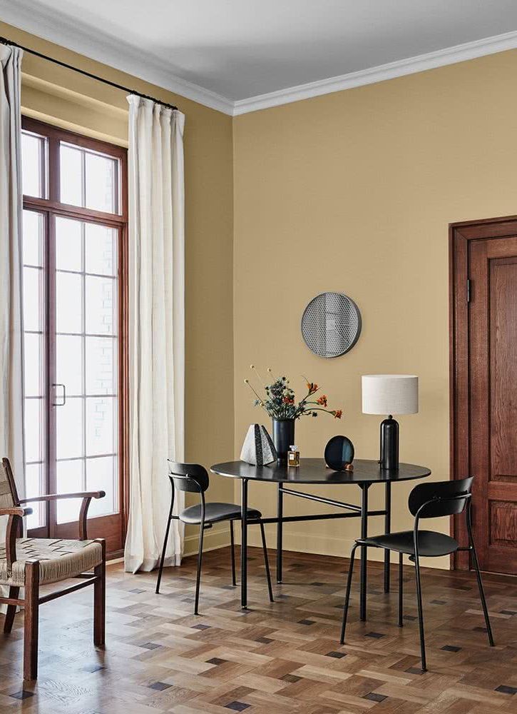
This other beige has a yellowish touch, which also looks very elegant.

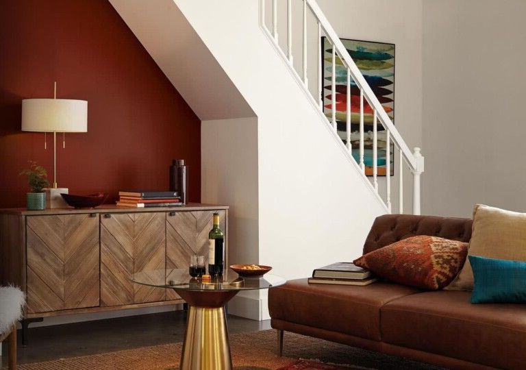
Brown
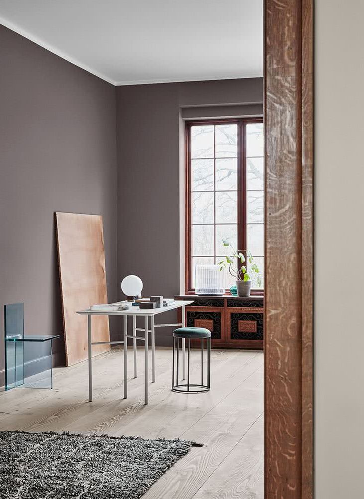
The brown tones of the earth are incorporated into the home to achieve a decoration inspired by nature.

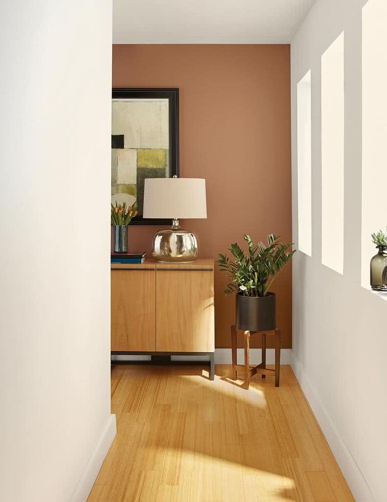
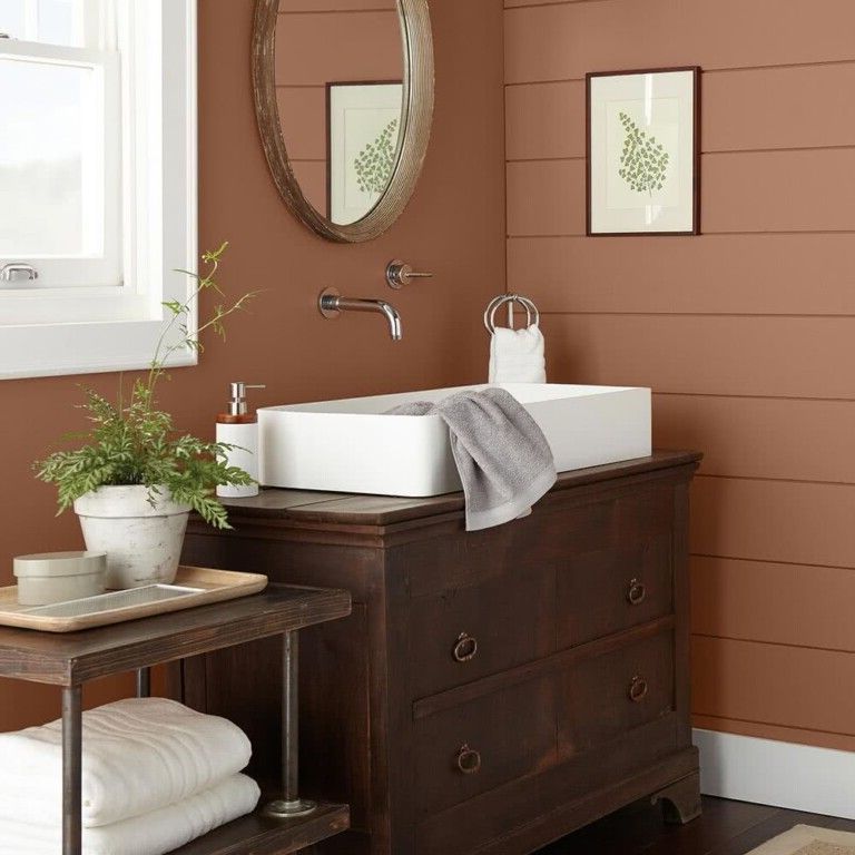
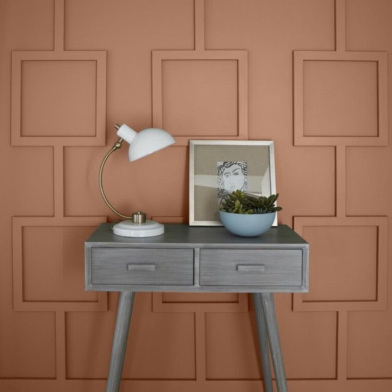
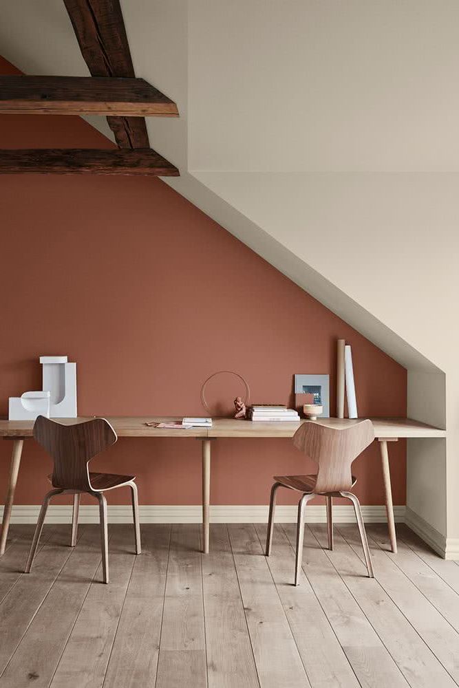
The reddish undertones are reminiscent of adobe or mud, which combined with raw colors such as gray, achieve a very beautiful composition that connects us with Mother Earth.

By marking contrasts with light and dark tones, an emphasis on silhouettes can be achieved. This year, browns are combined with whites and greys, which undoubtedly make up a place with light and personality.


Whites stand out in an environment where brown predominates, and can become the focal point, as we see below, where the washbasin acquires an indisputable leading role.

The focal point can also be grey, like this side table.

Another way to achieve an interesting focal point is to paint just one wall this beautiful color.

If gold is combined with a dark brown, the result is majestic and opulent.

Grises
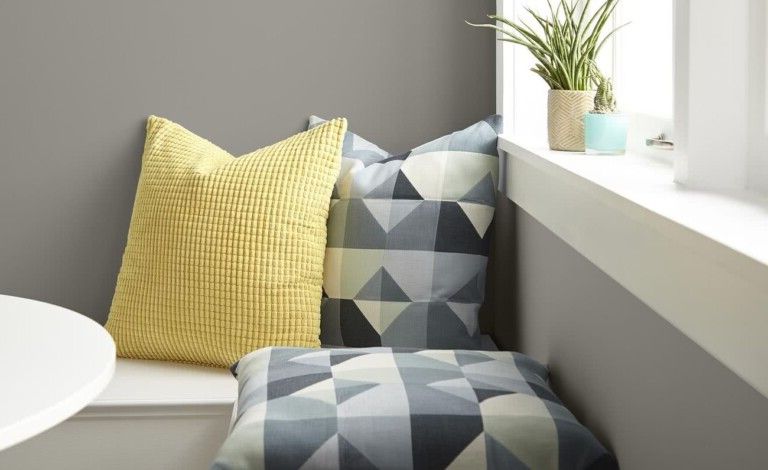
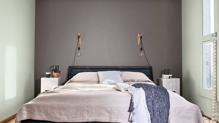
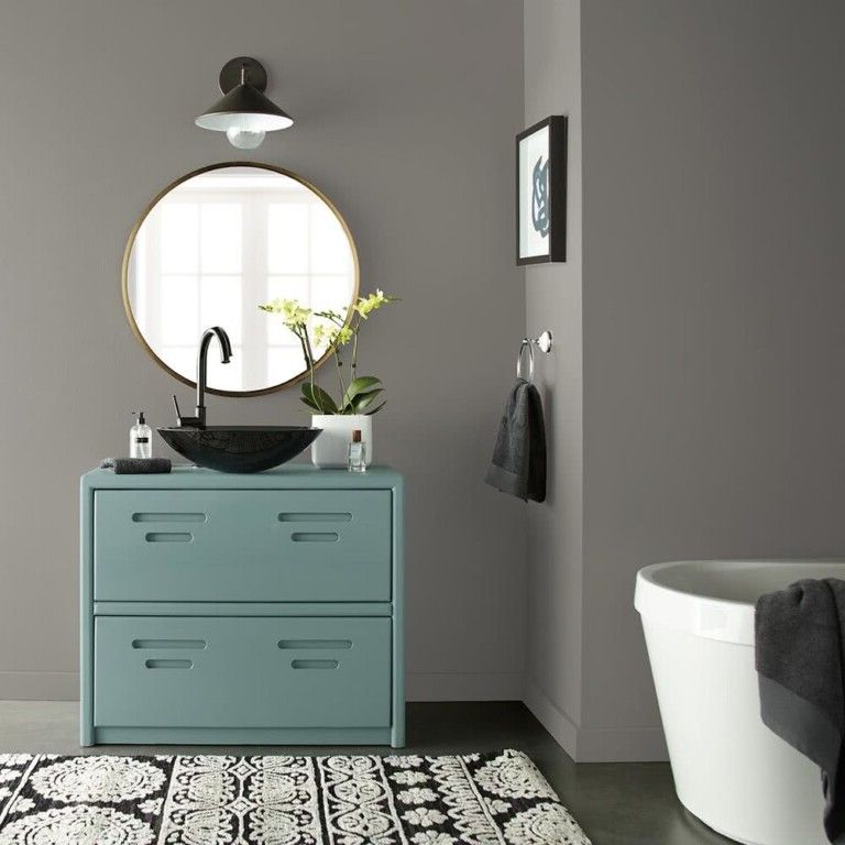
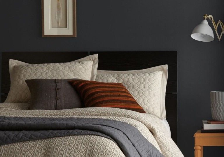
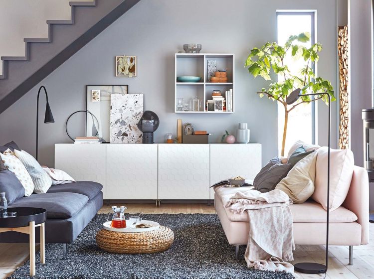
To give a warm and welcoming look, you can implement gray neutrals on the walls, and combine them with furniture and accessories in warm or bold colors.

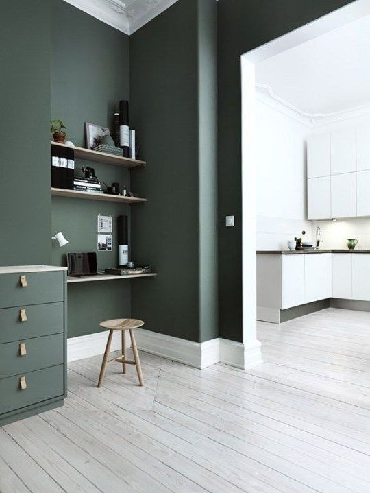
Dark green, brown or yellow go well with all shades of grey.

As you can see in these images, there are many shades of gray that can be used. Both cool and warm tones will help you achieve excellent results.


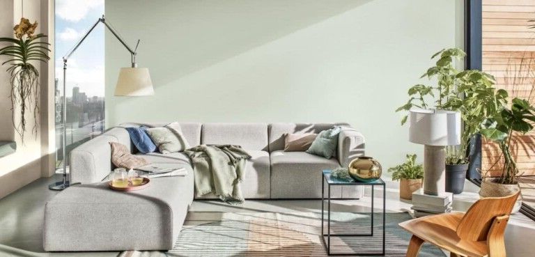
Mint green is one of the colors that is being used a lot today, and it looks great with gray.

The titanium color, a variant of the many grays that are in fashion today, has become famous for its ideal qualities for minimalist spaces.


Mint green
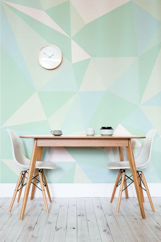
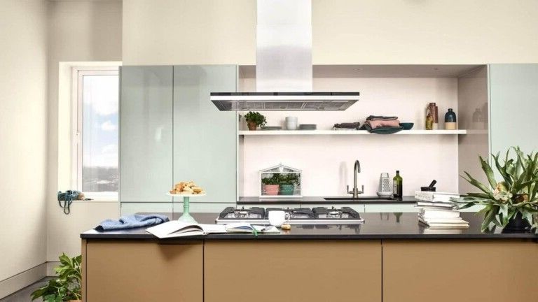
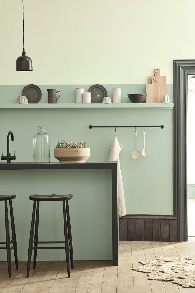
Mint green is very well suited to interior design, particularly in bathrooms or kitchens, due to its clean look.

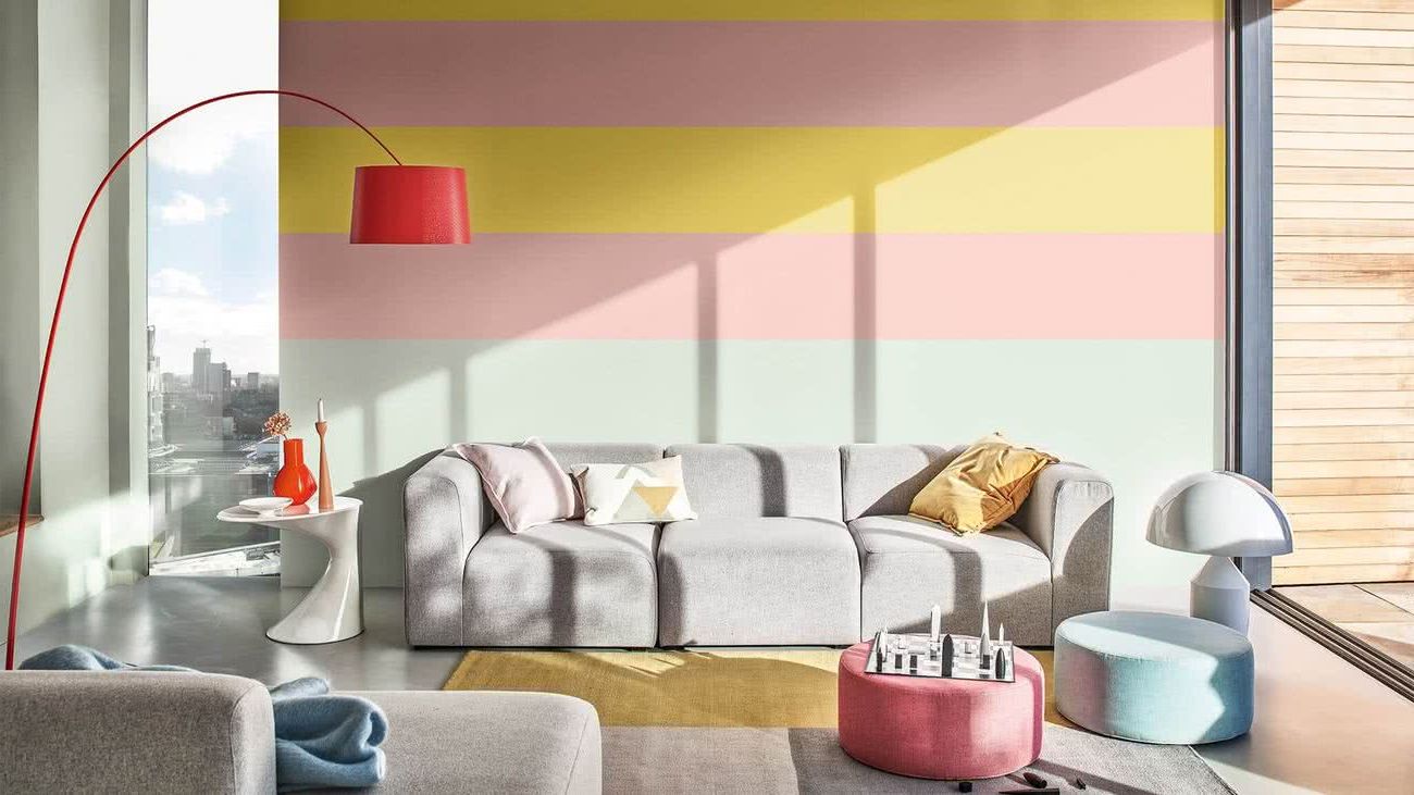
Mint greens, when used as an accent or contrast to neutrals like taupe, can give a really fresh look. If combined with white or blue they can provide a very maritime atmosphere. It also looks great against analogous shades of green. Combined with pastel pink, old pink or lilac, it also looks very powerful.

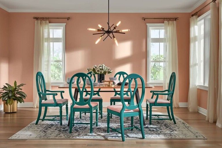
There are also opposites on the color wheel (red-orange) to consider; shades like salmon, coral and tangerine can bring green to life. Mint green is the perfect complementary color to coral.

Sage green
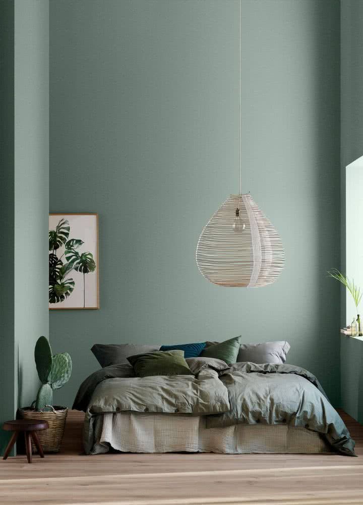
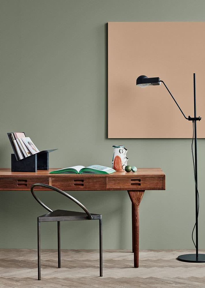
This tone is ideal for decorating a bedroom, as it is relaxing, calm and even somewhat muted. This as long as you don’t study or work in your bedroom, since it won’t give you the energy you need.

They are a good shade of green to achieve a chic style.

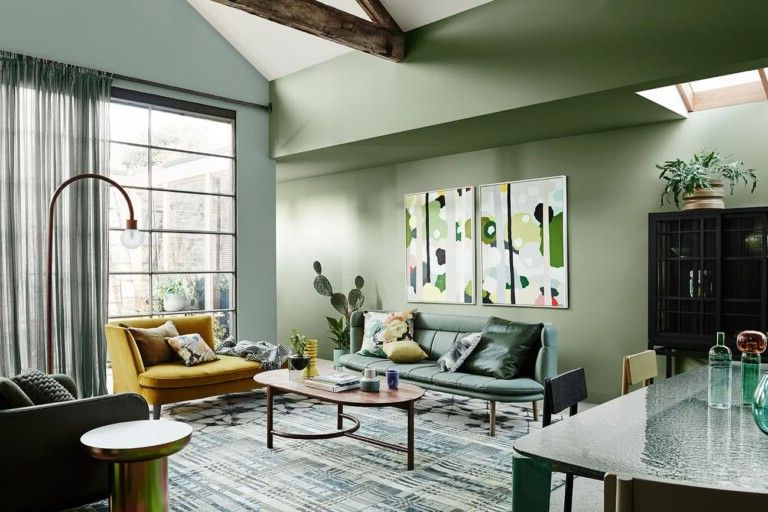
Pastel green has already made a place for itself in the world of decoration, it is no longer relegated to decorative elements, such as curtains or minor decorations, but to entire walls.

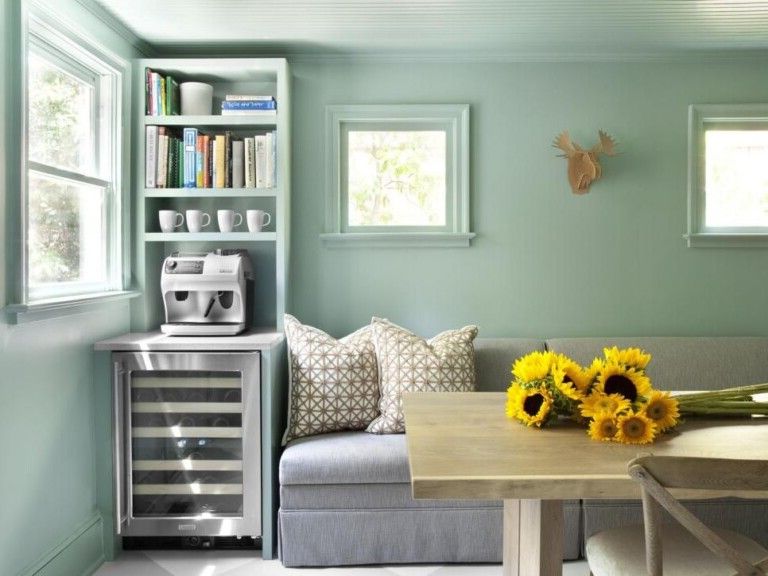
Here we see it incorporated into the kitchen. Combined with brown and grey, it looks fabulous.

Pistachio green
This is a muted shade of green, mixed with gray, which can help us achieve a very calm environment.


Olive green
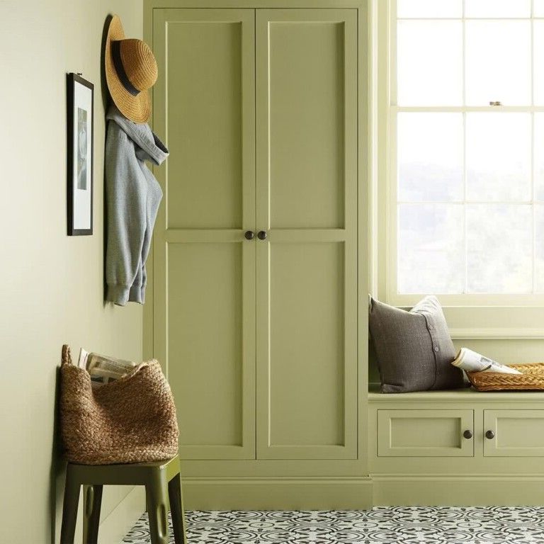
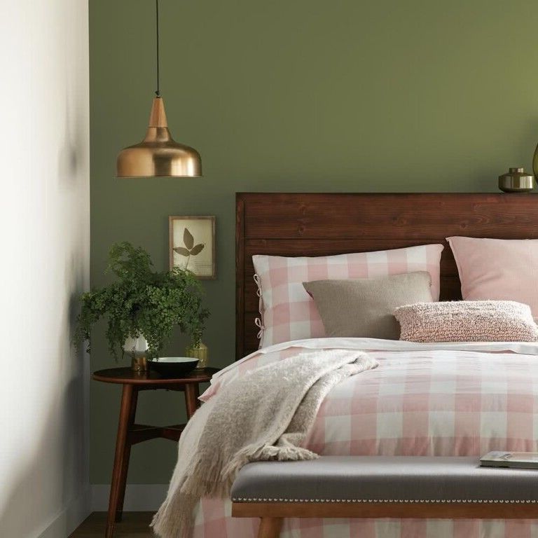
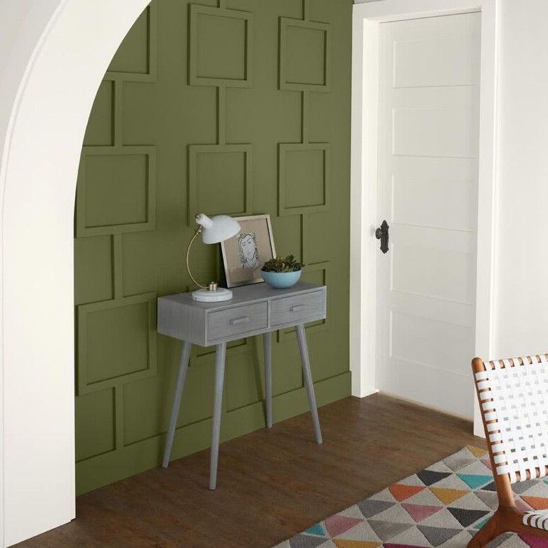
This is another one of the shades of green that enters the scene once again.


In its most saturated tones, it can be used on a single wall, as a focal point, so as not to saturate and darken the room too much.

Hunter green
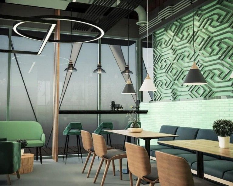
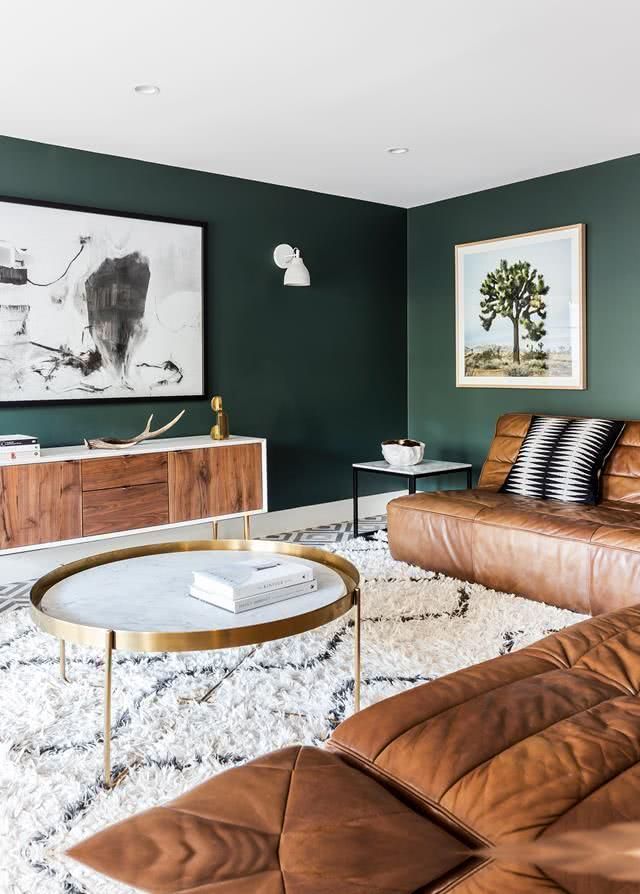
Hunter green, which evokes the vitality of nature, can give us fresh and very modern interiors.

For greater interest, it is proposed to combine this color with white, gold or any other bright color.

In recent years there has been a strong influence of nature in terms of colors for decoration, since many shades of green can be seen as protagonists.

Colors have always been ideal for creating accents in decoration, although there has been a more daring turn in terms of the elements that are colored within the home. While before generally the elements that were colored were the walls, the cushions, the flowers or the decorations, today color is imposed on entire walls.

Bluish green
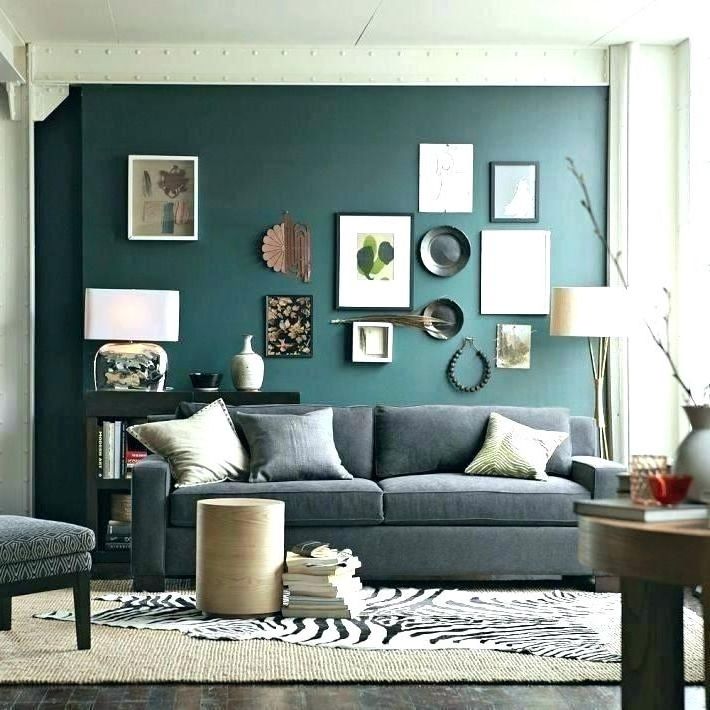
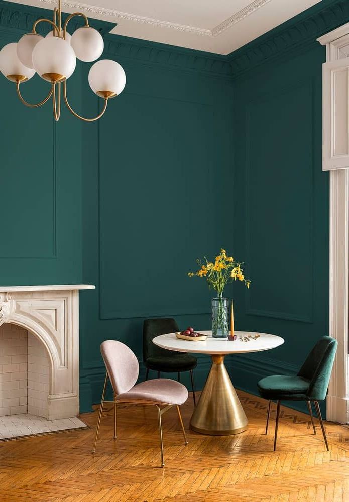
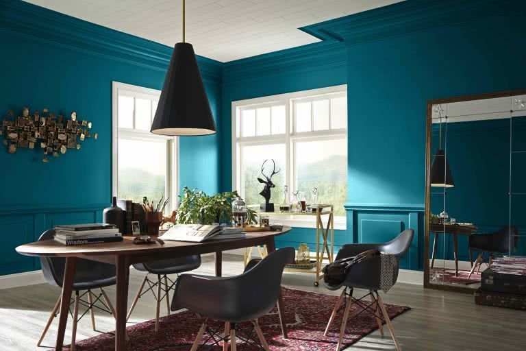
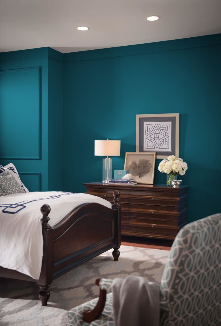
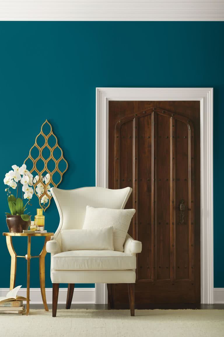
A composition with bluish green achieving the color of a jewel, is one of the proposals for this year. A deep, complex color that offers a sense of familiarity with a touch of the unknown, it unites a harmonious balance of blues and greens that can be found in old and new.

The color teal evokes a multitude of moods and associations that depend on tone, hue, and application. Despite these possible variations, it is universally perceived as intelligent, honest and interesting, being a favorite color.

The oceanic inspiration of this color can create a welcoming statement as a vivid color for a front door. Its green hue with blue undertones can also stimulate creative thinking and mental clarity in a home office, or invite meditation and introspection in a bedroom or reading corner.

It is a universal shade of green, adapting to various styles, from modern to Mediterranean, traditional or contemporary.
Navy blue
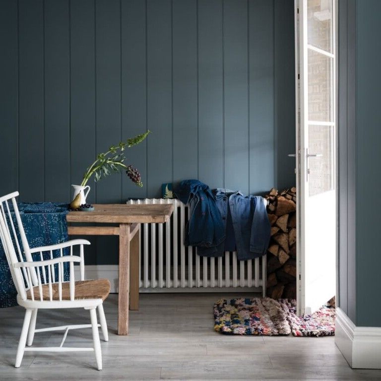
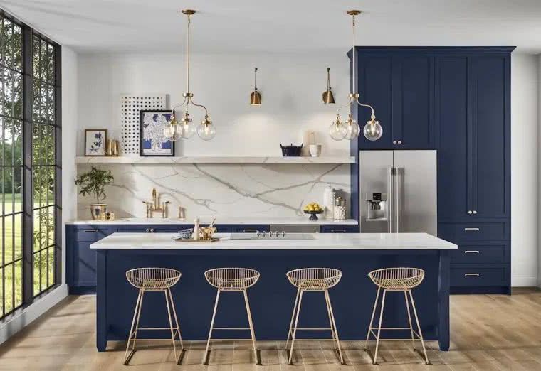
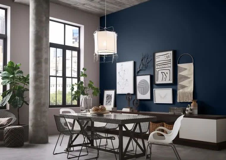
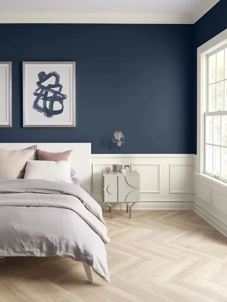
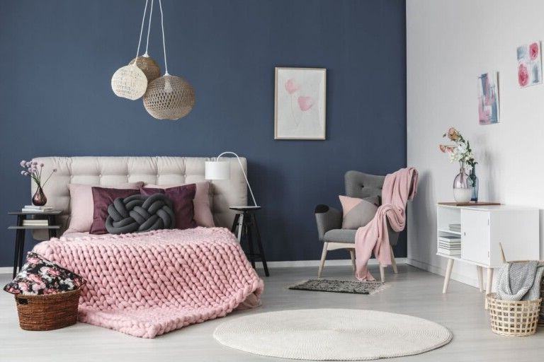
This shade of blue is one of the most repeated in the different color forecast lists. And thanks to its versatility, it can be successfully taken to the various spaces of our home.

It can also be effectively combined with light tones such as pastels, different colors of this same color, brown, white and black.

These deep, serene shades of blue are an attractive color choice for almost any setting, giving a sense of beautiful serenity.


Sky blue
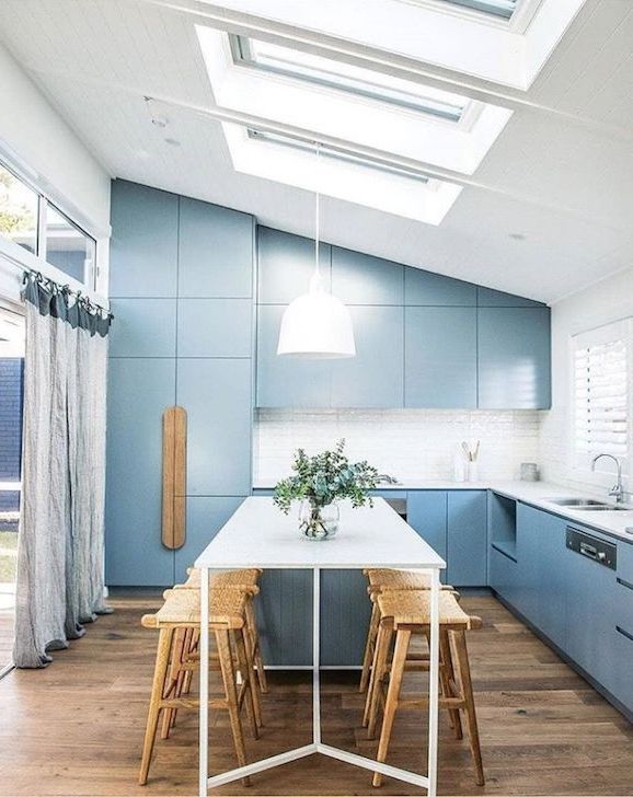
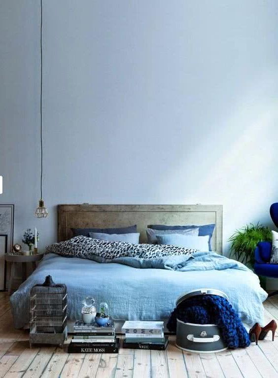
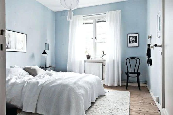
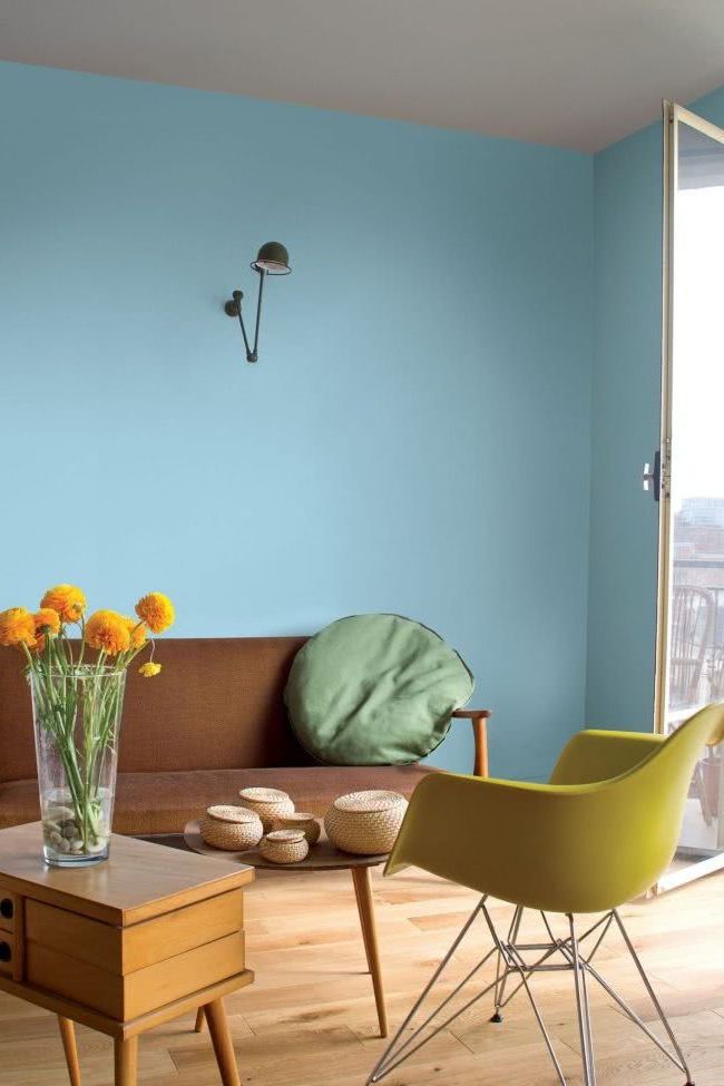
Pastel blues, beautiful light blues, are also becoming more and more numerous, the most prominent being watery and greyish tones.

The light blue color is very soothing and adds a delicate feel to modern interior decoration. Light blue color combinations are relaxing and pleasant, ideal for decorating bedrooms, bathrooms or living rooms.

Pale blue color tones are calm, but can look very vibrant when paired with dark colors.

The sky blue is a beautiful color, that when you put it to the test, then you want to have absolutely everything in that hue.

Rosado
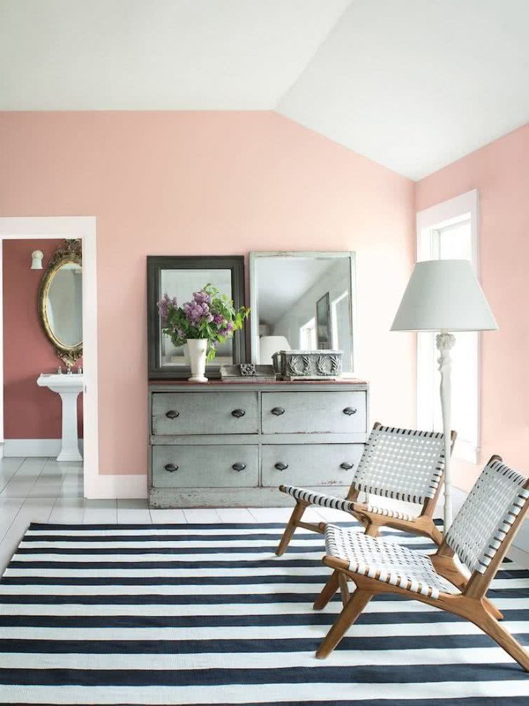
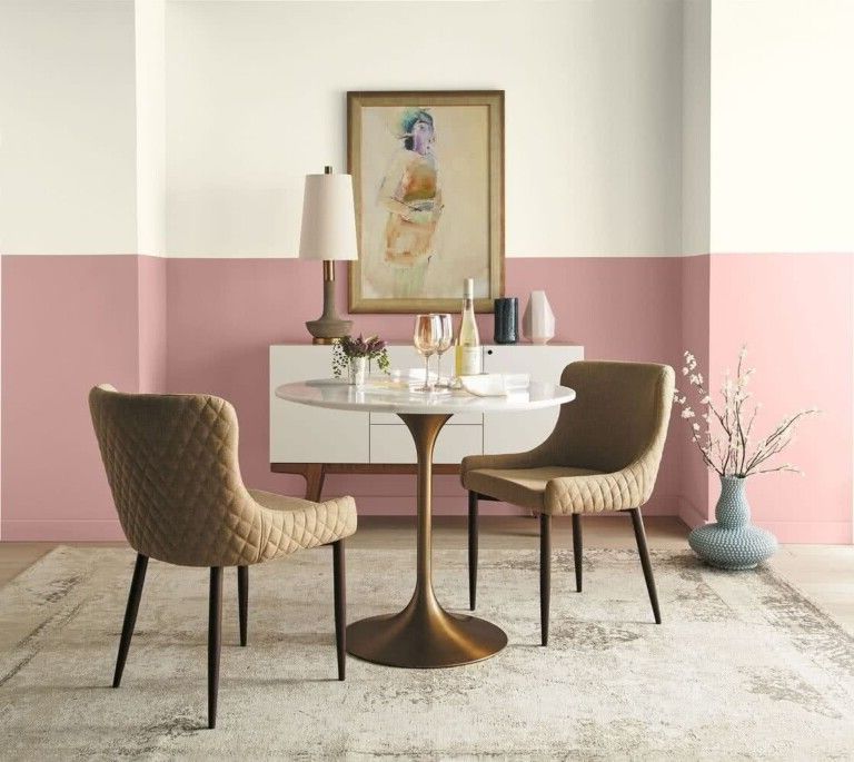
Coral pinks are being used a lot.

These tones can be contrasted with mint green.

And the old pink.

Yellows
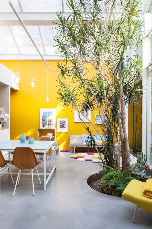
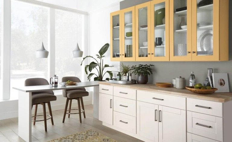
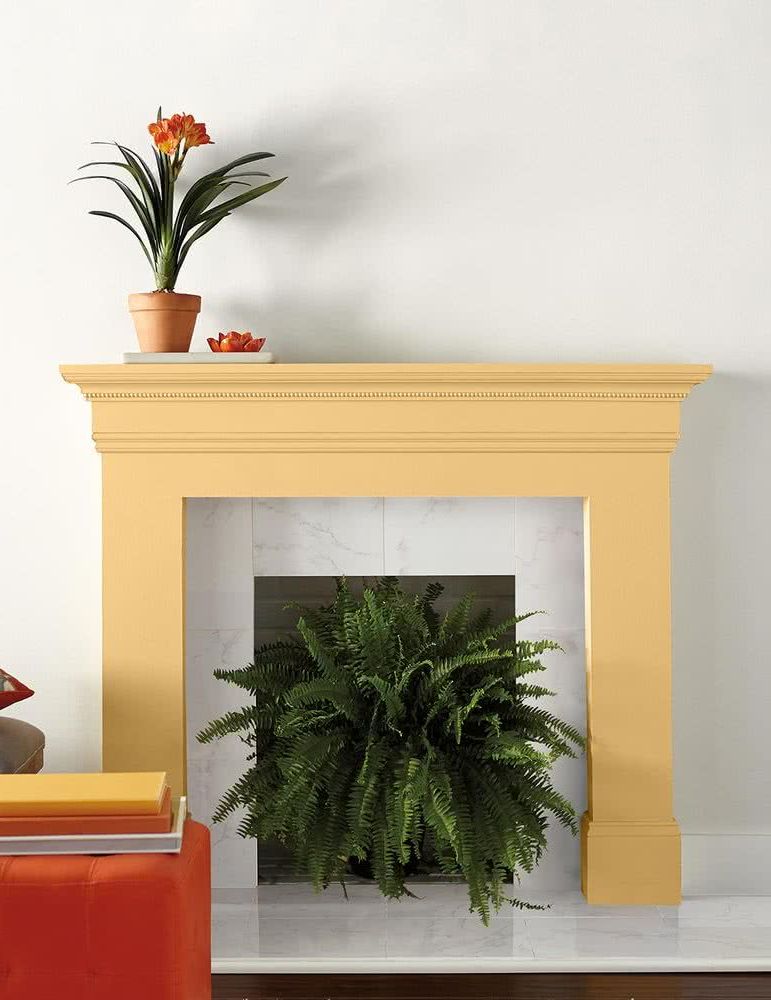
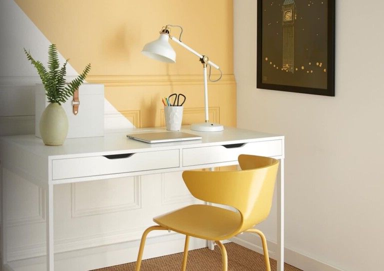
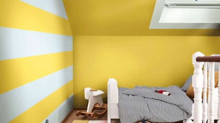
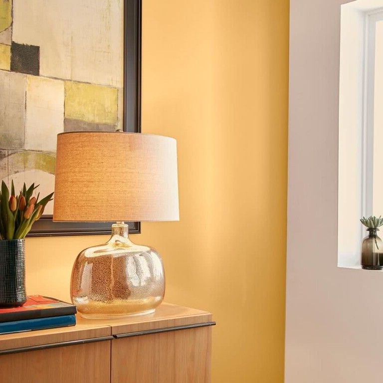
A super cheerful, warm yellow, gold color with orange undertones will be used.

This is another of the colors that stars in trends, being ideal for recreating warm and energetic interiors. It looks good paired with versatile colors like black and white, as well as paired with shades of grey, brown, or green.


The trend-setting tones are very bright, which with natural elements such as plants, give the place a lot of personality. We can give free rein to the imagination and create in our home, a space that invites us to stay, where color is one of the reasons for attraction.


Orange
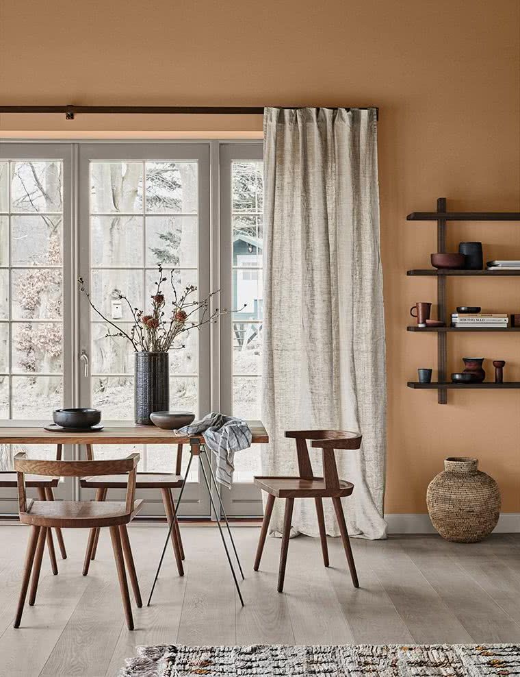
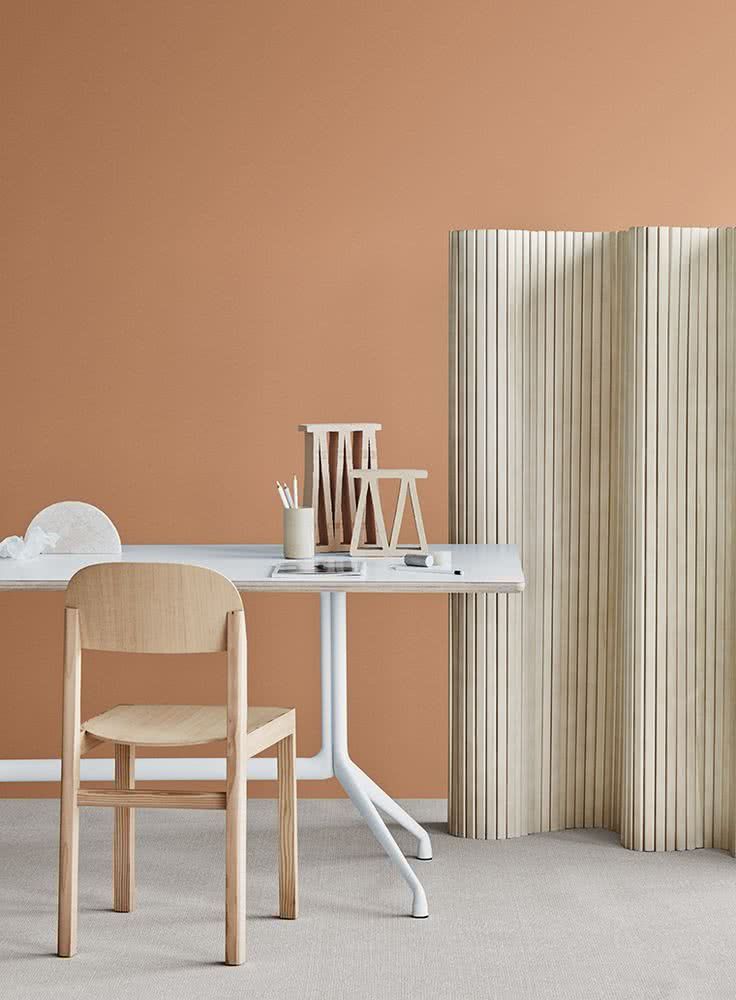
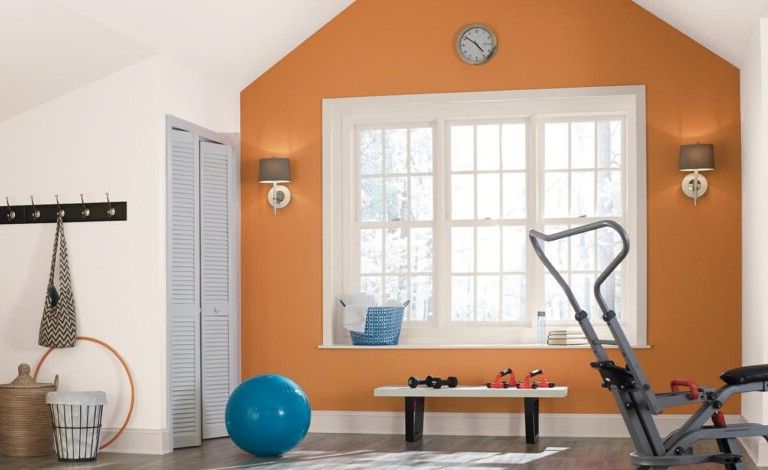
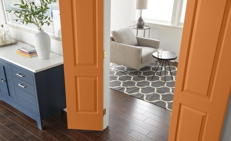
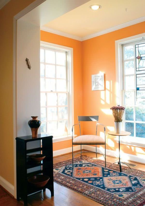
If you are looking for very warm proposals in decoration, you can bet on shades of pumpkin and rusty orange.

These rusty shades of orange carry a lot of weight in modern decor. They are orange with small mixtures of earth tones.


If you are currently designing your own home, or you are looking for colors for walls or for the set of armchairs in the living room, and looking to give warmth, then you should take these warm colors into account.

If you’re tired of the dominance of neutrals, especially gray over the last five years, then you’ll be pleased to see that more varied and interesting shades and hues have been introduced, including plenty of vibrant colors to bring your walls to life.
Lilac
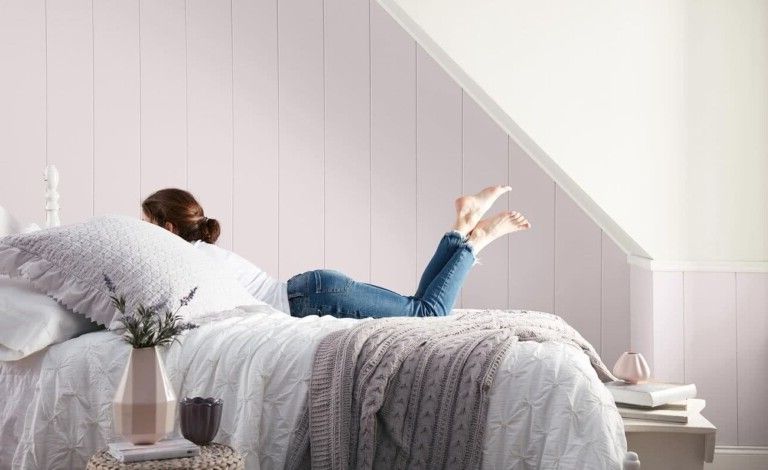
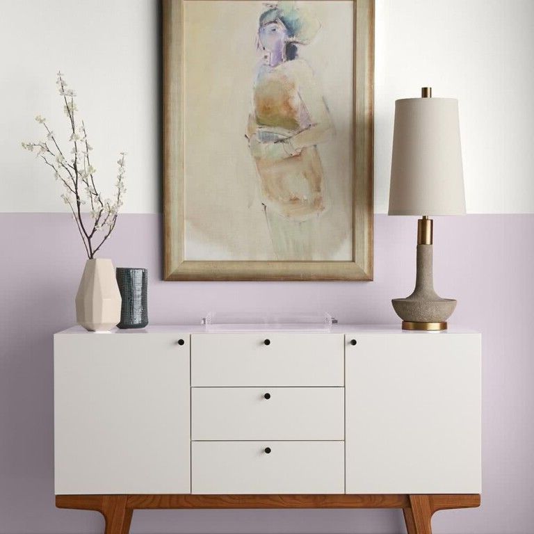
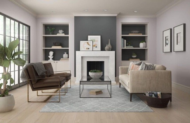
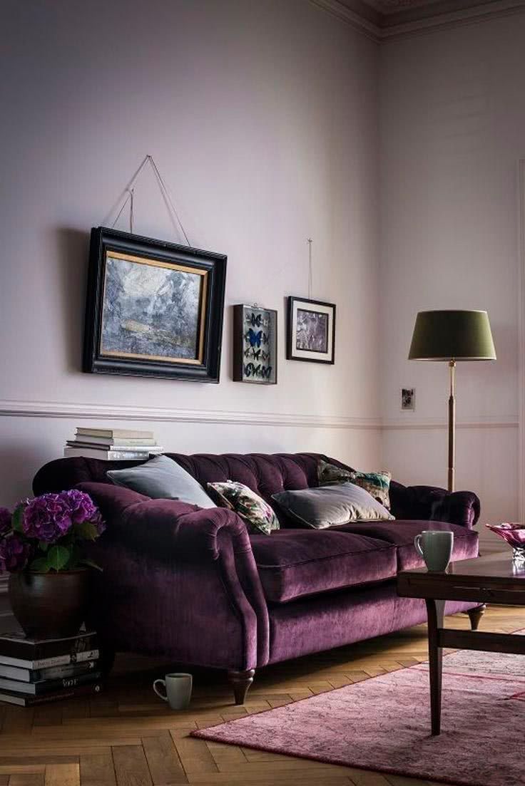
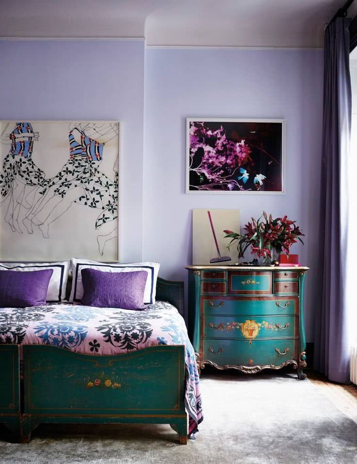
The next color, a mauve lilac, is also on trend. It transmits serenity, promoting meditation and de-stressing.


This combination is romantic, ideal for girls’ bedrooms, guest bedrooms and living room.

This shade of lilac, a little darker, but at the same time it is so little intense, that at times, it makes us confuse if we are not facing a gray. It is harmonious and goes perfectly with all kinds of styles, from classic to modern.

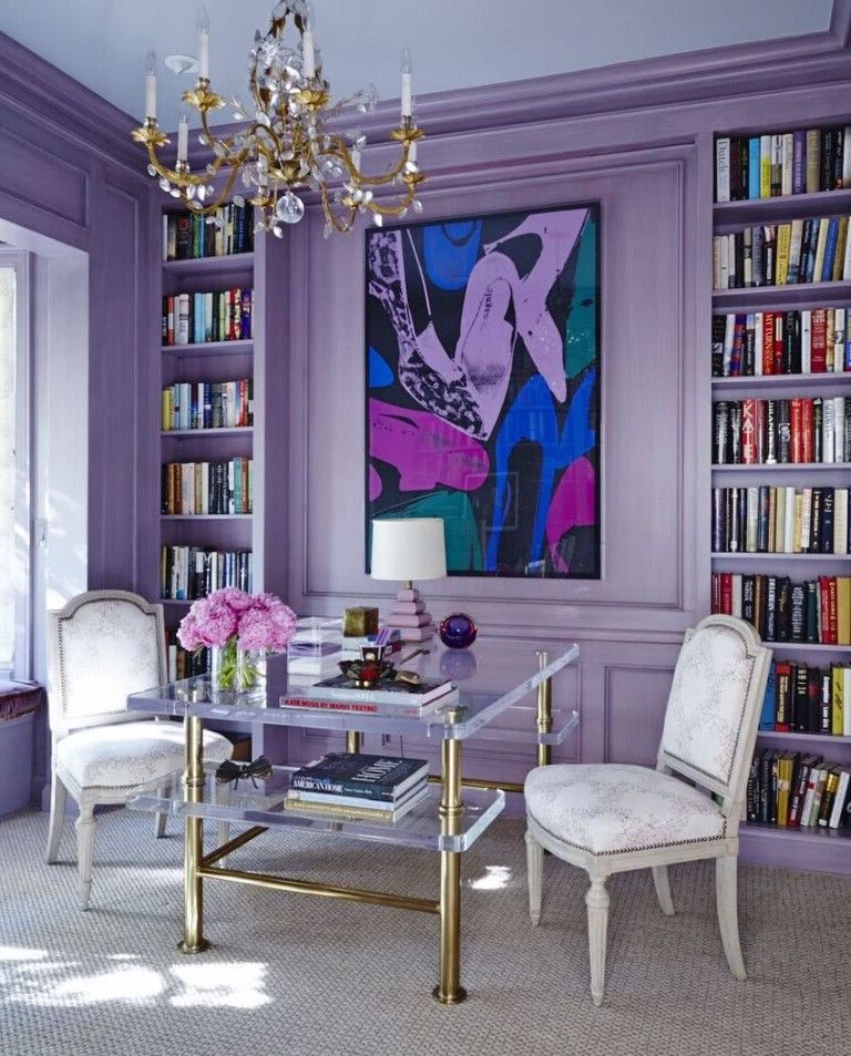
The most intense lilacs can also help us achieve a glamorous space.

Purple and violet
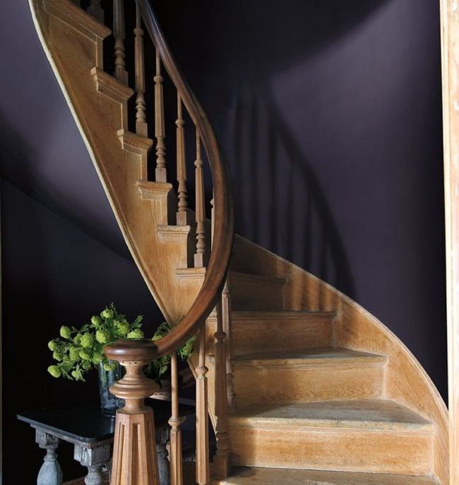
These shades of purple, very dark, tinged with blue, will be one of the colors that can be adopted for the walls. It can be used to give sophistication and elegance to spaces.

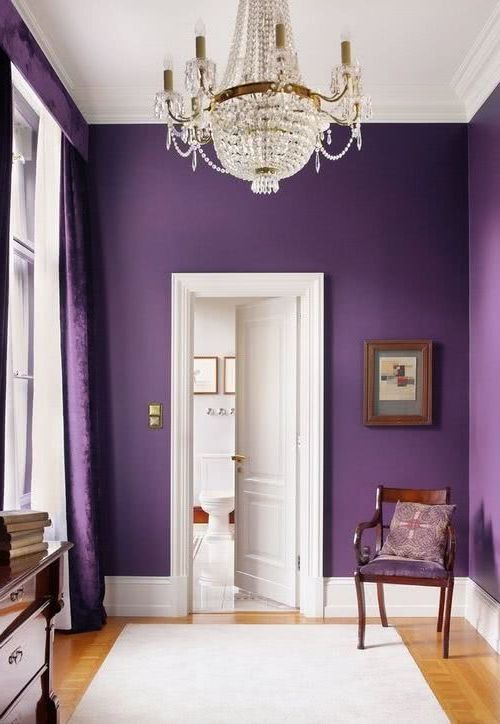
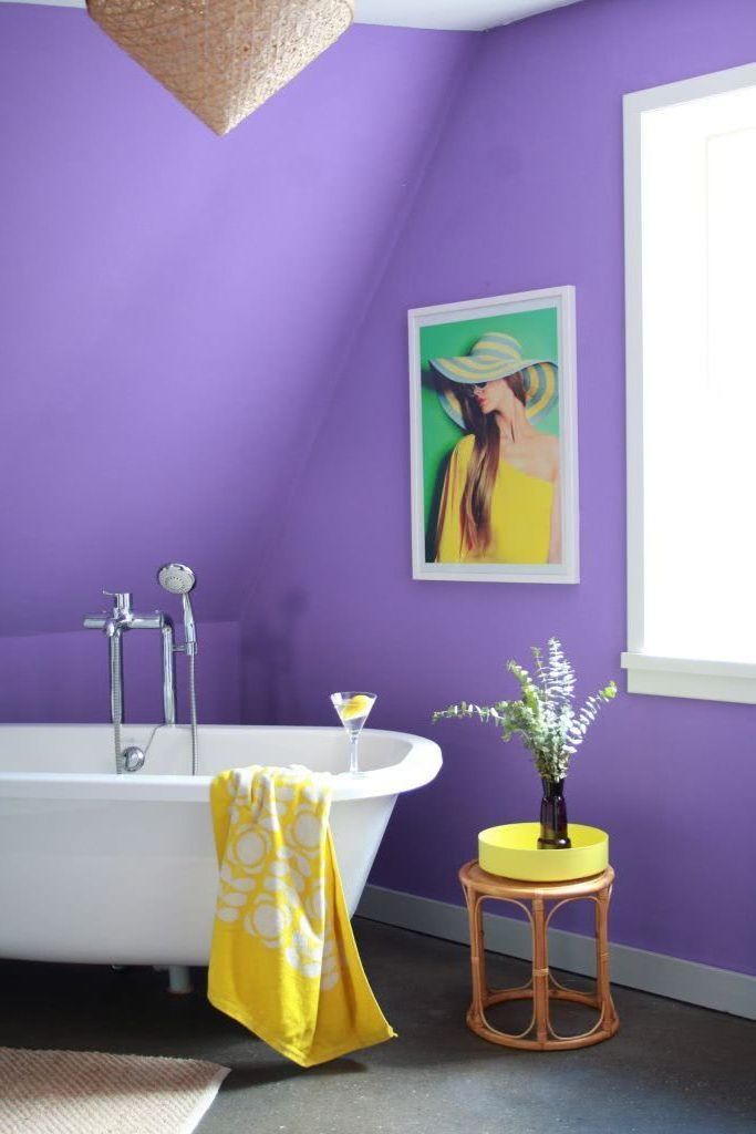
Shades of violet are on many of the forecast lists, one of the most relevant color trends. They are ideal for those who seek to recreate relaxing and very warm spaces. Therefore, it is especially recommended to give life to bedrooms, although it can also look very good in living rooms, bathrooms and kitchens.

Ultra violet is a very strong tone, and precisely whoever chooses it must have a dominant personality. Although we are not used to it, it ends up looking great in environments with nude, blue, brown colors and to a lesser extent, with greens and mustards.
 Do not miss:
Colors for kitchens 2022 70 photos and modern trends
Colors for the dining room 2022 40 photos and modern trends
Colors for rooms 2022 modern 65 photos and beautiful ideas
