Colors have an effect on how we feel and react. Each color then has an associated mood and influence on the color schemes used to decorate the home. This is the meaning or psychology of colors in decoration. You may not agree, but try this…what comes to mind when you think of the color red? Fire, heat, passion, hunger, temper, rapid pulse.
Does color affect us? Color makes us feel things, so the answer is yes. The choice of colors should not be taken lightly, they have meanings and influence how we feel within a space. You are already under the influence of color and the feelings they invoke. So why not learn how to use these attributes to your advantage?
Red
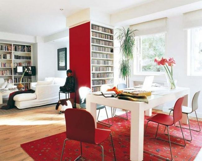
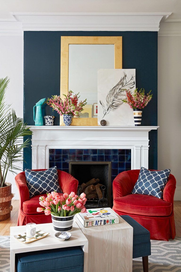
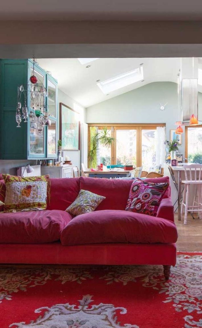
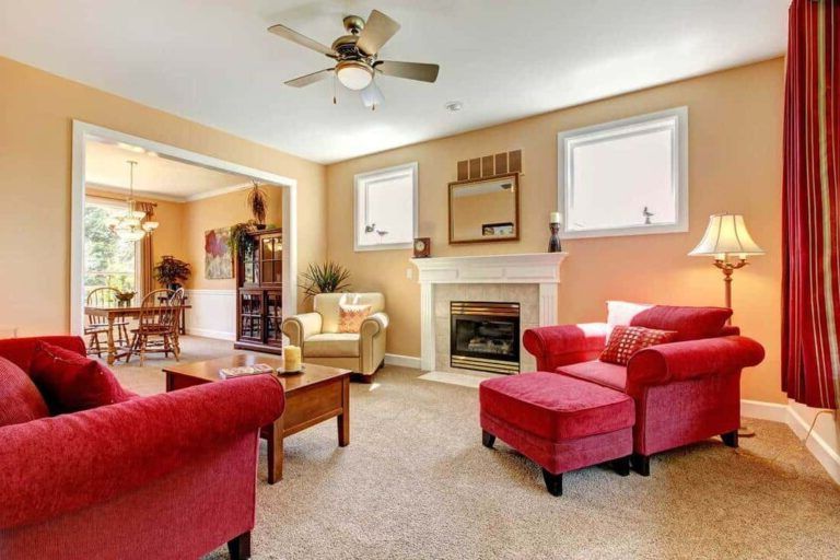
It symbolizes passion, enriches, stimulates, warms, dramatizes, promotes movement and activity. Red is frequently used in hallways, game rooms, and dining rooms. This color makes rooms look smaller.
If it is going to be placed in a business, the best businesses to place this color are those where speed is needed, for example fast food. People come in, eat and leave.
Some colors should be avoided if you have high blood pressure, especially outside the bedroom and living room. For example the color red. If you want a dark color you should try cool colors and not warm ones.
- Love and war – Red is a warm color. It is a strong color that evokes a series of apparently contradictory emotions, such as passionate love, violence and war. Red can be both Cupid and the Devil.
- Nature of red – It is a stimulating color, the hottest of all warm colors. Studies show that the color red can have a physical effect: it increases the rate of breathing and blood pressure. It is related to anger, due to the reddening of the cheeks caused by the increase in blood pressure and the increase in physical exertion.
- Red in culture – The color red is power, therefore it is associated with business people and celebrities walking the red carpet. Red lights indicate danger or emergency. Stop signs at traffic lights are red to draw the attention of drivers and warn of possible dangers at an intersection. In some cultures, red denotes purity, joy, and celebration. It is the color of happiness and prosperity in China, and is often used to attract good luck. Red is often used by brides in the East, while in Africa it is the color of mourning. In Russia, the Bolsheviks used a red flag when the Czar was overthrown, which is why the color red became associated with communism. Many national flags use the color red.
- Use of the color red – The color red is used to attract attention and make people take decisions. It is used to suggest speed combined with confidence and even risk. Small doses of this color are usually more effective than a large amount. Various shades of red combined with pink or orange can achieve a cheery effect.
- Red with other colors – Red combined with green is the color of Christmas. Combined with cool blues it contrasts the warmth of the red color. Bright pinks and yellows harmonize very well with red. Care should be taken when combining it with purple. It can be a very elegant but overwhelming combination.
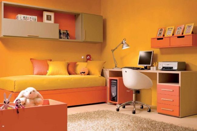
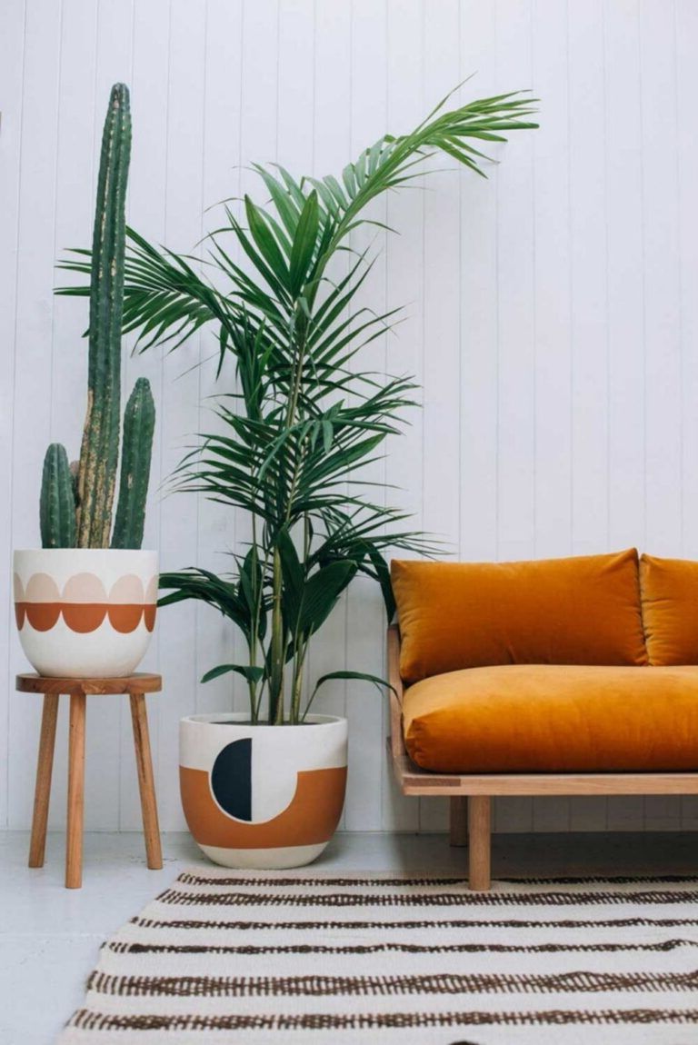
Orange
It stimulates the appetite, conversation, charity, warmth, is cheerful and lively. It’s a good choice for high-activity and social areas such as kitchens, playrooms and family rooms. During the winter, the use of colors such as reds, oranges, and yellows make a home cozy by making the inside seem warmer than the outside. It certainly makes people less cold.
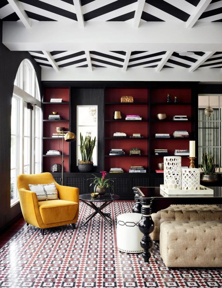
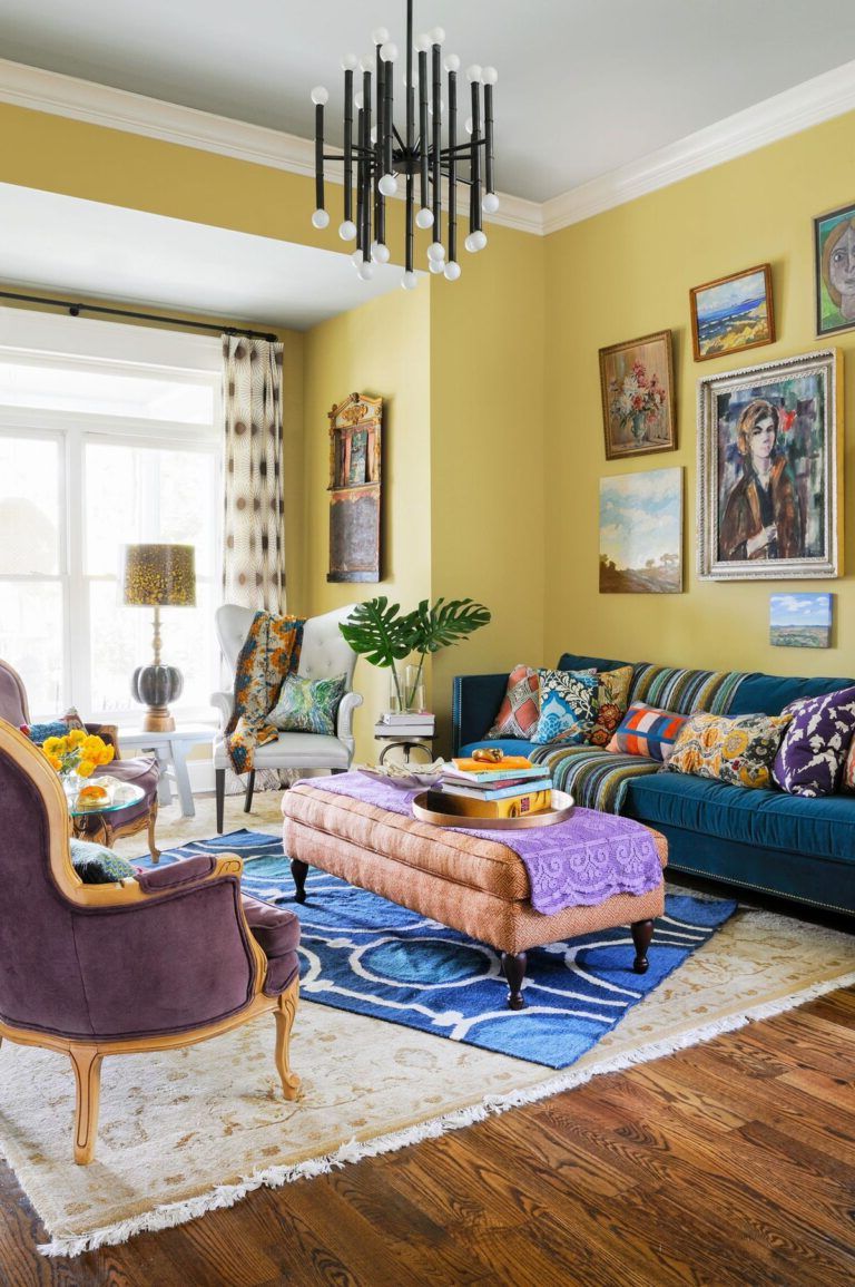
Yellow
It increases energy, it expands, it gives a lively and fresh touch to the room. It is frequently used in the kitchen, living room and dining rooms.
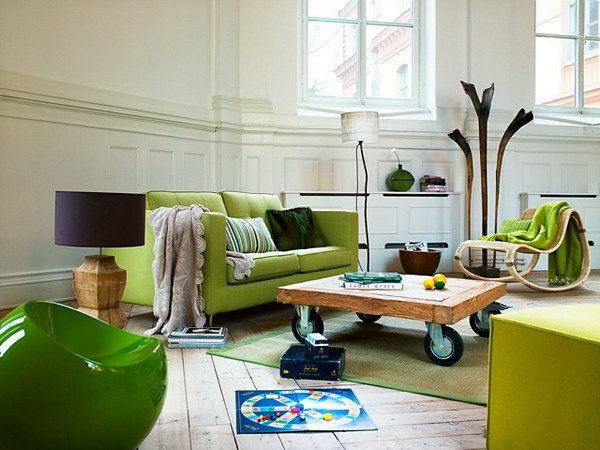
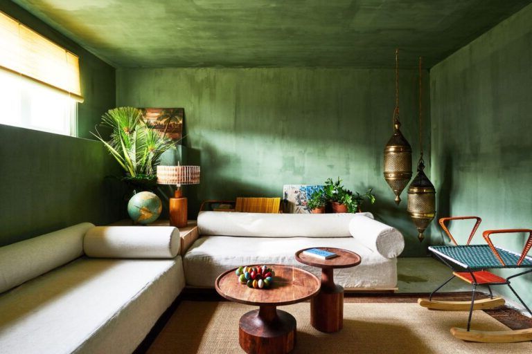
Green
It feeds personal growth, renewal, freshness, calm and tranquility. It is often used as a neutral color to combine with other colors, as it happens in nature itself. It is often used in kitchens, bedrooms or study rooms.
- Life and renewal – Green is life. Abundant in nature, green signifies growth, renewal, health, and the environment. On the other hand, the color green can be associated with jealousy, envy, and inexperience.
- Nature of green – Both the color green and the color blue are calming. These two colors also make time seem to run faster.
- Green culturally – Green is the national color of Ireland and is strongly associated with this country. It also has a close relationship with Islam. It is also associated with spring, a period in which we see a large number of shades of green. Along with red, it is the color of Christmas.
- Use of green – It can have both a warm and a cold effect. The green color indicates balance, harmony and stability. Using different shades of green creates a refreshing, spring-like effect. Olive green is a summer green that can have military connotations for some people.
- The color green with other colors – Green with blue echoes of nature, water and forests can signify new beginnings and growth. Green with brown or beige is very organic, calming and gives a sense of security. The triple combination of yellow, black and white is sporty, outdoor activities colors. The contrast with purple can be very invigorating. Green with lime, orange, or yellow is a nice, fruity, sweet palette.
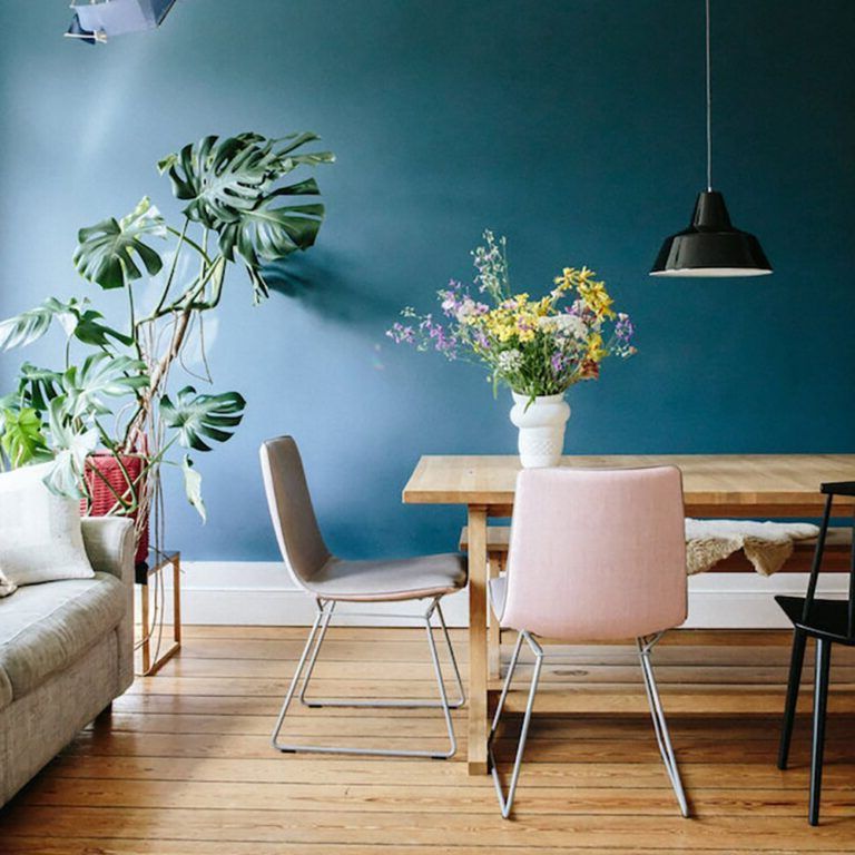
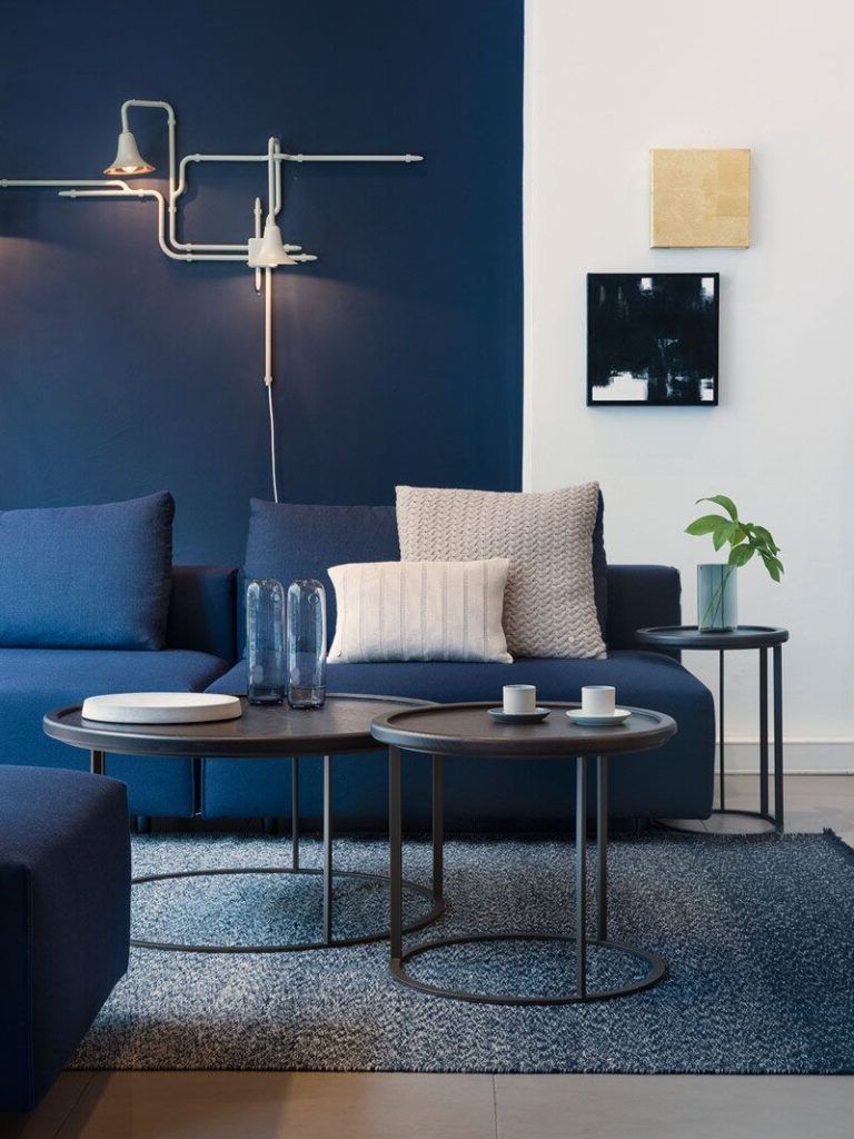
Blue
Produces a peaceful, relaxing state of mind, broadens and refreshes, calms. It is useful for hot or very active rooms and small rooms. It is frequently used in bedrooms for its sedative and relaxing effect.
- Calm and serenity – The color blue is calming. It can be firm and strong or bright and welcoming.
- Nature of blue – It is a natural tone, the blue of the sky is a universal color. Being cold, the calming effect of blue makes time pass faster and can help you sleep. Blue is a good color for bedrooms. However, too much blue can dampen the mood.
- Blue culturally – In many cultures the color blue is important in religious beliefs, it brings peace and is believed to keep evil spirits away. It conveys importance and confidence without being gloomy or sinister, thus the demand for blue energy in the business world and on police uniforms is justified. Long considered a corporate color, dark blue, especially, is associated with intelligence, stability, unity, and conservatism. Just as red alludes to strong emotions, blue can also be interpreted as sadness or depression or a lack of strong emotions. Dark blue is sometimes seen as serious or boring and old-fashioned.
- The use of the color blue – A deep navy blue conveys richness and perhaps a touch of superiority. If you combine a dark blue with a light one, you will transmit confidence and truth (the colors preferred by bankers). A conservative yet sophisticated look can be created with subtle contrast by combining light and dark shades of blue. Pastel blues, especially accompanied by pinks and pale yellows evoke spring.
- Blue with other colors – If we combine blue with green in a natural and watery palette, and combine it with gray, it will create a very elegant space. Sky blue combined with a light brown or beige will create a friendly look. A touch of blue refreshes the hot red or orange color. The contrast between blue and yellow is very attractive. Red, white and blue is a nice combination that has been used in the flags of many countries. Adding hints of blue to silver objects will give you a rich, elegant look.
Brown
Provides security. It is mainly used as an accent color.
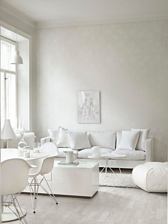
White
Purifies, energizes, refreshes. It is often used as an accent color in hot sunny areas and kitchens.
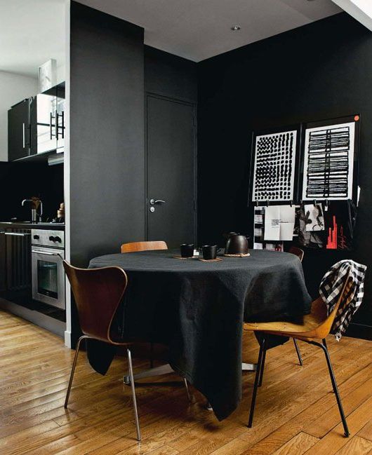
Negro
Elegance, distinction. It is also used as an accent color.
Emotional effect of colors
Have you ever wondered why when you enter certain places your emotions change? Perhaps you haven’t stopped to think about why you like to think about certain parts of the house more, others make you much more energetic and others depress you. This may be due to the colors in the room, which changes your mood when you see them.
It is a scientific fact that color affects mood. And since the colors we choose to live in can definitely affect the way we act, think and feel, you should definitely consider color personality when choosing a room’s color scheme.
For example, the color red is used in kitchens because it awakens the senses and keeps the people who are in that place alert. The kitchen is one of the rooms in the house that needs you to have all your senses focused on it, because there is fire, water and electrical appliances.
However, you have surely noticed that in rooms with warm colors ranging from orange to brown, they are places where you want to talk much more. This is because orange in all its shades calms the senses and fills with optimism.
Not only is this based on feng shui, but even color therapies are often very successful with all of his patients.
When choosing a room’s color scheme, remember that balance is best achieved with a mix of warm and cool colors.
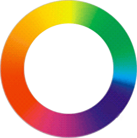
Warm colors
Warm colors, located on one side of the color wheel, are colors with warm undertones such as red-oranges, reds, yellows, and yellow-greens. These colors are radiant and welcoming. They make rooms smaller and more intimate.
Cold colors
Cool colors, the opposite of warm colors on the color wheel, are colors with cool undertones and include purples, blues, and blue-greens. These colors can have a calming effect. In a room, cool colors seem to recede, making a room appear larger. They work well in a sunny room and will make it seem cooler and more comforting.
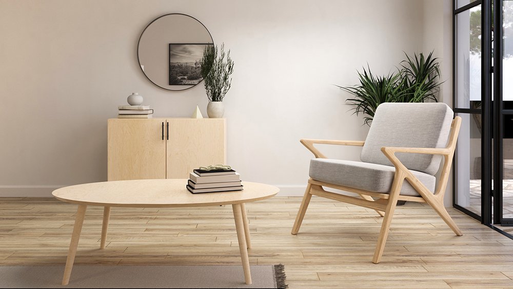
Neutral colors
Neutral colors (or non-colors) are white, gray and black, and they are excellent to use as a background.
Colors are an important tool not only as a method of decoration but also to inspire emotions, whether it is used for the interior or exterior. The psychology of colors in decoration is a great way to achieve a beautiful and healthy home.
More about colors in decoration:
Color combination