As we all know, colors are one of the most effective ways of injecting dynamism and personality into spaces, either including them one by one or combined in two or three. That is why today we present color palettes for interiors 2022 that have the most to offer in walls and modern decoration.
The key to success in decoration is that although we can be inspired by the colors that are in fashion, they must be to your total liking, otherwise you will have to live in a space in which you do not feel totally comfortable.
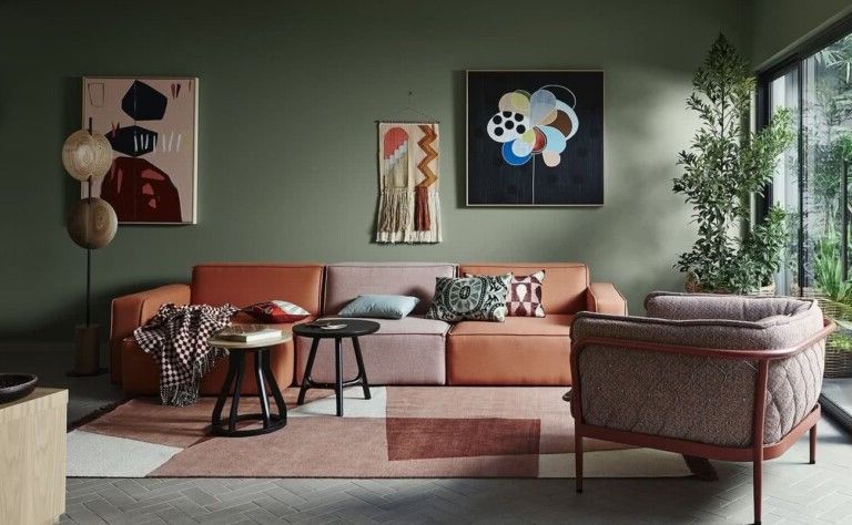
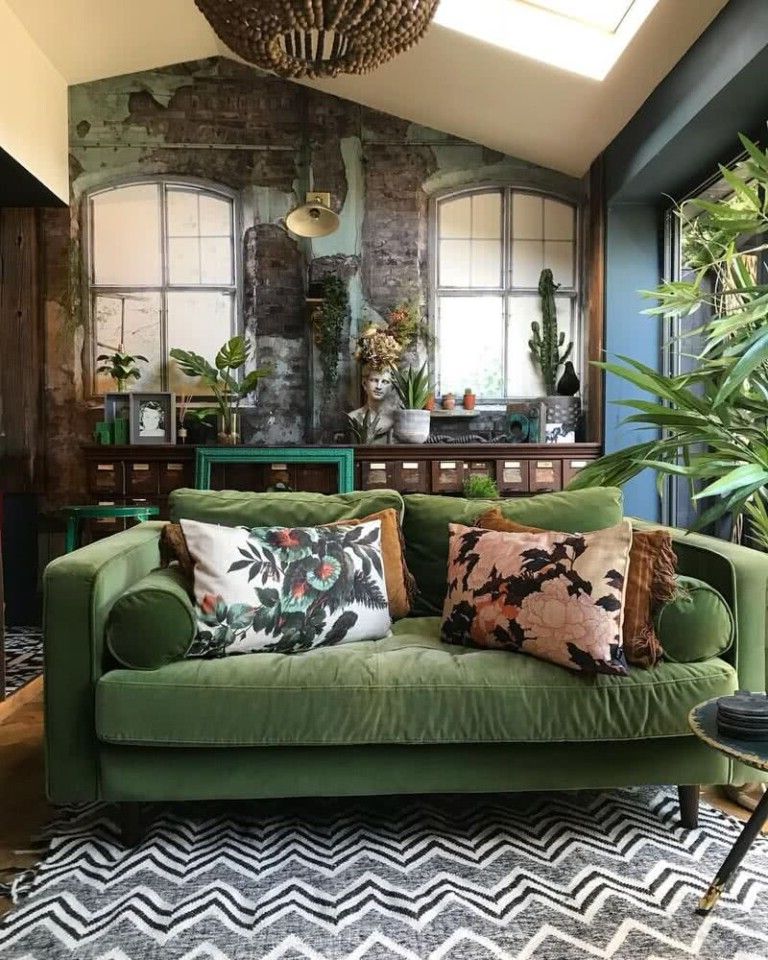
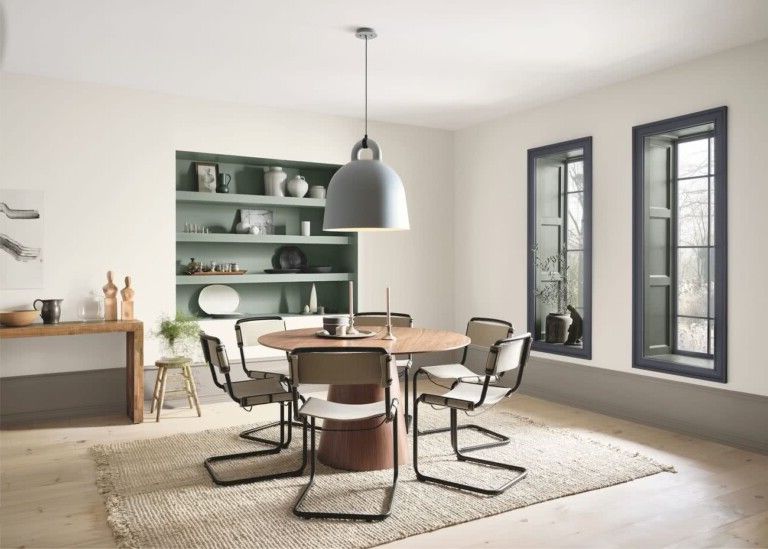
- Greens
- Celadon
- Celery
- Avocado
- Mint green
- Light olive green
- Bluish green
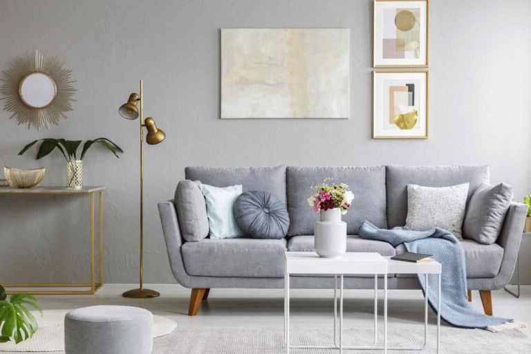
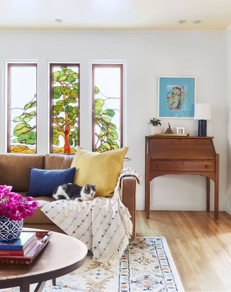
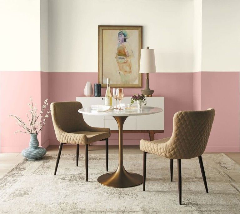
- Green and pink
- Blue
- Prussian blue
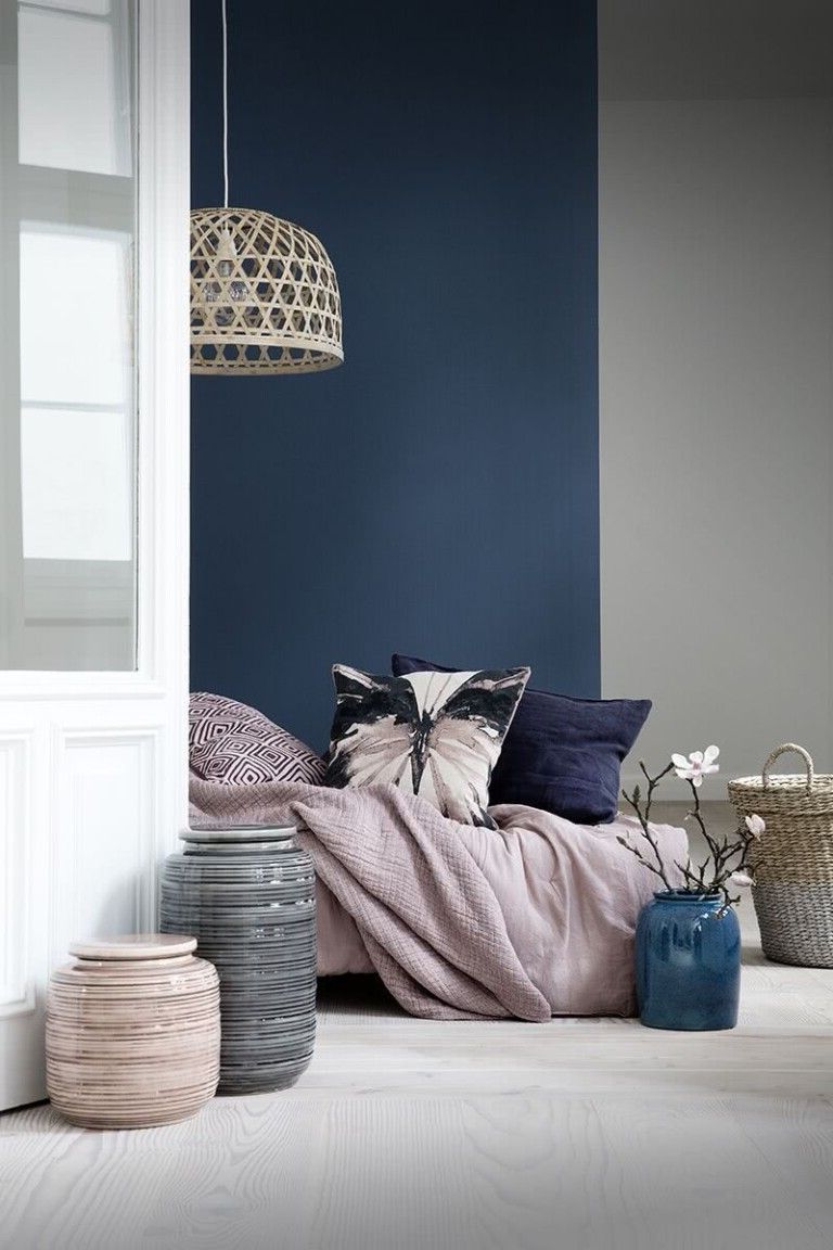
- Navy blue
- Pale sky blue
- Bright blue
- Blue and white
- Blue and brown
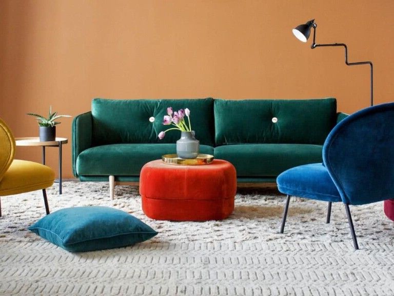
- Blue and yellow
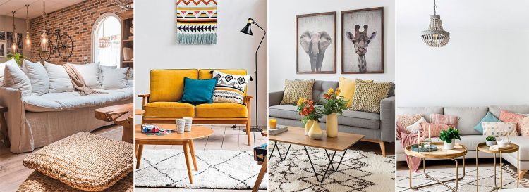
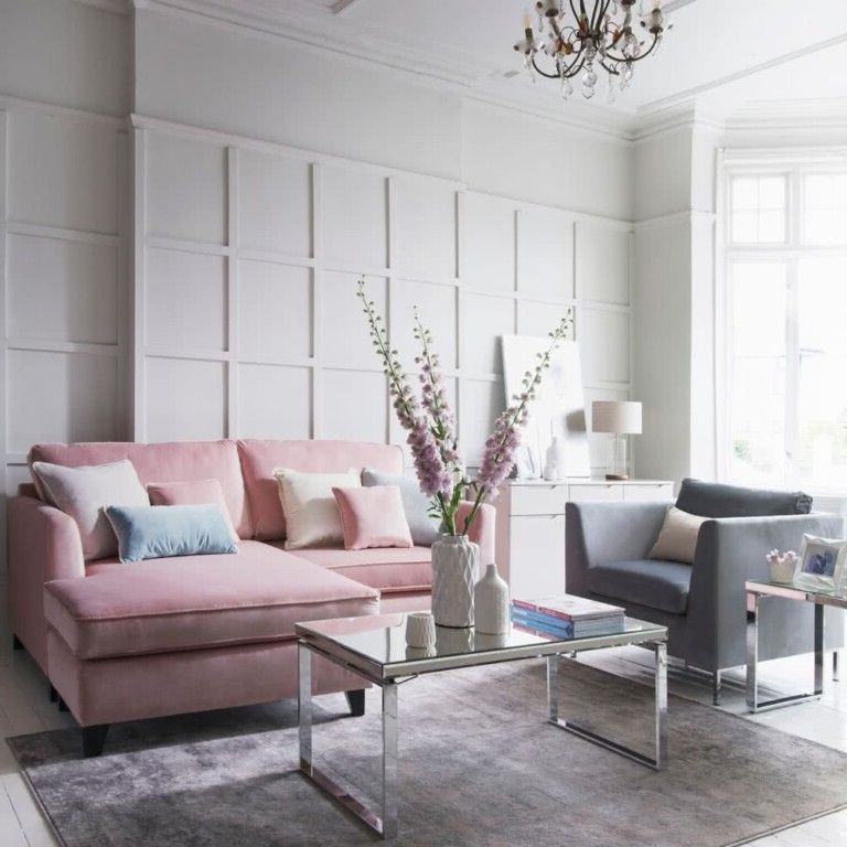
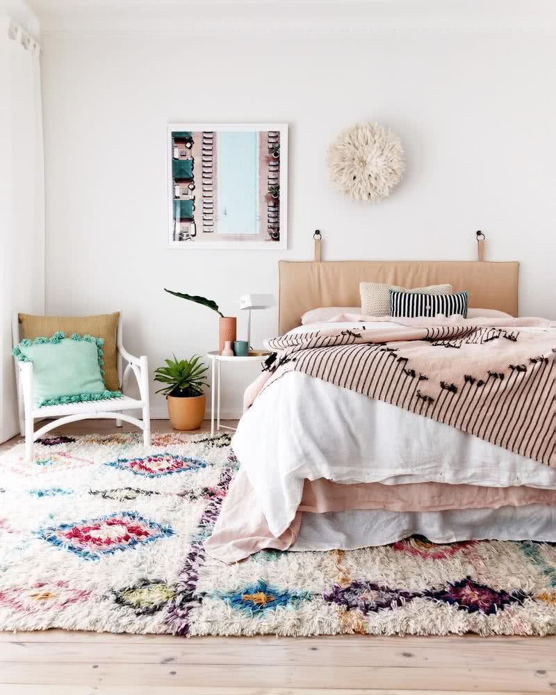
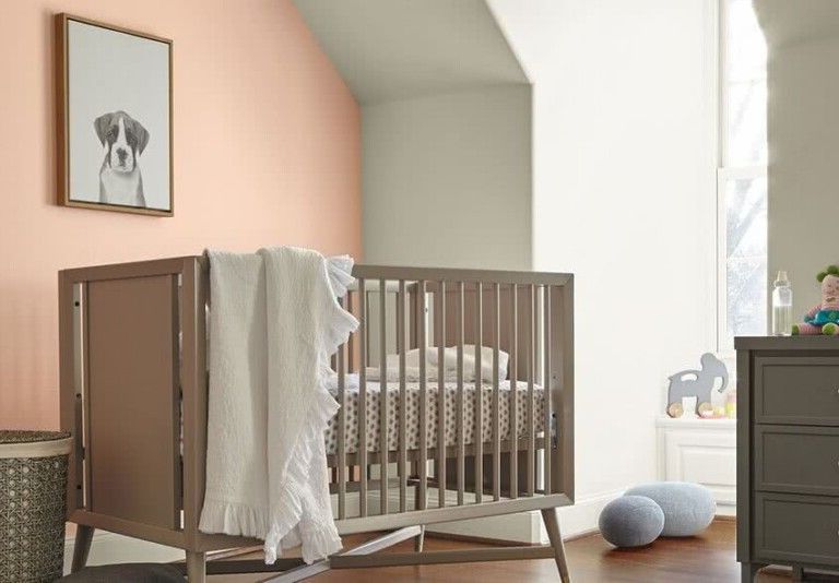
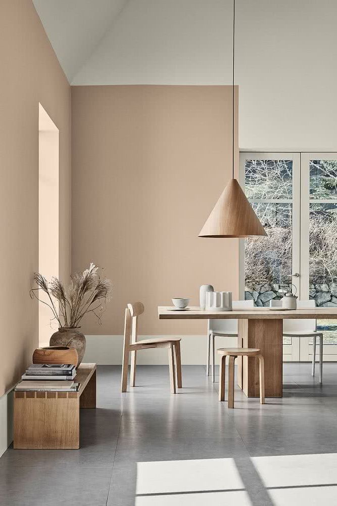
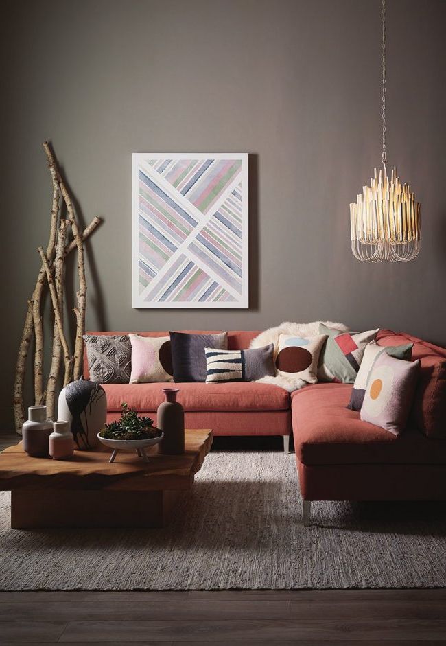
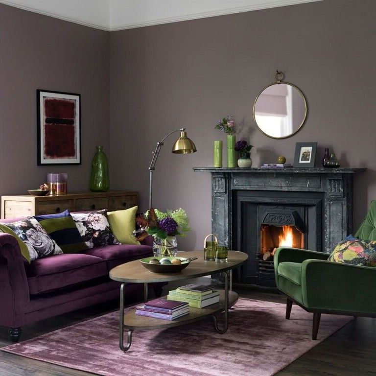
- Old pink
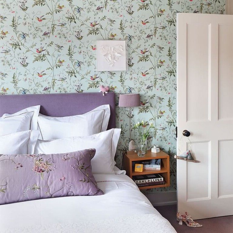
- Lilacs and purples
- Beige
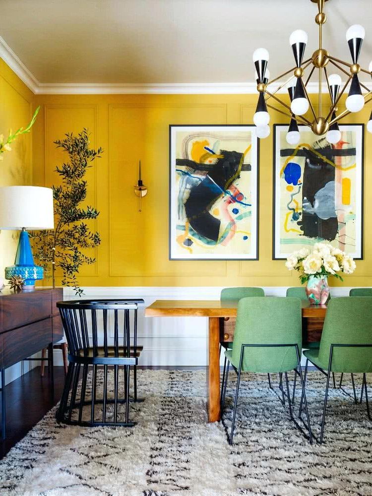
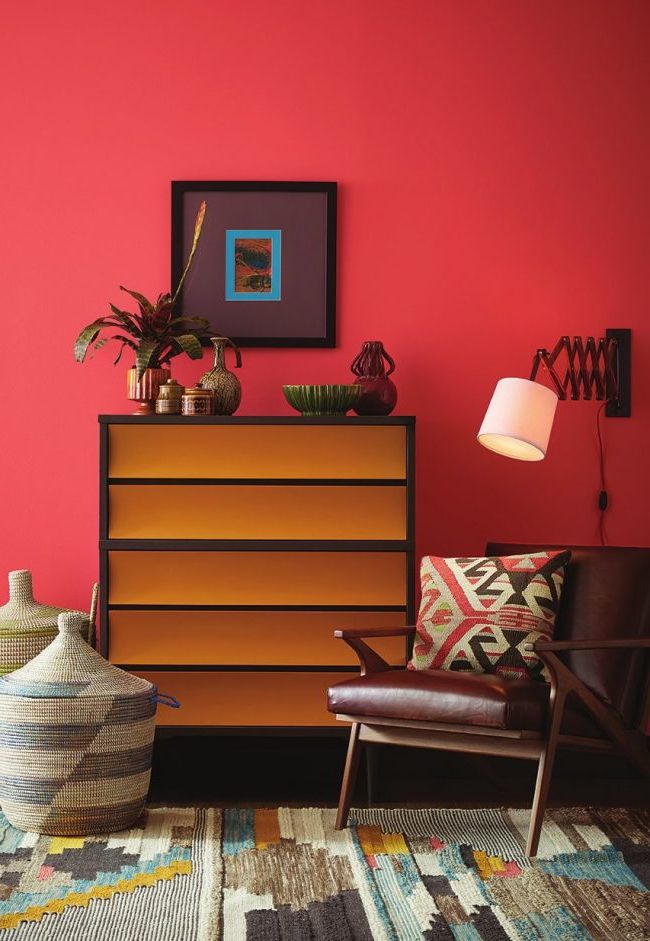
- Yellow
- White
- White with black or dark gray
- White with vibrant colors
- White and silver gray
- Color combinations for interiors
- Holistic colors
- Youthful colors
- Globalization
- Night tones
- Walls in two colors
- How to choose interior colors
- 1) Decide on the colors of the furniture and accessories
- 2) Cool and warm colors
- 3) Define what the room will be used for
- 4) Room style
- 5) Run a test first
Greens
Celadon
These light and soft tones are all the rage in decoration, and will continue to be used in 2022, as they have been seen in many furniture and interior decoration fairs.
Celery
Celery green, a little more intense and vibrant than celadon, is another of the shades of green that are ideal to use in any element of the room.
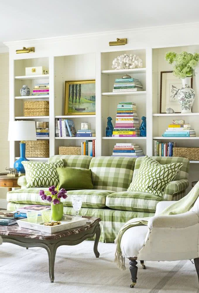
Avocado
Below we see the avocado tone, even more intense. We see it on the sofa and the painting, and it brings a lot of vitality and freshness. Due to its great intensity, it is also recommended to use it only in some elements of the environment. It is not recommended to use it on the walls, as it would make the room look too stuffy.
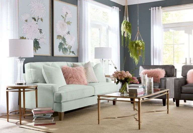
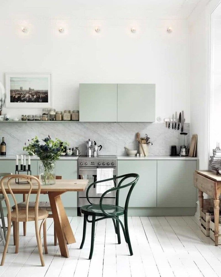
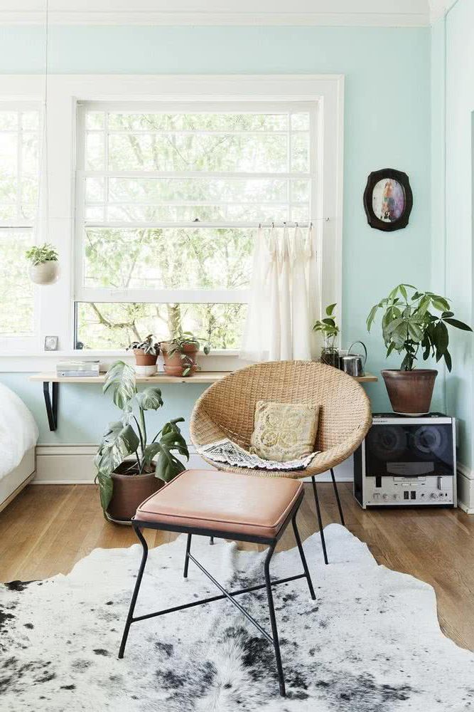
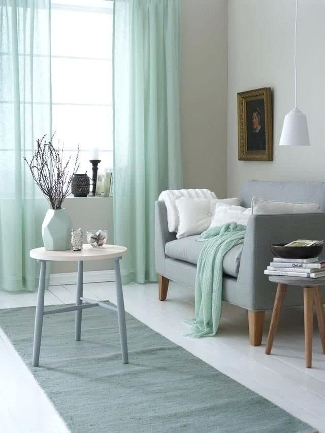
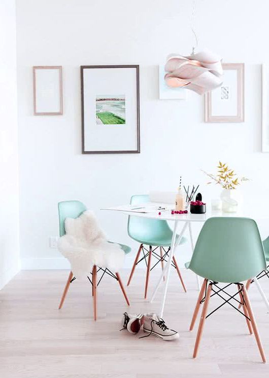
Mint green
A calm color, composed of green, blue and can be muted with gray. A beautiful color that evokes a sense of sanctuary and relaxation. It is versatile and perfect for both outdoors and indoors.
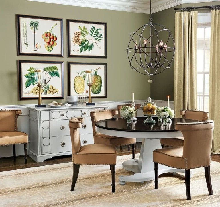
Light olive green
This shade can be used to add impact to any area of the home. They can also bring a window or door to life.
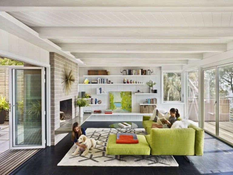
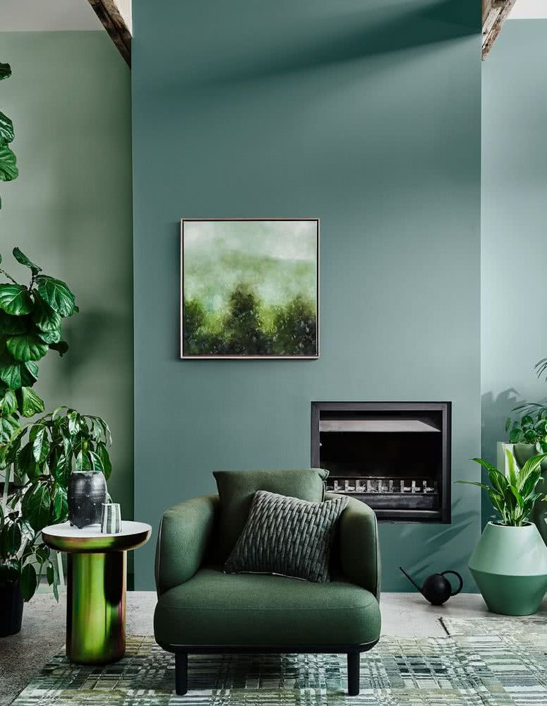
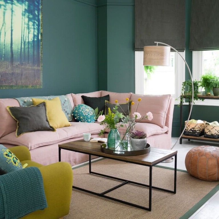
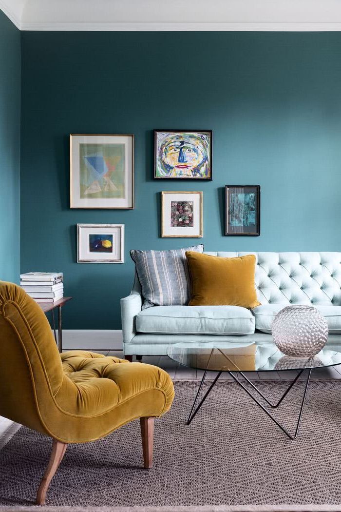
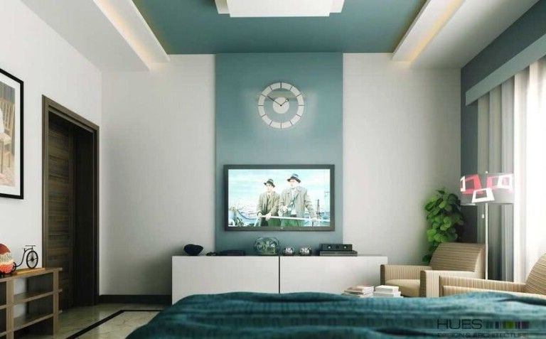
Bluish green
Dark teal greens can add a touch of mystery, while lighter tones give us a sense of space. For this reason they can be combined.
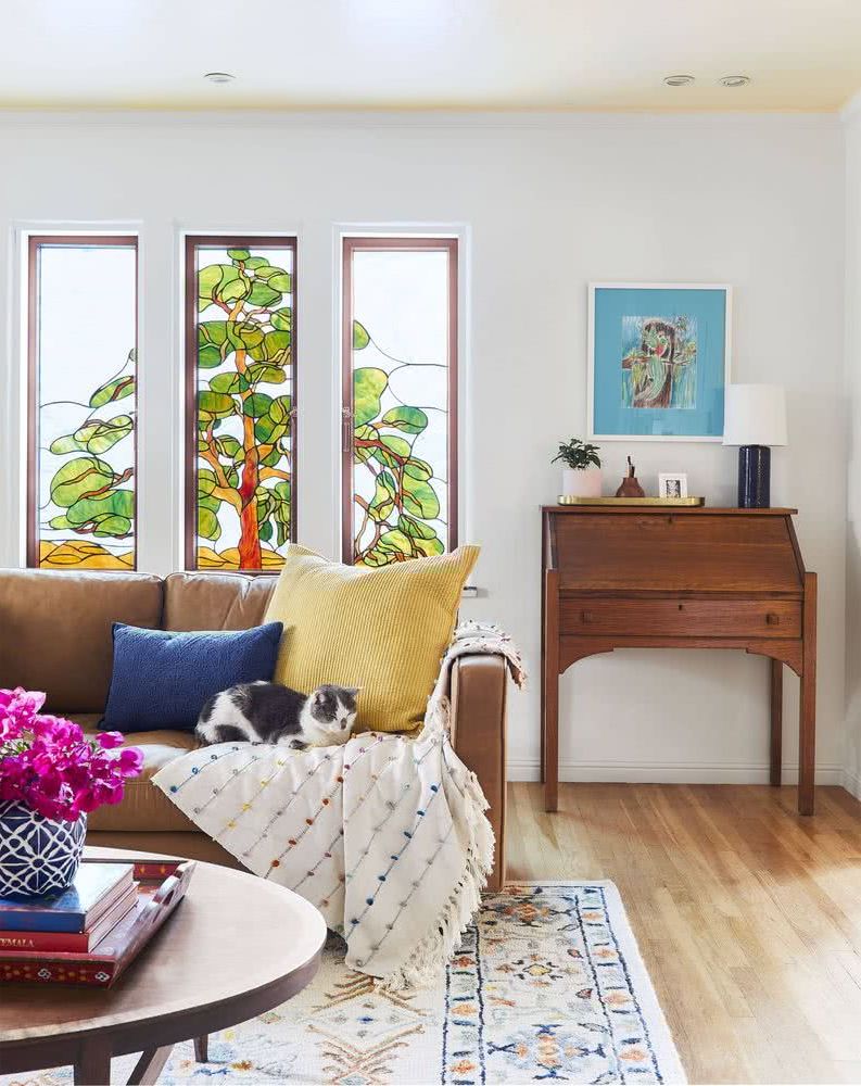
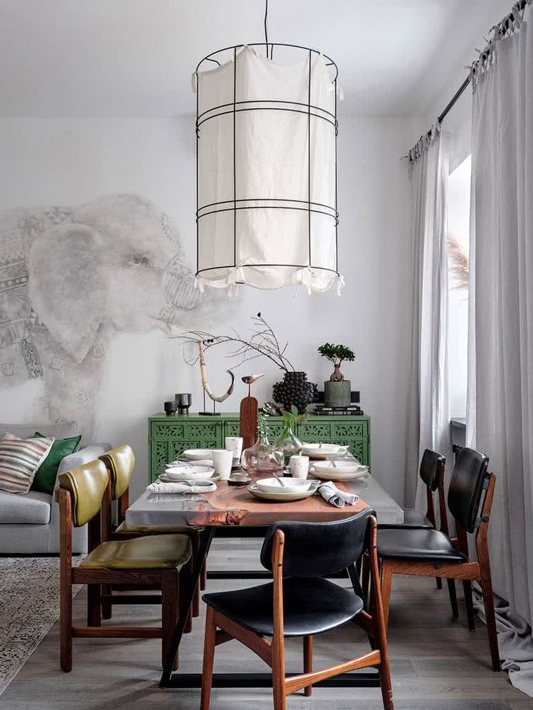
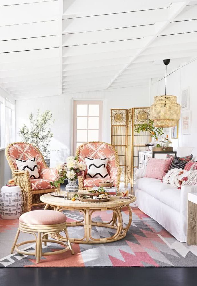
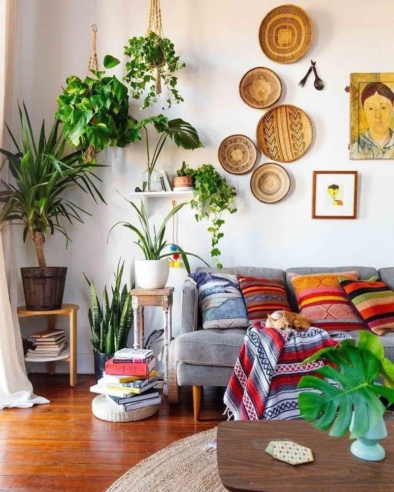
Green and pink
It is a combination to take into account especially for a bedroom or living room. It provides a fresh and soft spring air, ideal for homes in areas that have warm climates all year round.
Blue
Prussian blue
This color scheme also brings a lot of serenity as it is inspired by nature, using shades of blue, yellow and beige.
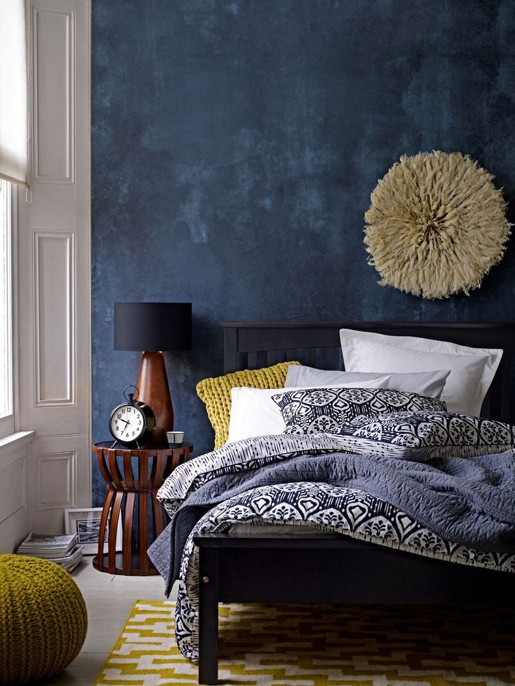
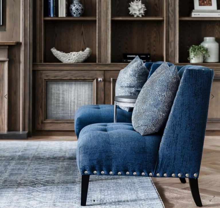
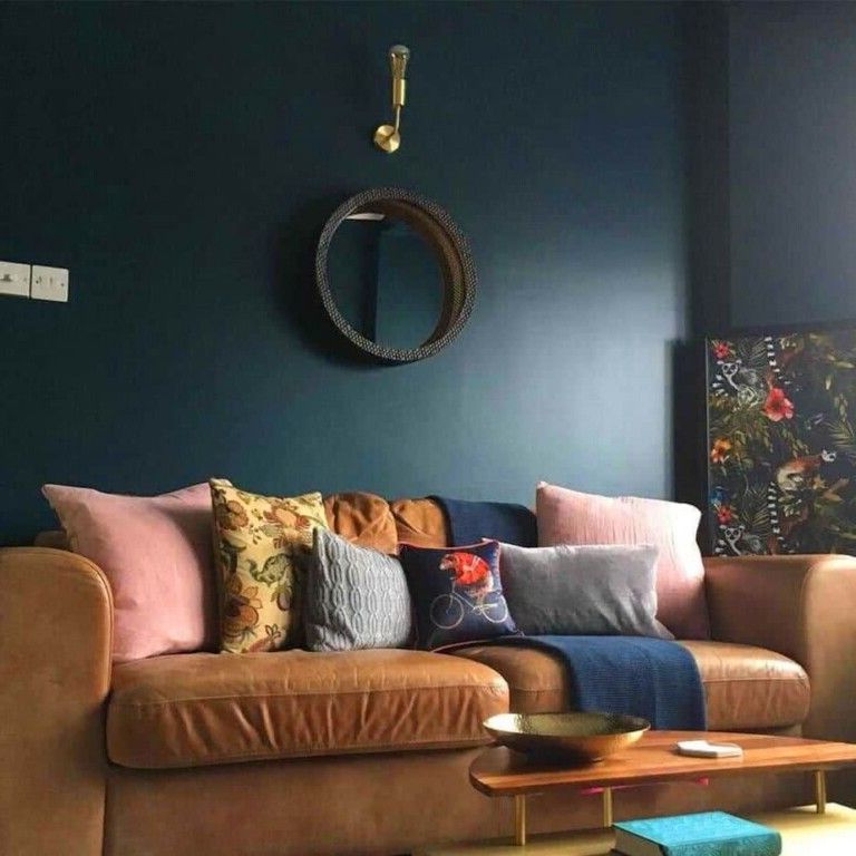
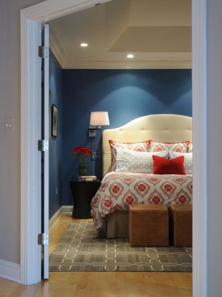
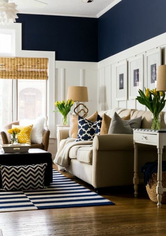
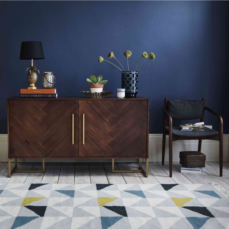
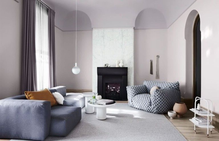
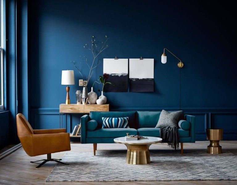
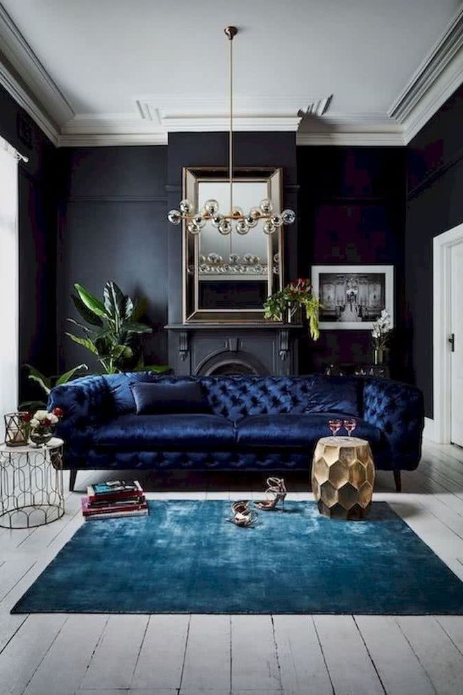
Navy blue
Colors have the power to change our mood. A deep navy blue provides a note of calm, while hints of orange, white and wood can balance it out with its warm notes.
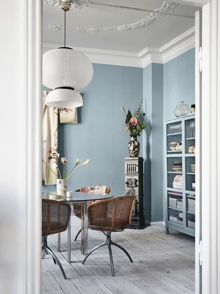
Pale sky blue
These colors are also perfect for turning our home into a sanctuary. Bedrooms and bathrooms are private spaces, a perfect refuge from the outside world. Pale blue and different shades of gray can help us create very peaceful and relaxing environments.
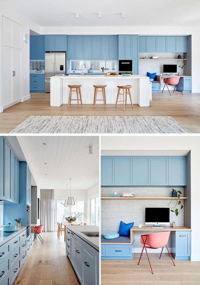
Bright blue
These types of blues achieve a different effect, although they also have a relaxing effect, they are a little more vibrant.
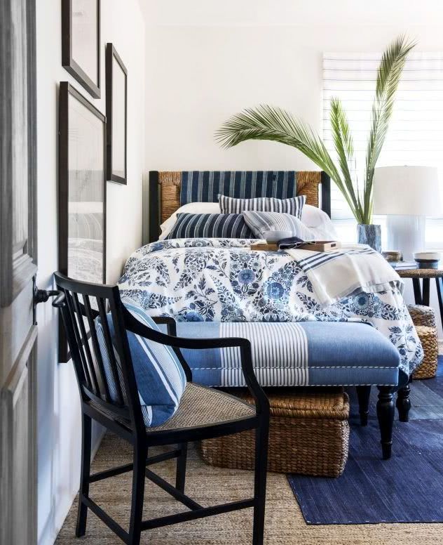
Blue and white
This combination is very popular, because it is soft, it does not harm the eye, it is less monotonous than others, and it is even relaxing.
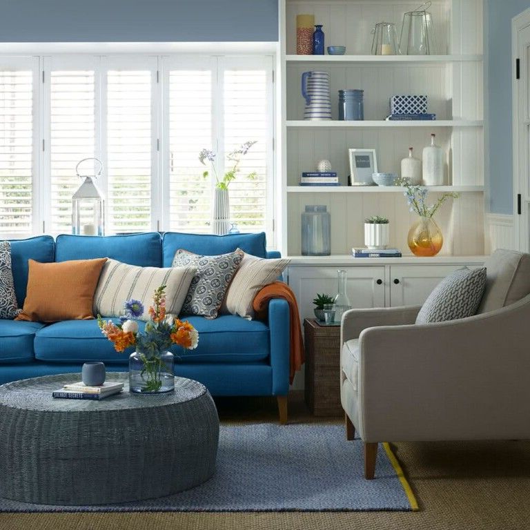
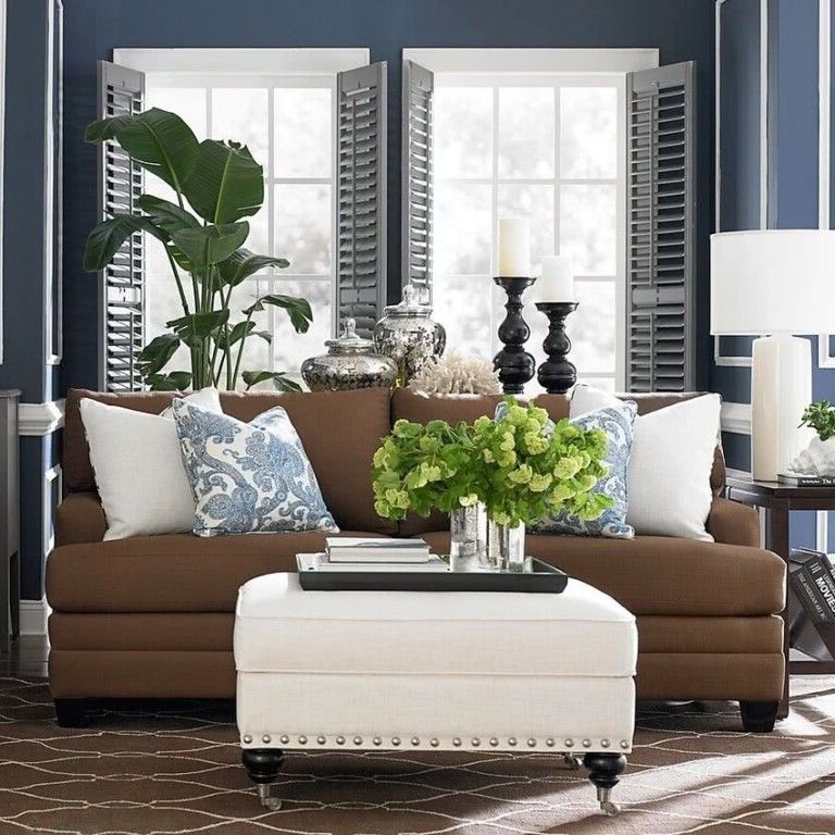
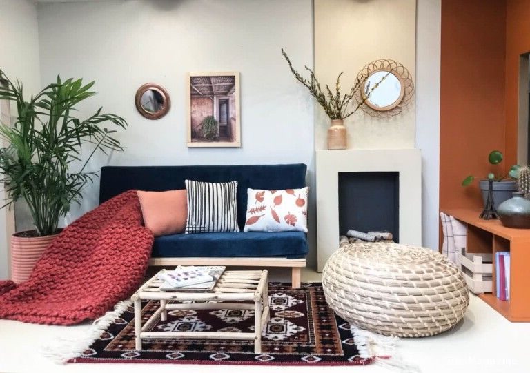
Blue and brown
These two tones, dark brown and blue, combine wonderfully and not only that, they are also two colors that are very easy to combine with the extra elements of the decoration, especially if they are in colors like orange, yellow, silver and purple.
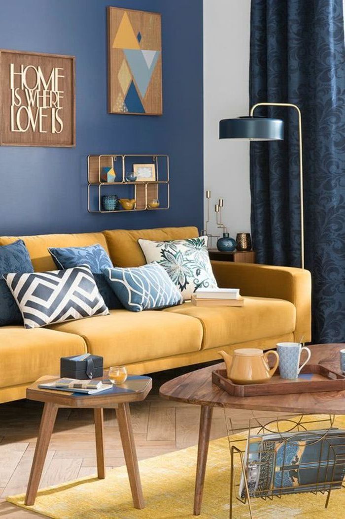
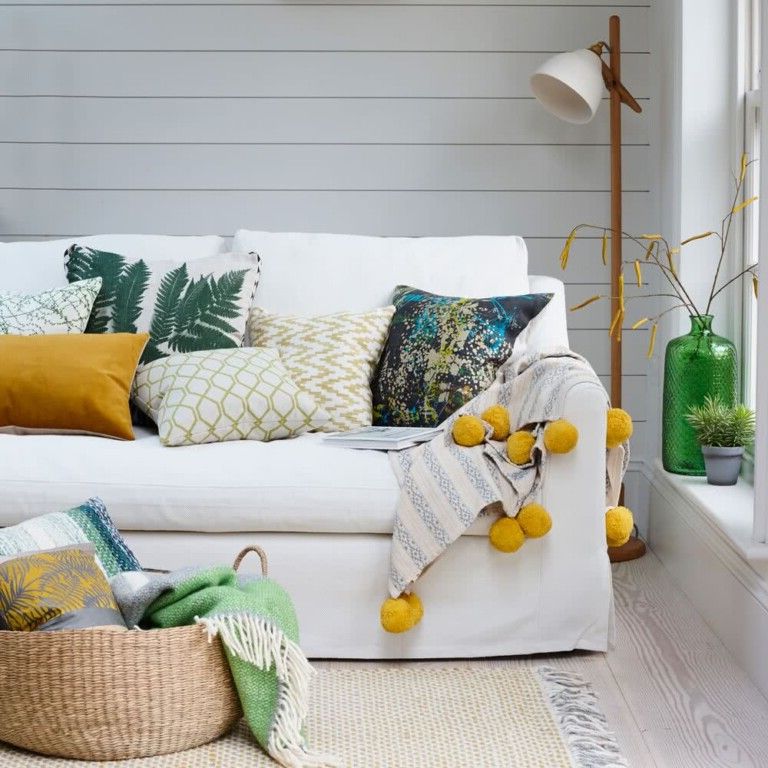
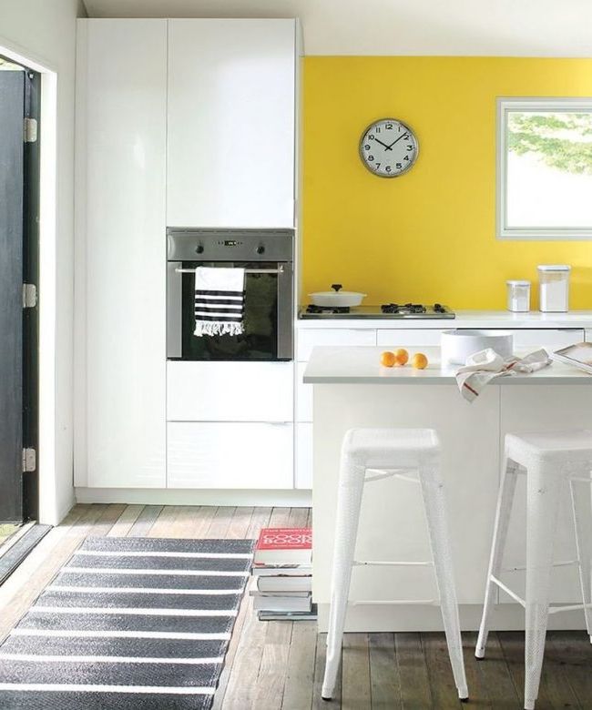
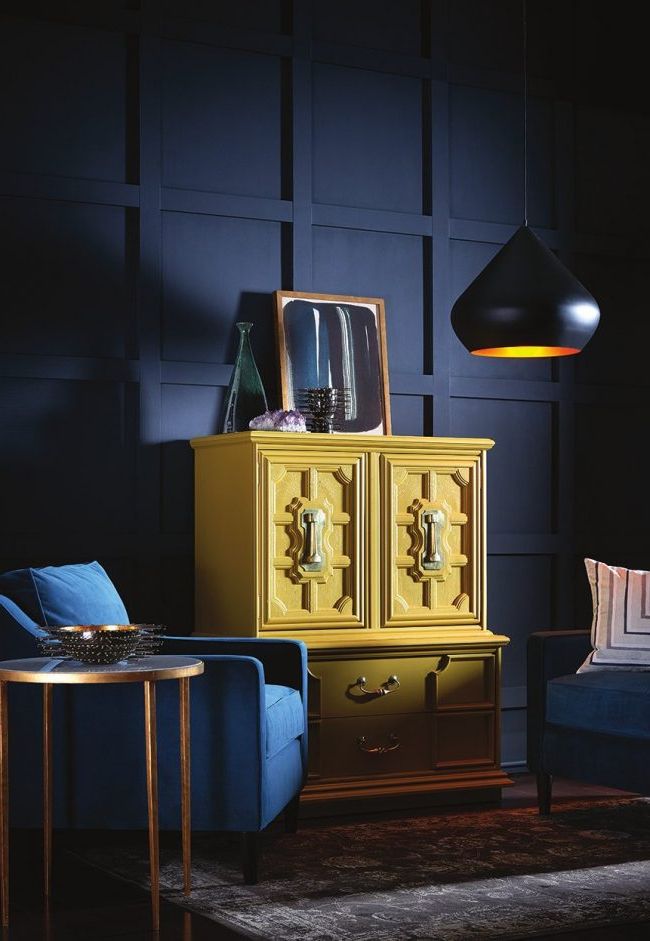
Blue and yellow
It is another energetic combination, somewhat stronger than others. The blue on the wall gives depth, and is combined with wooden furniture and touches of mustard yellow.
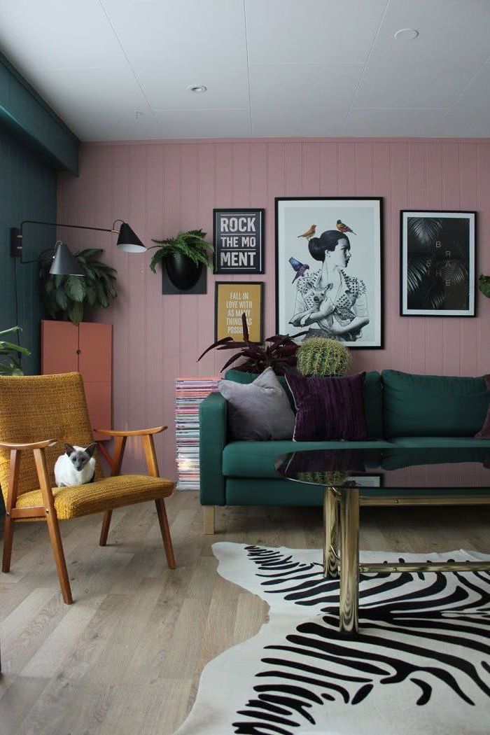
Old pink
Old pink is still widely used in decoration. It can be seen in lighter and brighter shades.
Lilacs and purples
Many people think these colors look too childish, but when used correctly they can add a level of sophistication and warmth to any space in the home.
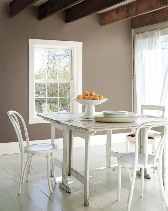
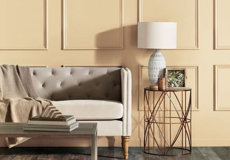
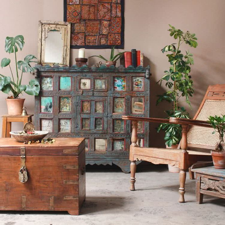
Beige
They are neutral colors, which are perfect combined with white.
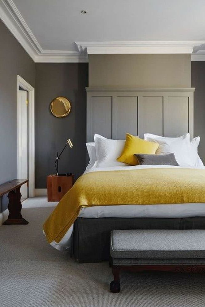
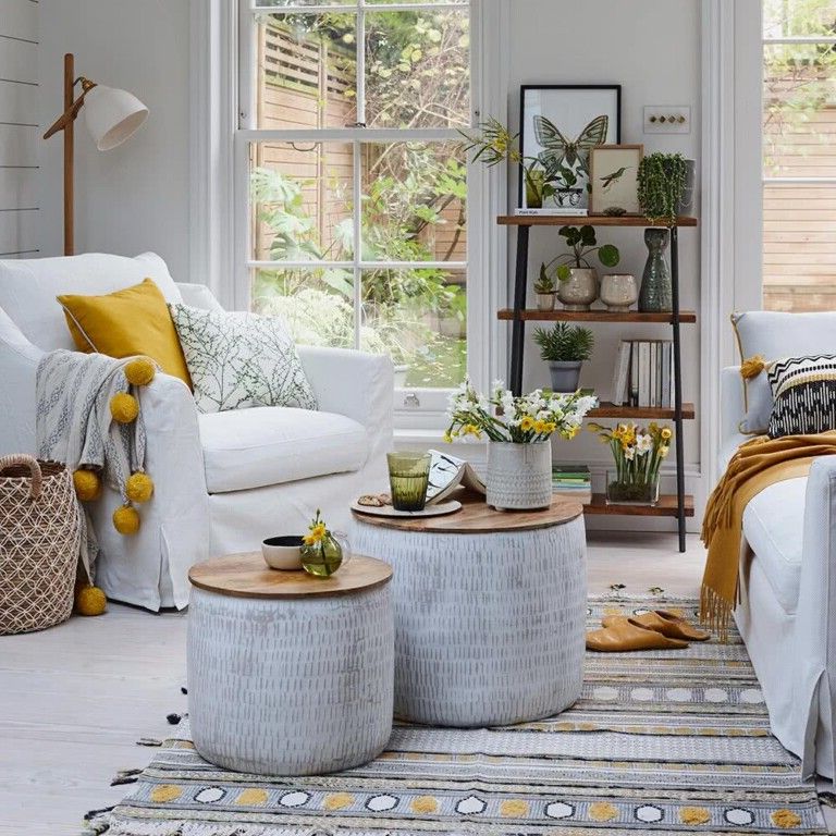
Yellow
If we want to give life to certain spaces, we have these energy options that are trending.
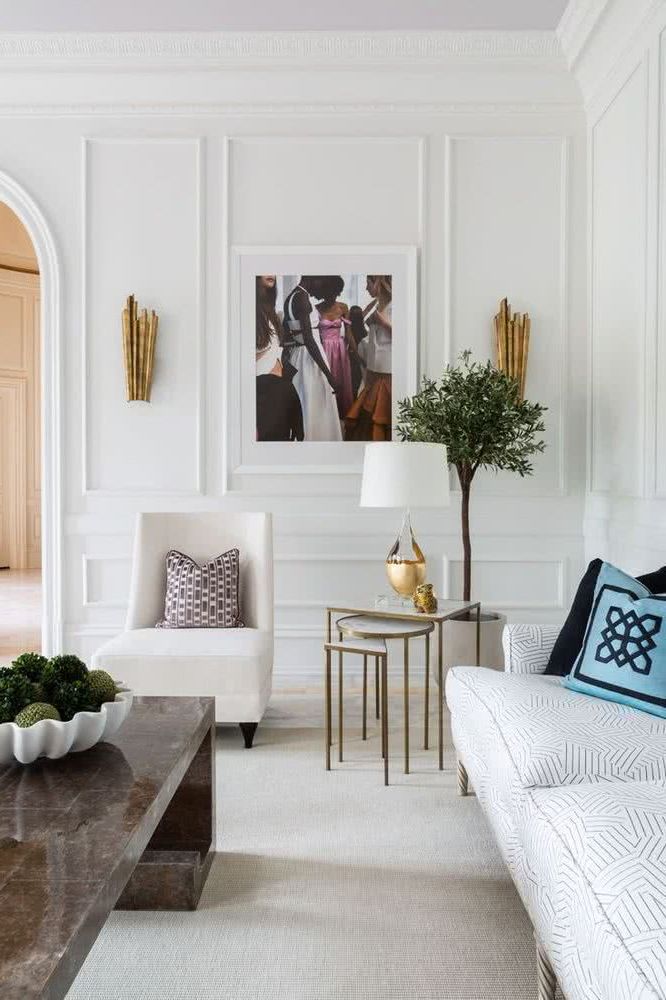
White
Whites of different tones that enhance the diffuse light that draws the shapes with their shadows and dark light. It is a basic color but one of the classics in decoration, and this year it will also be used.
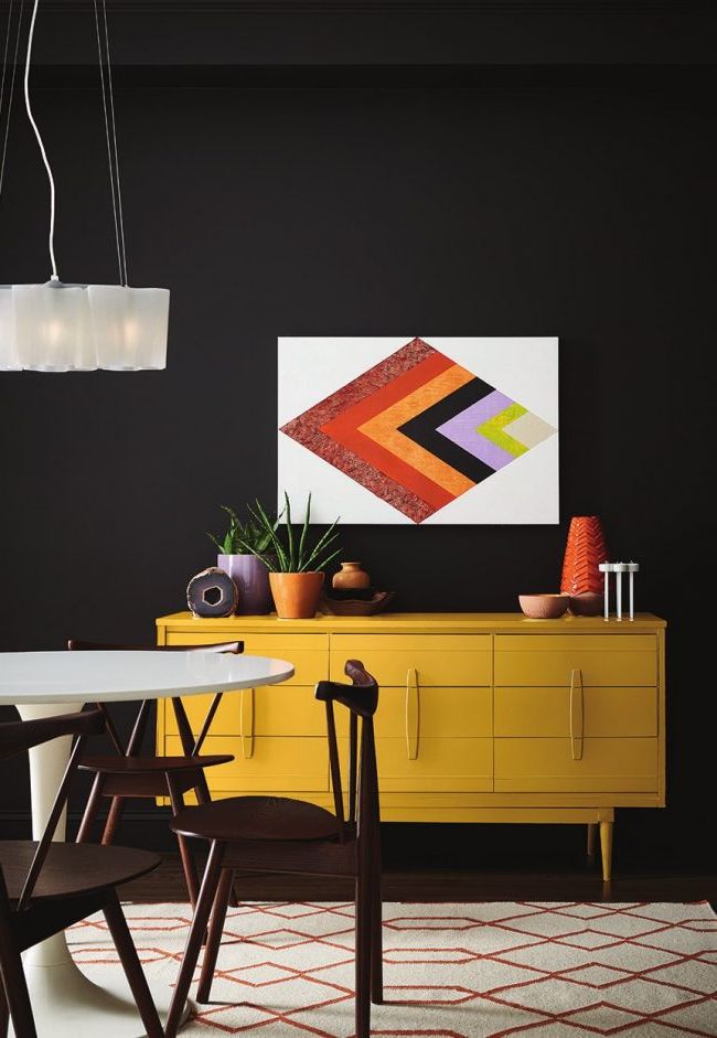
White with black or dark gray
Black or dark gray are used to create contrasts and define the lines. The angles and edges become clearly defined, and obviously, they are colors that combine perfectly with white.
White with vibrant colors
They are used to achieve the same effect that we mentioned above, to complement white, define lines, shapes and angles, but at the same time, give an energetic touch to the environment.
White and silver gray
The elegance of the 21st century is expressed in these two colors. You get a space that gives the feeling of cleanliness, simplicity and glamor at the same time.
Color combinations for interiors
The predicted color trends for 2022 include a bit of everything, from warm tones to the iciest hues. These are some of the color palettes for interiors that are being seen the most today.
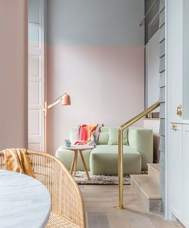
Holistic colors
These are shades that evoke calm, peace, which in some way recreate the current trends of holistic healing and spiritual elevation centers. The paths of this journey are lined with arctic neutrals, blush pinks, and natural browns.
Youthful colors
Impatient for social and political change, everyone on the planet is reinventing himself. That is why these types of daring, vibrant and daring palettes are proposed. There is a combative energy in our present time, coming in fiery hues and vibrant colors.
Globalization
Global immigration is redefining borders, national identity and our sense of coexistence. Communities are much more connected. The design must be adapted to more diverse populations. Global Consciousness is a mural painted in earthy mustards, sea blues, corals and mud.
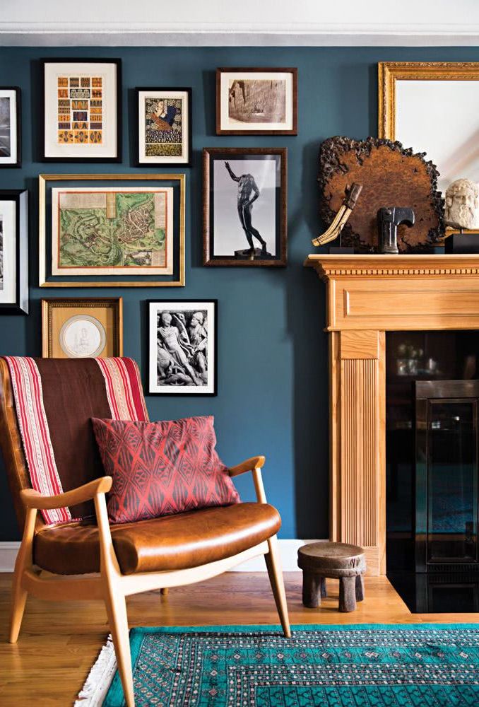
Night tones
It is a series of shades that evoke the night, that recreate a space to direct the gaze inward and recharge the spirit. Dark tones establish a way to achieve this sensual space.
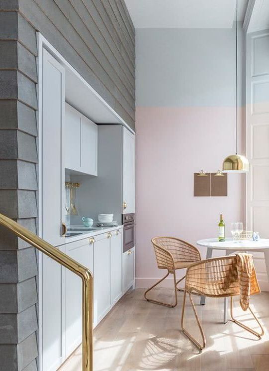
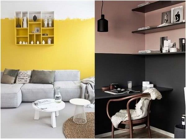
Walls in two colors
Solid color painted walls are more traditional and can often create a formal look in a room. While this classic look is very beautiful, let’s look at a very interesting and modern look, the two-tone. This is done with the help of painter’s tape, to separate the two areas.
How to choose interior colors
As we well know, painting the house is not easy, much less, being able to imagine how it will look when we deal with more than one color. For this reason, we will give you some advice on what color combinations to use for the walls and decoration in general, with the guarantee that you will have a good result.
1) Decide on the colors of the furniture and accessories
Before deciding on paint colors, there are a few decisions that need to be made first. You must decide on the furniture, carpets or rugs, wallpaper, tapestries, fabrics and any other element that you plan to place within the space to be painted. It is much easier to choose the colors of the walls if you already know the colors of the carpet and the furniture in the room.
Once you have the decoration of the room more or less settled, you should keep in mind that the colors of the walls must match the colors of the decoration.
2) Cool and warm colors
Keep in mind that colors like blue, green, or purple will make a room look larger, and colors like red, gold, orange, or brown will make a room look smaller.
Warm colors in decoration
cold colors in decoration
3) Define what the room will be used for
Another thing to consider when choosing colors is to determine what the room will be used for. Warm colors like dark yellows encourage play and fun. Cooler colors like dark blues or purples encourage reflection and serenity.
To achieve balance, it’s best to use both warm and cool colors in a room.
You should analyze the room and how you expect to feel in it. You must decide if you want a quiet space to concentrate, vibrant to stay active, harmonious to relax, etc. The sensations you are looking for can be infinite, it would be good for this to inform you how each color in decoration affects people’s mood: Meaning and psychology of colors in decoration
You should also reflect on the current decoration of the room. Look at the room and decide if you want a darker color than it already is, if you want a brighter color, more relaxing, more cheerful, etc. This will help you get even closer to what you are looking for and make sure of it.
4) Room style
It is important that you know several styles of decoration to inspire you and make a better decision. For this, there are many sources that can be of help such as searching the Internet, decorating magazines and interior decoration television shows.
5) Run a test first
To be sure that the colors will work, you can buy a small quantity and paint somewhere on the wall to check that it is the color and tone that you are really looking for. You should paint with the same technique and number of coats that you will use when painting the entire room. Remember to wait for the paint to dry before deciding on the color.
Take a look at:
Colors for bathrooms 2022 50 modern and elegant styles
Colors for kitchens 2022 70 photos and modern trends