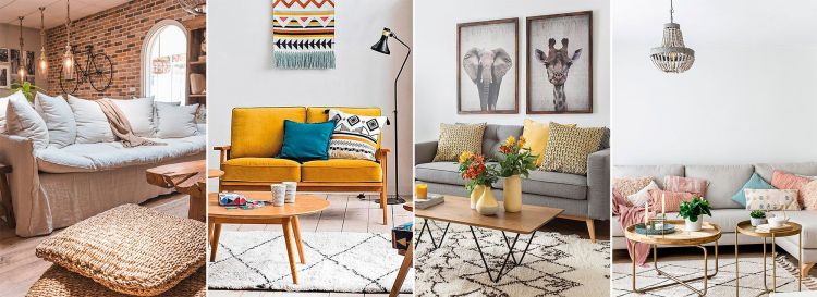
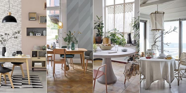
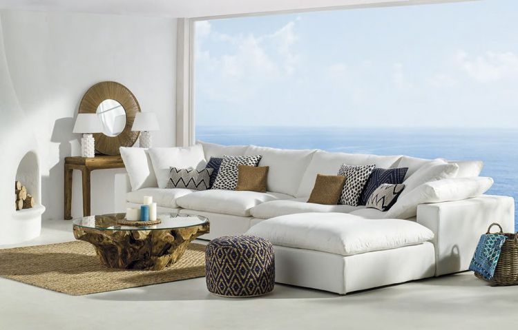
We can carry out the decoration of small spaces effectively by applying several of the tricks to decorate small spaces that I have prepared in this article.
All of them are tricks, tips or decorative resources that we interior designers use in our day to day. That is, they are effective. Choose the one or ones that best suit your style, your home and your needs.
That said, the article is divided into 3 parts: Lower area (floors), middle area (walls, decoration, furniture), upper area (ceilings and lamps).
We start with the first area, paying attention to the floors in the decoration of small spaces.
You can watch the video or if you prefer to see the photos and the text, the article begins below the video.
Decoration of small spaces: Floors
Clear floors .
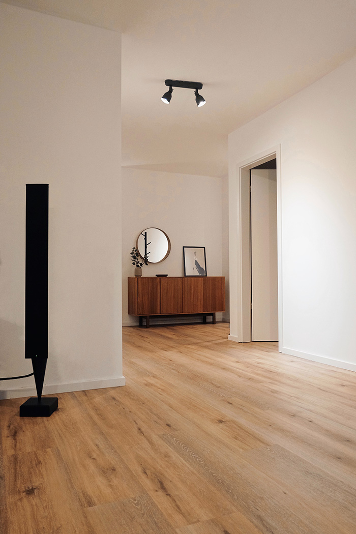
So, if you look at the floor of your living room or any other space and you see little surface, see if you can clear, move some furniture or remove some piece.
As I told you, the greater amount of soil the eye perceives, the wider the area seems.
On the contrary, the less ground you see, the smaller and more crowded everything seems to you.
Without carpets or with large carpets .
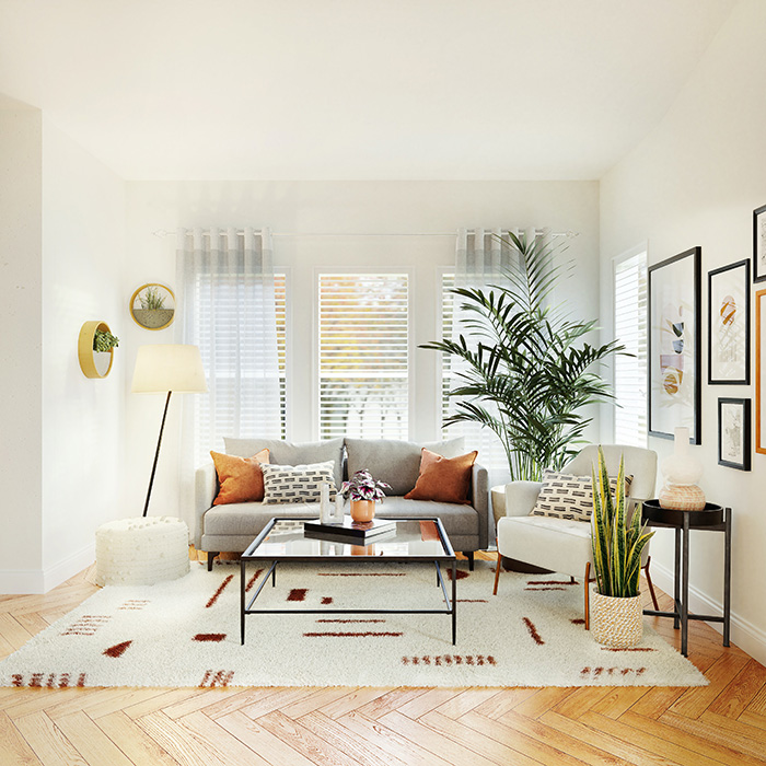
And in the decoration of small spaces, my advice is that, better, without carpets.
But you may want a rug yes or yes. In that case, my advice is to put a generously sized rug, which covers a lot of surface to create the feeling that the area is wider and larger.
Interestingly, when it comes to decorating small spaces, large rugs work better than small ones, making the space appear larger as the large scale of the rug invites the eye to think big.
Light floors .
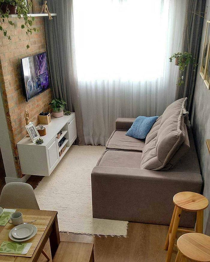
Obviously this is something that not everyone can or wants to do.
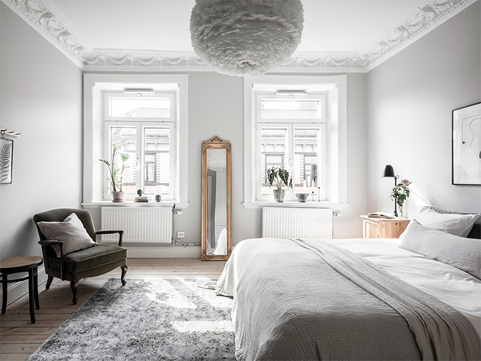
In that case and in line with the previous advice, you can use rugs in light colors and make your floors look much brighter and this will make you gain visual amplitude.
It is most effective.
You can also see how to make a space brighter.
Large floors .
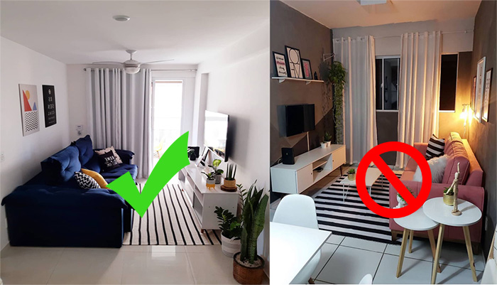
It may seem logical to think that in the decoration of a small space, the floor should also have a small floor format, but it is quite the opposite, since the smaller the floor, the more joints there are and the more ornate it seems.
On the contrary, a floor without joints or in a large format with few joints generates greater visual continuity, without so many limits or contrasts, making everything look wider.
Remove everything you can and want from the soil .

The whole set of SKLUM
As we have already seen, a clear floor makes everything look bigger, so take a good look at all your objects and if it suits you, replace all those that are using the floor, such as, for example, the standing coat racks for coat racks. wall, floor lamps for wall lights, perhaps bedside tables for suspended ones, small plants can be hung from the ceiling, etc.
If you remove it from the ground and you can replace it with elements that go on the wall, you will undoubtedly see your house more spacious.
With these tips for decorating small spaces facing the ground we will have already made our house feel bigger and lighter, now let’s move on to the middle area of the houses, starting with the furniture:
Decoration of small spaces: Furniture
Choose furniture with high or suspended legs .
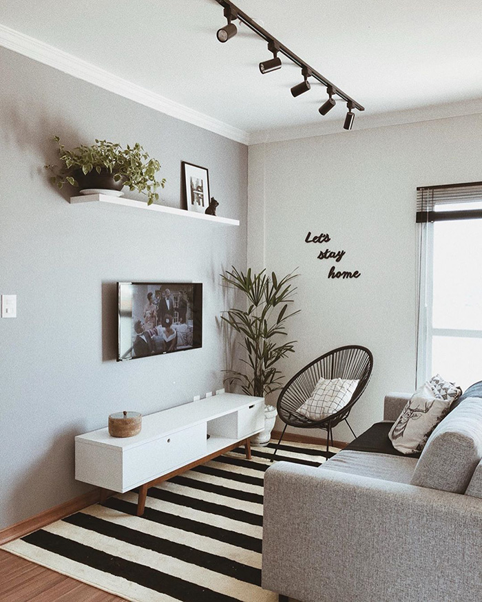
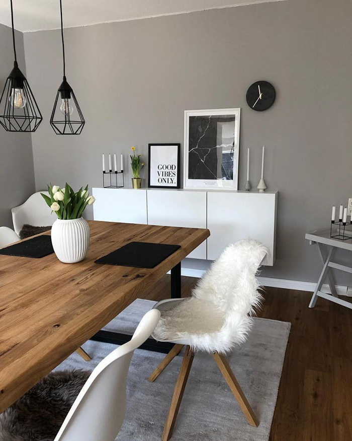
Use folding, folding and lifting furniture .
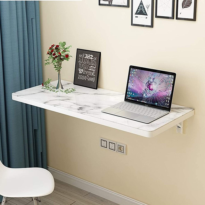
Make use of this type of furniture and replace some fixed and heavy and you will make the space look more clear and spacious.
Use glass or methacrylate furniture .
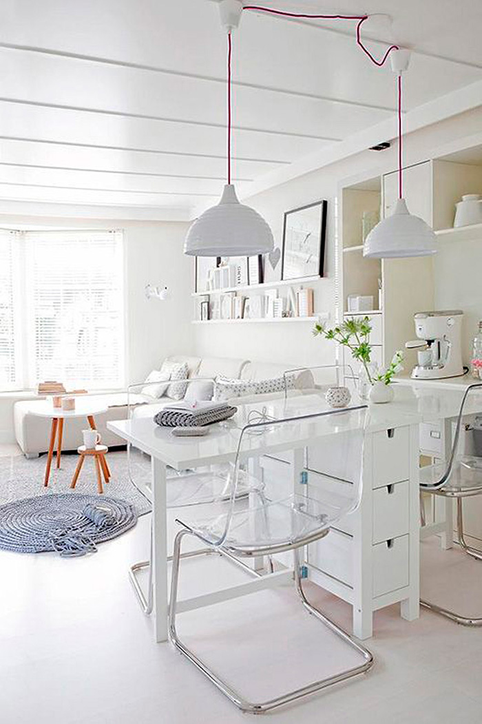
Thus, depending on your tastes and needs, add pieces of glass or methacrylate that do not take up any visual space and offer the same function.
You will not be able to do it with all the furniture, but you can with some very important ones, such as the dining table, the coffee table, some chairs, etc.
A little bulky sofa .
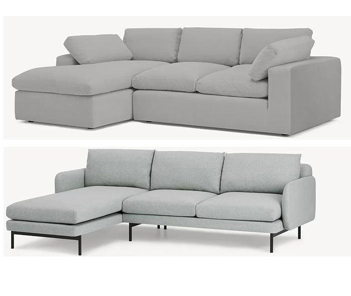
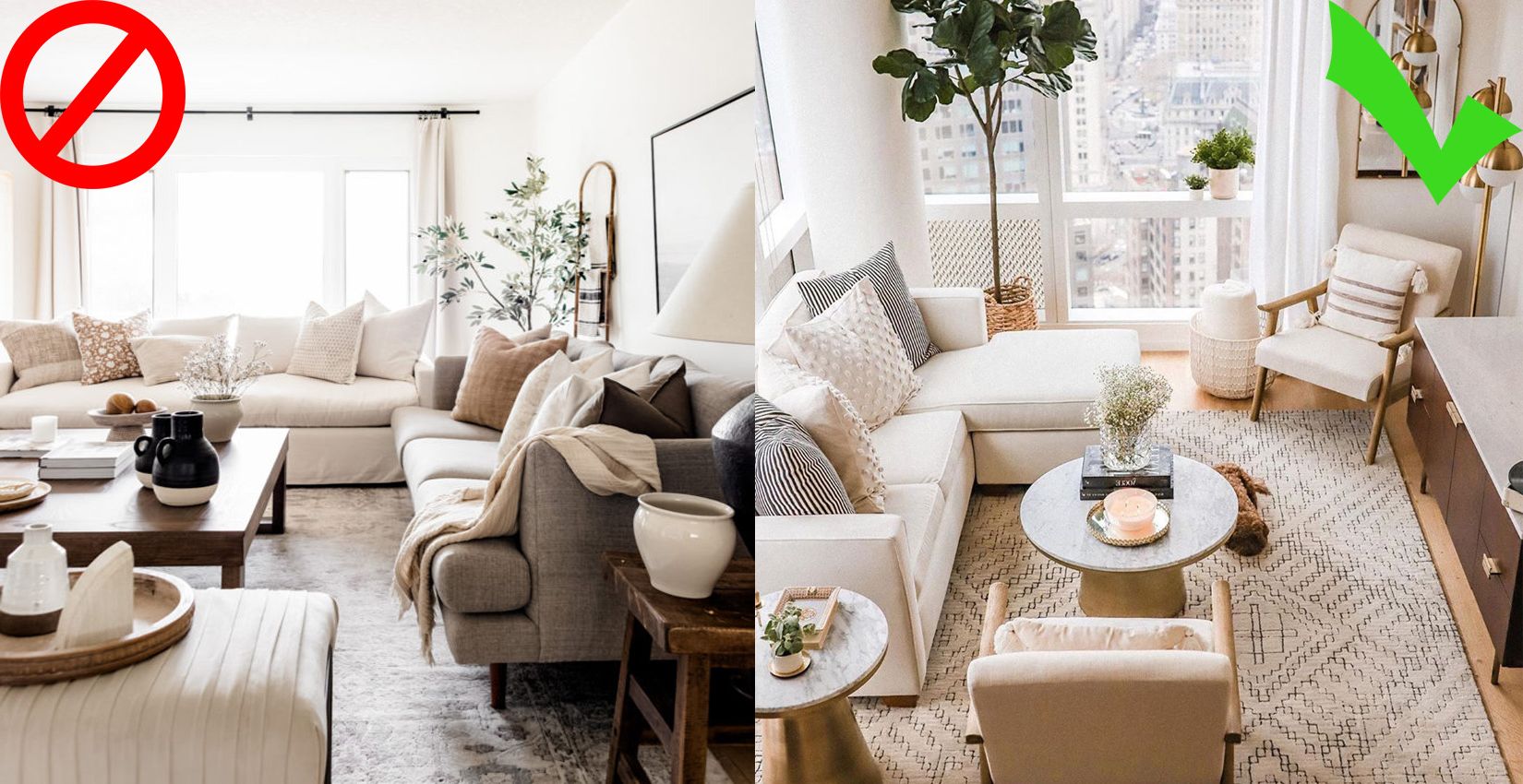
And by this I do not mean having less comfort or less seats, but the volume of the sofa, look at these two examples.
Which sofa is heavier and bulkier? The one on top, right? Well, in reality, both have the same seats and the same size.
But you are going to put one of them in the living room and it is going to eat up all the land, while the other is going to offer you the same seats, but in a much lighter and clearer way.
Let all the furniture breathe .

On the contrary, when all the furniture breathes and has its space, everything looks more clear and spacious, in addition to each piece looking more beautiful on its own.
Try it, it takes 5 minutes to move a piece of furniture and check with your eyes how much clearer you see that area.
Leaving the furniture to one side but still continuing in the middle zone, we now turn to the decoration of small spaces focusing on colors and decoration.
Decoration of small spaces: Colors and decoration
Add mirrors .
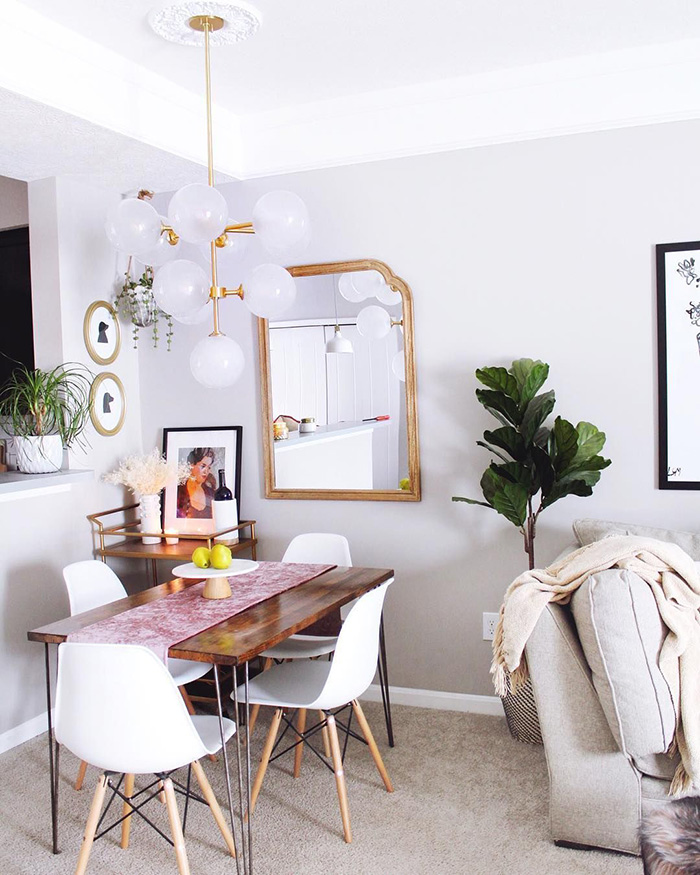
We all know that mirrors make spaces appear larger and also brighter.

Keep the decor cohesive .
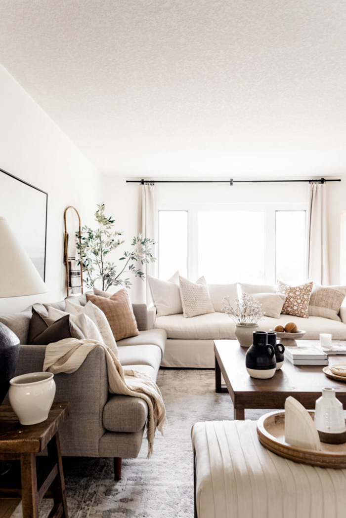
So, to decorate small spaces, one of the best solutions is to make the whole house feel cohesive in style, colors and materials.
In this way, we give visual continuity to all of it, eliminating many of the contrasts, responsible in many cases for visually making a house look smaller.
Create a monochrome palette .

Dormitorio monocromático pintado de verde
Dulux color
If you want to take the above tip up a notch, then create a monochrome palette.
This is the most effective thing you can do to decorate a small space.
Basically it is about adding the same color on all surfaces. Although it is the same color, we can use subtle variations of that color.
By doing this, we eliminate contrasts as much as possible and as we have already seen, the fewer contrasts there are, the fewer visual limits we put on the eye and the greater depth and visual breadth we will gain.
White is your friend .
White is the color that reflects the highest percentage of sunlight. There is no other color that makes spaces brighter and larger.
But not all whites are worth it.
Depending on the orientation of your home you will have to choose one target or another.
If it is oriented to the north, choose warm whites that have yellowish, ocher or reddish pigmentation, since the light that spaces with this orientation receive is cold and warm whites will compensate for that coldness.
On the contrary, if it is facing south, use cool whites, since the light that south-facing rooms receive is warmer and we can use cool whites that have blue or greenish pigmentation, making everything look ultra white.
If you don’t like white, use cold tones .
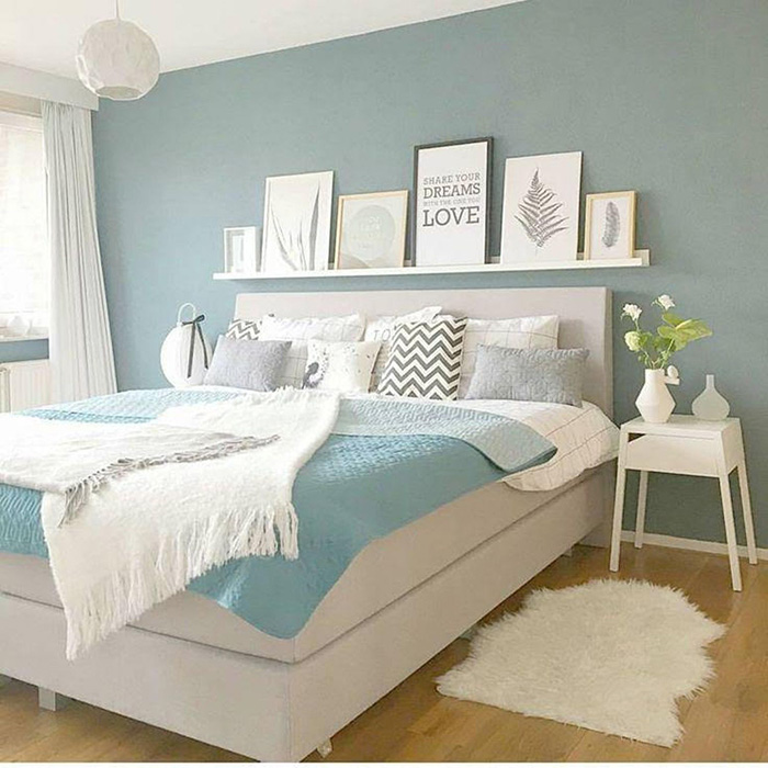
Everything is due to the wavelength by which the eye perceives these colors.
Also, they work best when they are in soft, grayish tones, such as grayish pastel blues, or grayish pale greens, among others.
Calming neutral tones work very well .
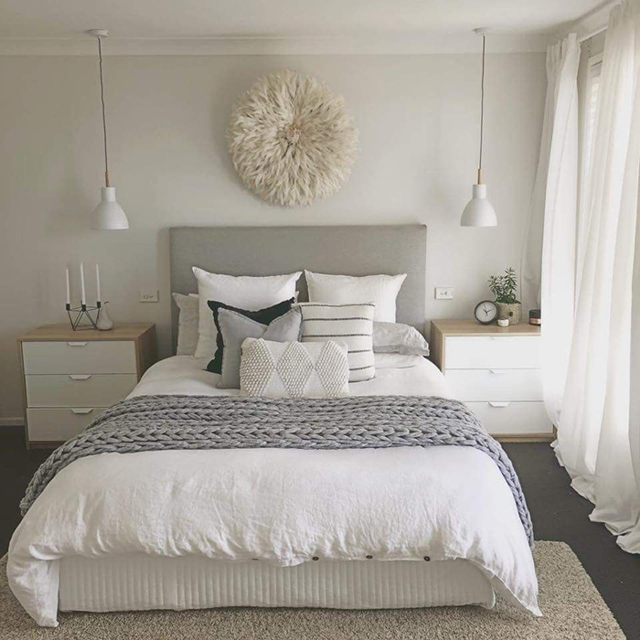
They are subtle, calming and slightly saturated, perfect for creating a serene and enveloping atmosphere to decorate small spaces.
Avoid warm and highly saturated colors .

And that’s because the wavelength of these colors is the longest and the one that takes the longest to focus the eye, especially in red, and this makes the walls have a zoom effect.
Paint horizontal stripes .
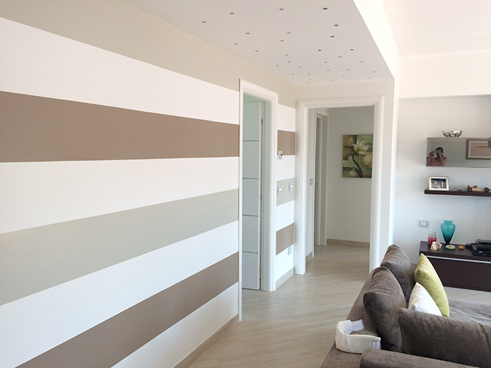
This is the same as when we put on a striped shirt and we look fatter and wider.
It is because we are guiding the eye from left to right and the horizontal plane is visually enlarged.
The same thing happens on the walls and it works very well to gain visual horizontal amplitude.
Create focal points .

This is a trick to decorate small spaces that works very well every time.
Create a focal point with paint, with paintings, with plants, with whatever you want.
One in each room and all the attention will go to that focal point, concealing, or at least concealing more, the small size of that space.
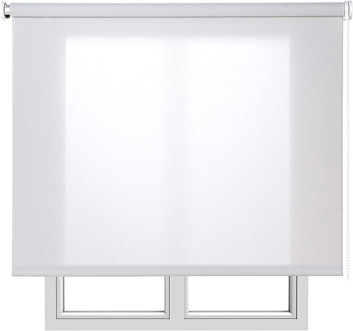
Light curtains, or no curtains directly .
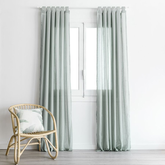
Kenay Home Light Curtains
In the decoration of small spaces, curtains with large prints and very visually and physically heavy should be discarded, since they steal both physical and visual space.
Instead, you have several options: Opt for light curtains with an open weave such as linen or cotton, type curtains, like the ones we see above these lines, or direct curtains.
Try it, you will be surprised.
Take the doors off .
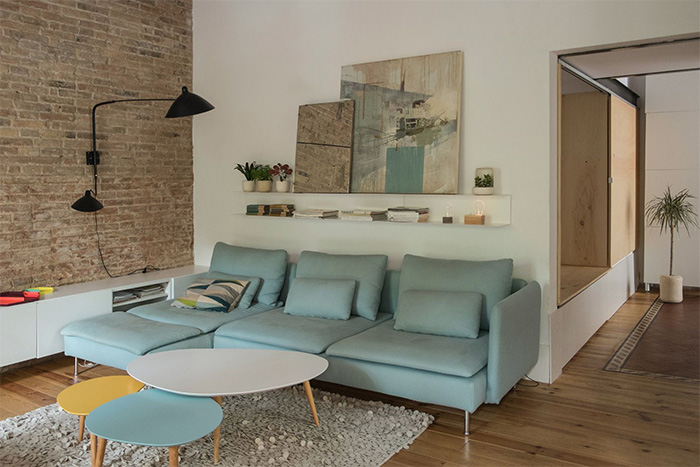
In most homes it is always open, as if it were an ornament.
An alternative may be to remove it, everything will look bigger and brighter.
This cannot be done in all cases, but where it can be done, this trick to decorate small spaces works very well.
Replace some doors with glass doors .
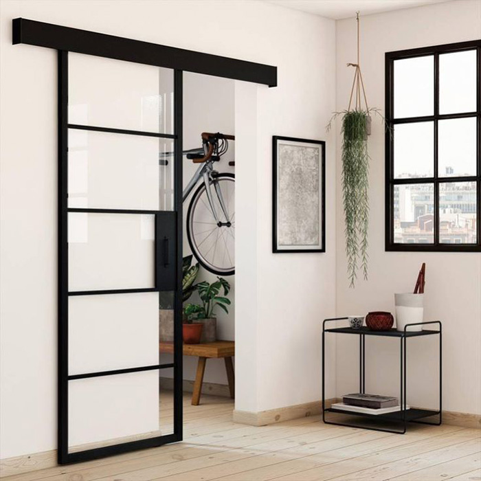
Leroy Merlin’s door
If the previous trick seems excessive to you or you cannot or do not want to apply it in your home, a solution to decorate small spaces that works wonders is to replace any of the wooden doors you have with transparent glass doors, either with metal panels. or wooden or as you like.
Undoubtedly, the space will look larger and also brighter because the light will have fewer barriers.
Eliminate septa .
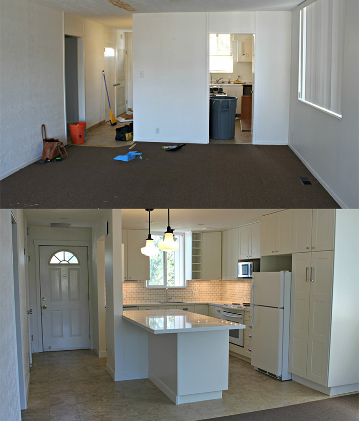
This has its pros and cons, but there is no more effective option for decorating small spaces than this.
If you are interested here you can see an article where I tell you everything you need to know to have an open concept space with the kitchen open to the dining room.
Textiles with little ornate patterns .
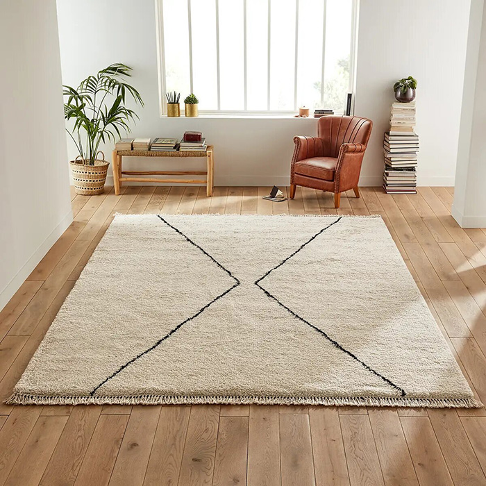
Large Pattern Rug by La Redoute
Whether on the carpet, upholstery or curtains, prints with ornate patterns load and make spaces heavier.
Instead, go for more subtle patterns or go straight into a large pattern, and you’ll make your space feel less visually heavy and instead magnify the feeling of spaciousness.
Instead of many paintings, better few and large .

One solution may be to put paintings and art in large format, as they are lighter than several small paintings together and they decorate the same.
Fluid passage areas .

You just have to look at some space where when you have to go through it you practically have to turn aside to go through.
Even if you didn’t see it, you would feel that it is small.
So, and this is very important, when you are preparing the decoration of small spaces, examine your passageways well, and leave them as clear as possible.
Going through clear passageways where we pass comfortably generate a feeling of spaciousness and comfort like few things do in a small space.
Use wall sconces .

The whole set of SKLUM
Wall sconces, in addition to giving a very attractive decorative touch, also make everything look lighter, for the simple reason that they are neither occupying the floor nor the walkable physical space, nor on any table.
A good idea may be to replace the floor lamp with a wall light in the same way as the table lamp or the bedside lamp with a wall light, and everything will look clearer.
Keep order .
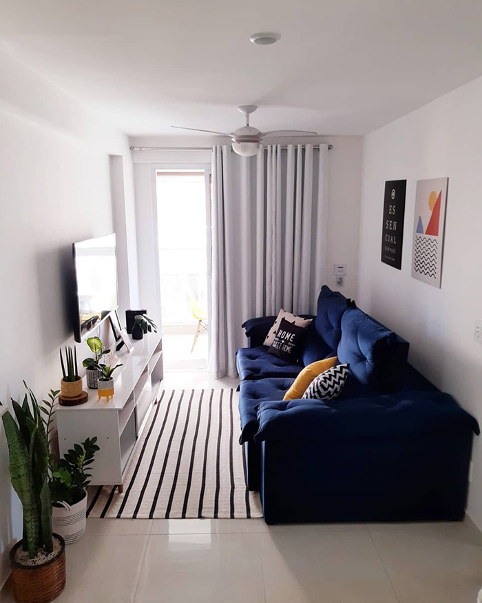
So, within your possibilities, keep a house as tidy as you can.
This won’t make your house look bigger, but it will keep it from looking smaller and cluttered, which is already a substantial accomplishment. And totally free.
The appreciation of a small space is not only seen in the square meters and in the practicable surfaces, but also in the height. So, if you have low ceilings, you can make your house look bigger if we visually make the ceilings appear higher, and this is something easy to achieve with these tips that we are going to see next:
Decorate to make ceilings look higher
Paint your ceilings white .

Eliminate the contrast between walls and ceiling as much as possible .

Low furniture .

And I say low, not small, nor practical, but low. And then, put a vertical element next to each piece of furniture, such as a plant.
This is perfect for decorating small spaces as it will create a sensation of brutal height.
Paint vertical stripes .
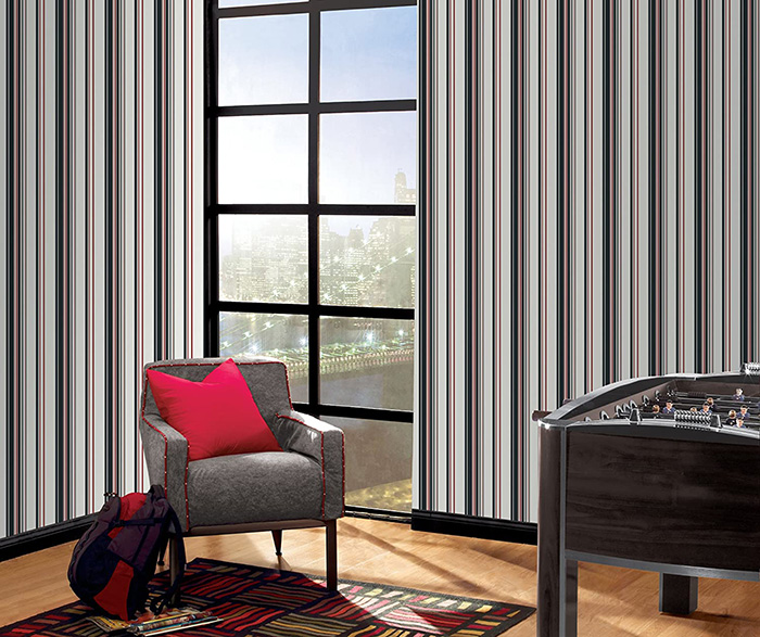
It never fails. Use paint or wallpaper. What you want.
Remove hanging lamps .

And this makes us see the ceiling lower than it is.
Instead, opt for recessed lighting or ceiling lights that are very close to the ceiling.
If you have any hanging lamps and low ceilings, try it, remove it for a moment and you will see what a difference.
Or you can also bet on perfect lamps for low ceilings.
Add vertical elements to the walls .

This trick works just as well as painting vertical stripes.
You can use mirrors, plants, vertical paintings or any decorative element.
By installing it, especially in corners and corners where we see the vertices and edges of the architecture of space, we will be guiding the eye from top to bottom and everything will seem taller.
The curtains from floor to ceiling .
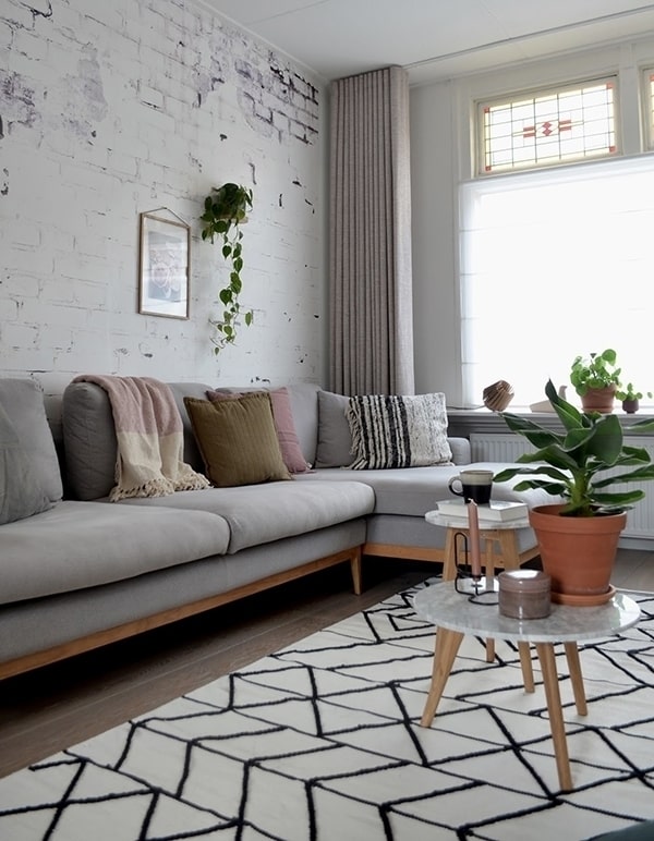
Fotografía From the cupboard to the wall
Curtains can define the view of a high or low ceiling.
If you put them from the ceiling to the ground, your ceilings will grow in height. It never fails.
On the contrary, if you have low ceilings and your curtains do not go from the ceiling to the floor, you are making the space lower than it is.
If you are interested in this topic, here you can see 12 solutions to make a ceiling look higher.
Create a plinth at half height .

Here you can see more ideas to paint baseboards on the walls.
If any trick to decorate small spaces that we have seen has not been very clear to you why it works or how to apply it, leave me a comment and I will explain it to you in more detail.
I have not wanted to dwell much on each piece of advice, because there are many and the article would become very long and I wanted to get to the point.
But if you have any questions, you know that you can leave a comment that I will be happy to answer.
And if you think that this article to decorate small spaces may like a friend or family member, share it. Thank you!

