The color of the walls in the kitchen affects the emotional state and appetite. To have a meal in a pleasant environment, you need to choose the right shade. Each interior design has its requirements. If they are not taken into account, it will be impossible to achieve the desired beauty and comfort. For originality, it is recommended to combine several colors.
- The choice of color and its effect on the psychological state of a person
- The most successful combinations
- Black and white
- Red and black
- White and blue
- Dark and light brown
- What color can you decorate the walls
- A selection of style and color
- For classic cuisine
- For french Provence
- For a modern style
- What color better to choose for walls if you have white furniture
- What shades are better to refuse
- What color will change the size of the room visually
- Conclusion
The choice of color and its effect on the psychological state of a person
The walls in the kitchen are the backdrop for the interior. Therefore, they must be in harmony with style, headset, textile accessories. Also, consider the lightness of the room: the lighter the room, the darker the shade of the walls should be. Learn some tips for choosing a tone:
- Dark colors for the walls of the kitchen or dining room should be chosen if its windows face the sunny side. If the room does not have access to natural light, it is better to finish the surface with pastel colors.
- Cold shades are not appropriate in spacious kitchens. They will emphasize emptiness, the owner of the house will begin to feel distracted and restless. Give preference to a warm palette.
- If the kitchen is small, then brightened tones will come to the rescue. Dark steal free space, visually narrow the walls. The room seems cramped, gloomy, and uncomfortable. For small areas, choose only a pastel palette.
- If the shade of the walls is discreet, then think in advance about accessories and decorations. They should focus on. In a small kitchen, two or three decorative items are sufficient, in a large – up to seven.
- Textile accessories: napkins, curtains, potholders must match the color scheme, combine naturally. In large kitchens, it is permissible to use curtains that stand out against the background.
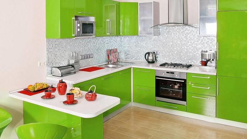
Do not use too bright and colorful colors of the palette. They include raspberry, orange, turquoise, light green, purple. They negatively affect the psycho-emotional state, cause stress, anxiety, anxiety. Such a palette provokes appetite even at the moment when you do not want to eat.
The most successful combinations
When performing designer kitchen repairs, several combinations of shades are used. Harmony can be monochrome, neutral, or contrast. The most successful are only a few combinations.
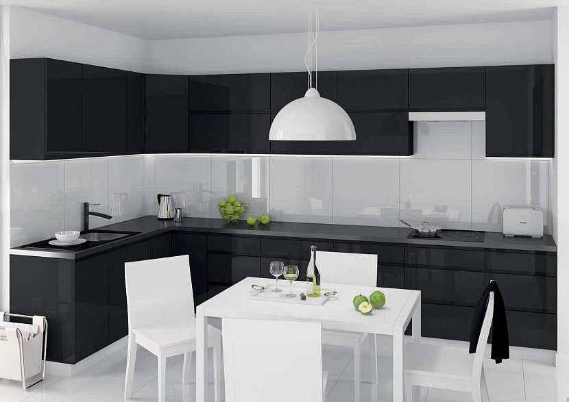
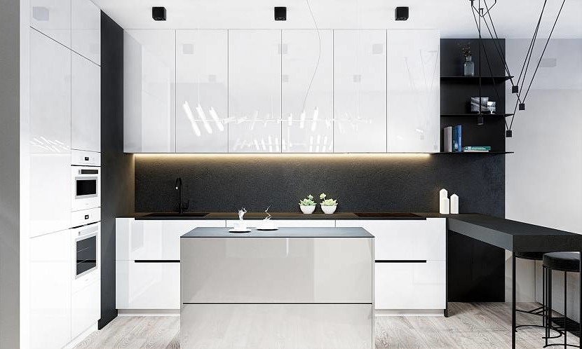
Black and white
This is an effective combination that creates excellent contrast in large and small kitchens. Such a range will help to correct the appearance, hide flaws in the form of curved walls, baguettes, and ceilings. If you competently combine shades of companions, you can get a beautiful modern design.
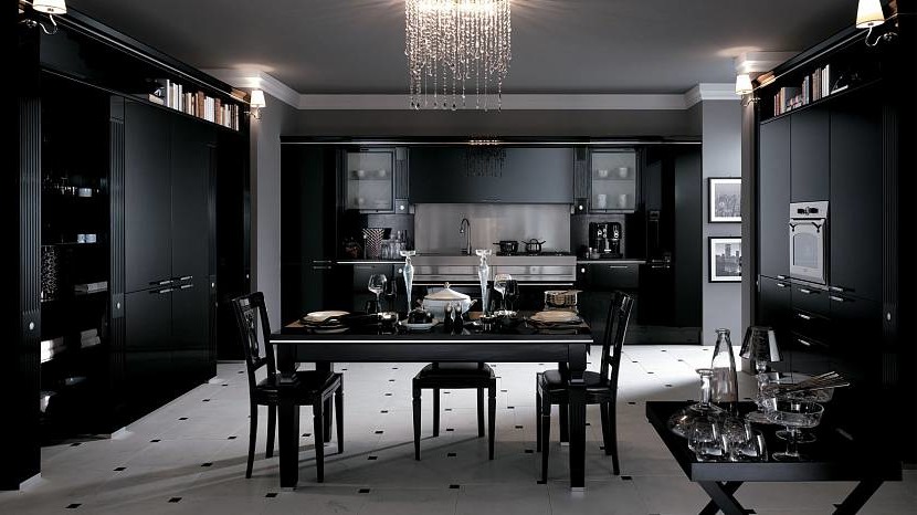
Black color may prevail in the room. The contrast is shown in a white tiled floor. A white apron and a wide baguette under the ceiling emphasize the situation.
Black furniture with white walls and a snow-white table in the dining area are interestingly combined in the setting. An object that accentuates attention is a vase of flowers or fresh fruit.
The structural wall in the apron area in black creates visual depth. The space seems elongated and functional. The matte surface finish does not reflect the interior, therefore it is suitable for kitchens with a large area.
Red and black
A similar combination should be organically integrated into the interior. The combination is contrasting and unusual. Often used a tandem of two chic tones to highlight the working area or floor. If the room is large, then it is permissible to repeat two identical contrasting details.
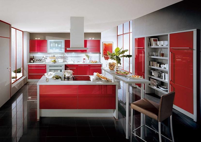
Black and red harmonize well if used not only on walls. The interior looks good when facing the floor with black tiles, using the red facade of the headset. Walls are left in white or light gray.
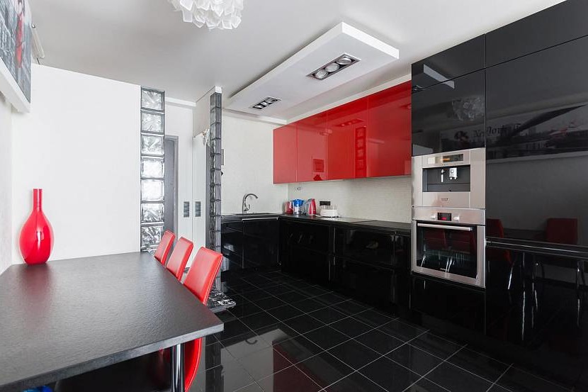
The white cladding looks good with an additional combination of black and red. The interior will be rich if the base remains light, and the emphasis is made in the contrast between red and black. For this style, you must observe symmetry: the same number of tones of companions.
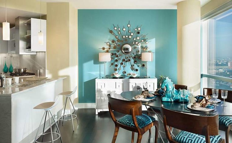
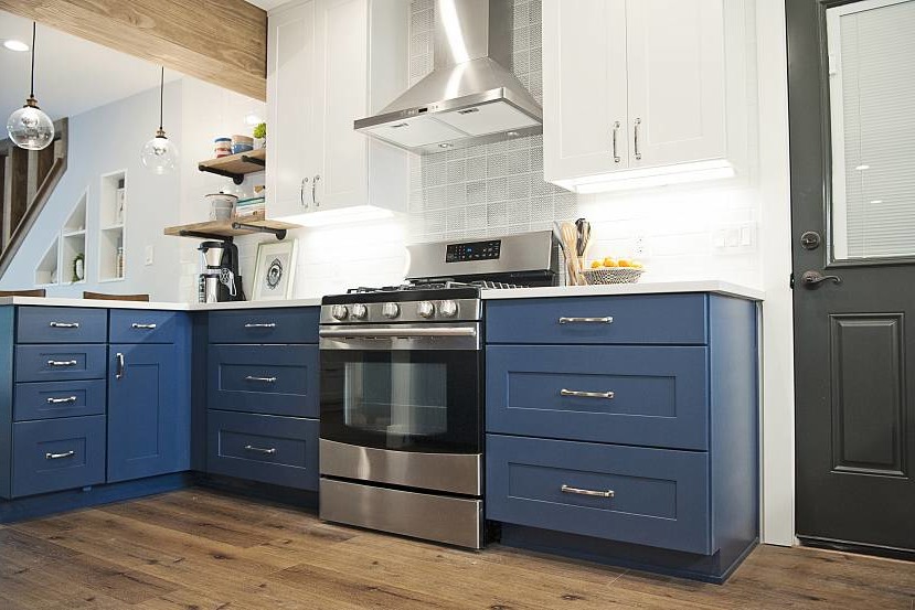
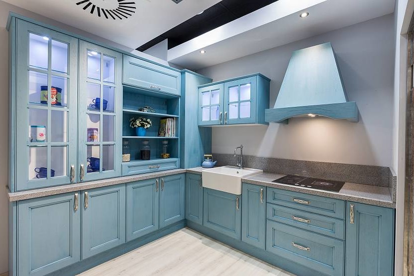
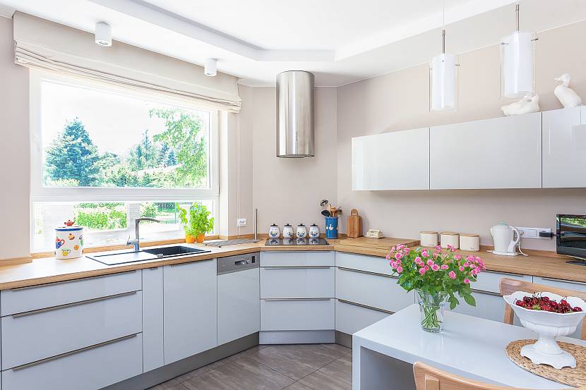
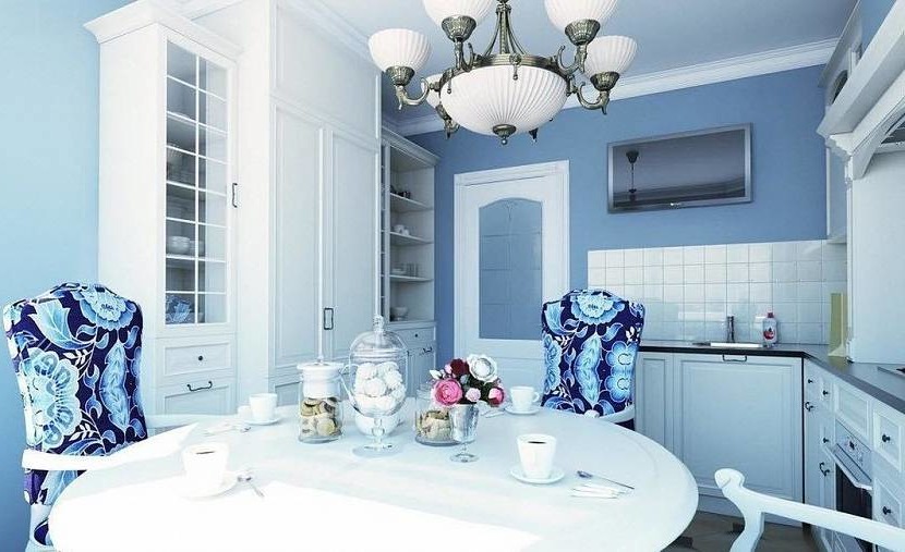
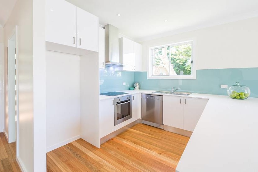
White and blue
The same amount of white and blue will make any kitchen fresh and spacious. The ideal solution is to repeat the structure of the wall in the facade of the furniture. It will help to dilute the decor with an apron made of white tile imitating brickwork. It is easy to combine blue and white in the corner layout of the kitchen.
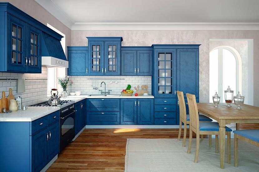
Blue matte furniture against the white walls of the kitchen looks gorgeous. When lining the apron, you can use a square tile with a light-dark ornament. In such kitchens, it would be nice to use additional colors: brown – for floors and shelves; silver metallic – in household appliances.
For a kitchen with an angular layout, you can use a clarified beige tone in harmony with white. A narrow set to the ceiling with glass top wings will emphasize the aged style. Here you can use the notes of modernity: use a marble wide tabletop.
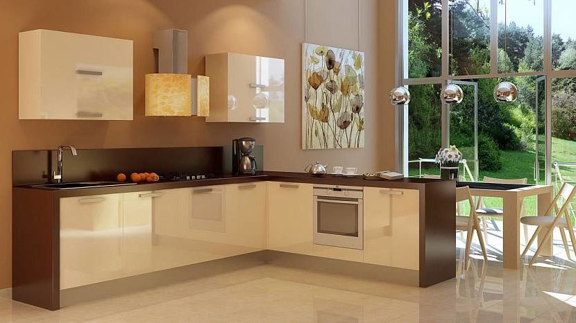
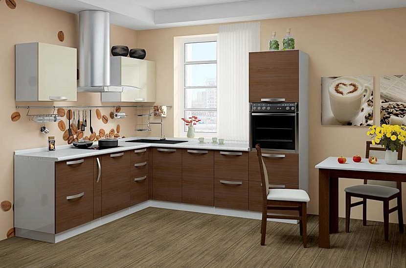
Dark and light brown
It is acceptable to use several tones of brown in the interior of the kitchen. Still popular are coffee, chocolate, straw. They give the atmosphere warmth and nobility. Such combinations look rich.

Massive brown wood furniture looks chic against a pixel high apron. The combination of several of these tones is suitable for linear and angular layout of the kitchen.
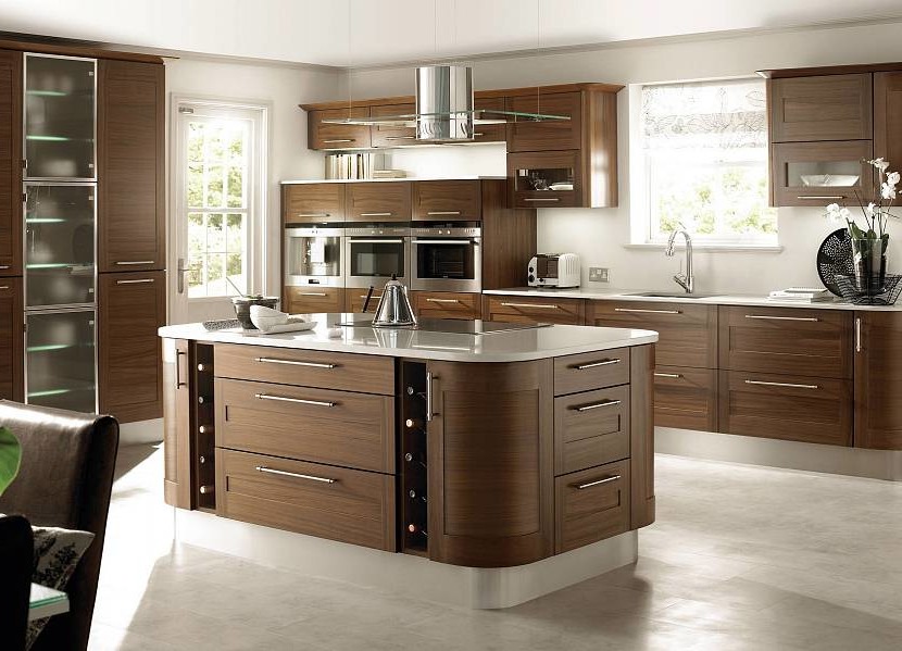
Perfect harmony in the interior of the kitchen can be achieved by combining brown, white, and coffee. Brilliant fittings on the facade of the cabinets will help to dilute the design. A parallel between the upper and lower headsets will draw a snow-white countertop.
What color can you decorate the walls
The basis in the kitchen can be several more shades:
- Different shades of green. Pistachio, olive, grassy look good in small cozy kitchens. If you paint the walls with one of them, then the headset should choose noticeable tones: white, black, gray. Against the background of green walls, cabinets with glass aprons look spectacular.
- Gray and its shades. This palette is ideal for a kitchen with a corner layout. This tone is considered a sign of great taste. The room is filled with a mysterious natural haze. It is important to use a muted palette: beige, cream, sand, ivory.
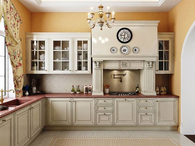
- Beige. Suitable for any style. The tone is considered warm. Used as a base and as a moderate decoration. Looks great beige on the walls. They can finish all the walls or focus on the work area.
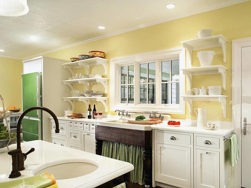
- Yellow. It symbolizes the sun and warmth. The kitchen acquires unique qualities of style, coziness, and comfort. Apply not too bright colors: pale yellow, diluted sunny, or lemon.
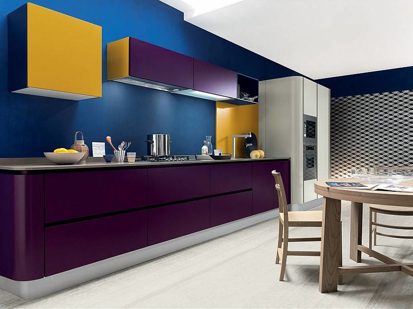
- Violet. The walls in kitchens are painted with such a shade, where the suite and flooring look much lighter. Use materials with different textures: wallpaper for painting, decorative plaster, tile.
Apply every shade wisely. If you go too far with any of them, the kitchen will turn out gloomy and uncomfortable. The wrong combination of several tones of the palette has a bad effect on the state of the nervous system.
A selection of style and color
In addition to the shade, the style of interior design should be taken into account. Not all directions look good with classics, modern, country, modern, and other solutions.
For classic cuisine
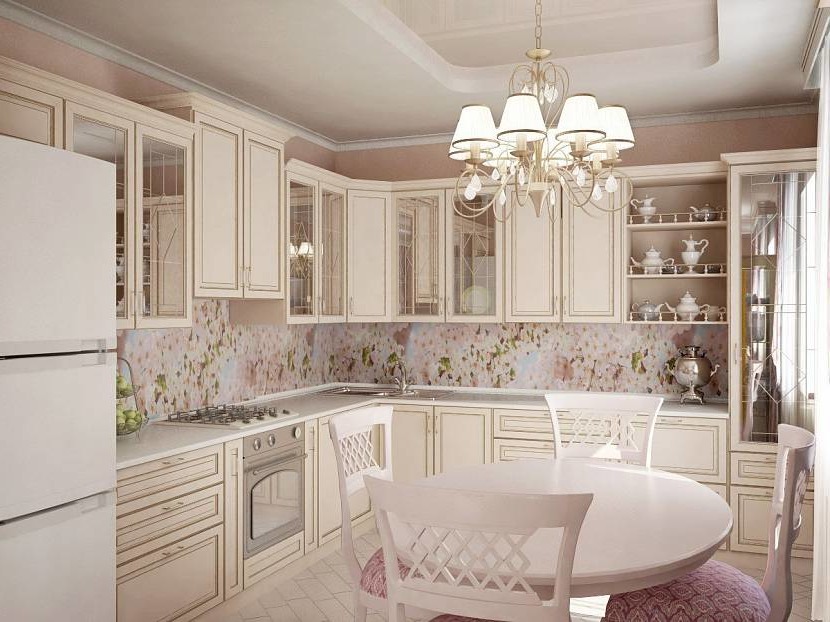
The classic interior is common for kitchen decoration. It is inherent in the use of delicate pastel shades: light pink, pale yellow, moon, peach, milk. Such tones are best diluted with large portions of lighting. The walls in the above colors look good with a white floor covering and a similar headset facade.
For french Provence
This direction is characterized by slightly faded, calm shades: beige, flesh, and peach. Here you can not do without bright accents in the decor: amber, mustard, orange. Such a tandem fully emphasizes the provenance direction.
For a modern style
In modern interior design in the kitchen, the harmony of no more than two or three shades is welcomed. Practice wall decoration in beige, cream, ivory, moonlight, milky tone. Such colors remain background. On top of them, you can apply tones of brown, gray, ashy. The latter is viewed in the headset, accessories, textiles.
What color better to choose for walls if you have white furniture
When performing cosmetic repairs of the kitchen, the walls lend themselves to restoration. If you have a white headset, you can use only a few options for shades:
- Dark beige. This background is suitable for perfectly white furniture, as well as for models with eye-catching fittings. The beige color creates an accent and highlights the functional area of the kitchen.
- Silver. This tone is best used only in the apron area. He will focus on the working triangle, separate the lower and upper headsets. For decoration, tiles or washable heat-resistant wallpapers with ornaments are best suited.
- Delicate pink. A primitive warm tone that emphasizes comfort and completes the interior. It looks good if you finish the part under the ceiling with a light baguette and attach a brown baseboard near the floor.
- Blue. This color will not look defiant if diluted with a white linear kitchen set. Adding accessories to the light blue palette is welcome. It can be chair covers, potholders, fabric napkins, Roman curtains.
- Green. Creative shade, it looks good in any tone, like a background for a kitchen with a white suite. Pistachio, mint, or olive are the most popular colors for painting walls in the kitchen with white furniture and flooring.
- Brown. Dark saturated color creates a contrast with the snow-white facade of kitchen furniture. Looks chic in spacious kitchens with high furniture. A brown rug under the islet will complement the wall decoration.
Pay attention to neutral pastel colors. They remain still in trend. Perfectly combined with white furniture in kitchens and small dining rooms.
What shades are better to refuse
When decorating the walls of the kitchen, refrain from bright colors. All tones will look unsuccessful:
- light green;
- orange;
- magenta;
- burgundy.
They can be preferred if the kitchen has a large area. In free space, tones look beautiful, do not cause disgust.
Many paint the kitchen in dark chestnut or black tone. For walls, this is not the best option. Even with good lighting, the room will remain gloomy and depressing.
What color will change the size of the room visually
A kitchen unit takes up a lot of space. Its color scheme should be combined with the shade of the walls. In order not to create a feeling of crampedness, you need to choose the right tones:
- Classic light brown. If they finish the wall behind the furniture in the apron area, space will gain depth. Visually, the kitchen becomes longer and wider.
- If the room is dominated by white, then red and scarlet are well emphasized. He visualizes the excess area if it is involved in textile accessories.
- Glossy light surfaces: white, milky, lunar. The surrounding interior is well reflected in them. For such cases, the emphasis should be restrained and discreet.
Not only color but also decoration plays a role in the visualization effect. Therefore, for the illusion of increased space, choose materials with a smooth texture, horizontal or vertical (to increase the height of the ceiling) stripes. These include a long narrow tile, PVC panels, glass mosaic, decorative paint.
Conclusion
The design of the kitchen can look spectacular in different colors. The main thing is to be able to clearly delineate the space and use any shade sparingly. From these simple nuances, it depends on whether the situation in the room is comfortable and calm.